Orange is not the colour you pick if you want to blend into the background. It is not quiet, it is not safe, and it definitely does not care if you are uncomfortable with how bold it feels. Orange is the unapologetic shade that makes people stop scrolling, look up, and pay attention.
It is the tone that sells fun on a Fanta can, makes a Hermès box scream status from across the room, and turns a budget airline into a flying billboard. Playful, fearless, and magnetic in a way that is impossible to ignore.
Handled with care, this vibrant hue makes your brand approachable, creative, and unforgettable. Get sloppy with it and you are giving cheap clearance rack vibes. Let’s break down why this is one of branding’s riskiest but most rewarding moves.

Brands that choose this bold hue are sending a clear signal: “We are not afraid to stand out.” It is not corporate beige. It is not polite navy. It is the wink across the room that sparks curiosity.
Psychologically, this shade hits a sweet spot. It is warm like red but less aggressive, bright like yellow but less childish. It is bold but still approachable. That balance is exactly why marketers love it.

the origin of this fearless shade
A colourful history
Orange has always had range. In Eastern traditions, saffron orange robes represent spirituality, purity, and enlightenment. In the West, it became tied to autumn harvests, fire, and change. Later, it earned its place as the ultimate colour of visibility: traffic cones, life vests, hi vis jackets. If you want to be seen, orange is your colour.
And then of course, there is the fruit itself. Bright, juicy, zesty even the word “orange” carries a built-in sense of energy. This duality is what makes orange fascinating for branding. It is both sacred and playful, serious and cheeky, practical and luxurious.
 Explore Hunter Lab’s The Color Orange — History, Meaning and Facts

fearless energy of orange
The personality of orange
If orange was a person, it would be that friend who convinces you to take the risk and makes you laugh the whole way through it. Bold, creative, charmingly unpredictable, but always warm and approachable.
When brands embrace orange, they usually want to communicate:
- Energy – A burst of vitality that feels alive.
- Playfulness – Creative, cheeky, not taking itself too seriously.
- Rebellion – A refusal to play by corporate rules.
- Accessibility – Inviting and approachable, the opposite of intimidating.
It is high risk, high reward. Done right, orange is magnetic. Done wrong, it screams desperate discount signage.
👉Wanna know more about orange? Read VeryWell Mind’s Psychology of the Color Orange

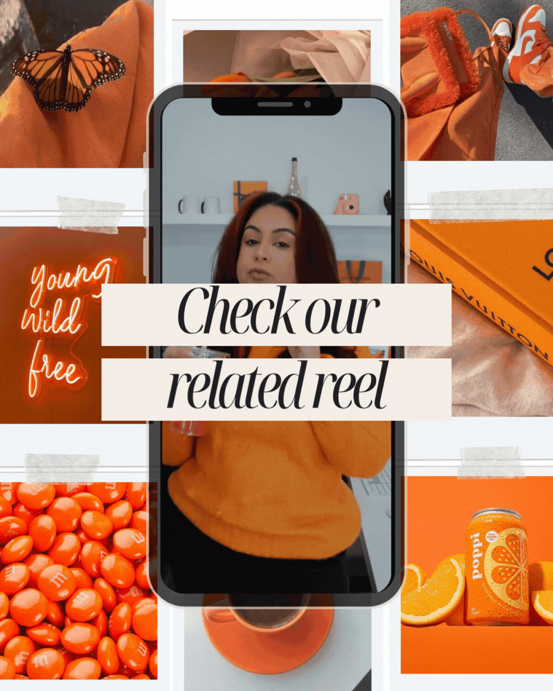
brands that are slaying orange
Orange in branding and marketing
Some of the boldest branding moves in history come from this fearless shade.
- Louis Vuitton – High fashion meets boldness. LV has woven it into campaigns, packaging, and striking window displays, proving it can live comfortably at the top of luxury without losing an ounce of elegance.
- Fanta – Pure fun in a can. Bright and playful energy bottled up.
- Nickelodeon – A splat that defined childhood creativity and chaos.
- Hermès – Their iconic box turned what was once considered risky into the epitome of timeless luxury.
- Harley Davidson – Pairing fiery tones with black grit created a visual identity rooted in rebellion and adrenaline.
- Home Depot and Bunnings – Practical authority. It feels no nonsense, hands on, and approachable.
- EasyJet – An entire airline drenched in brightness. Subtlety is not their vibe, and it works because you cannot miss them.
- SoundCloud – A signal of creativity, community, and underground culture.
- Amazon – Not a full takeover, but a clever accent. That bright smile under the logo adds just enough energy and optimism to feel fresh, modern, and approachable.
The lesson here is simple. This shade is not decoration. It is a headline.

shades of orange to explore for your next project
Shades of orange and what they mean
This hue comes with a whole wardrobe of personalities. Each tone tells a different story, and picking the wrong one can tank your brand faster than a bad font choice.
- Tangerine – Youthful, zesty, playful. Perfect for fun, lifestyle, and energetic brands.
- Burnt tone – Warm, grounded, sophisticated. Great for earthy, heritage, or boutique brands.
- Neon shade – Loud, disruptive, impossible to ignore. Perfect for industries that thrive on energy and urgency.
- Rust – Vintage, rebellious, gritty. Evokes nostalgia while staying bold.
- Hermès signature – Luxe, iconic, aspirational. Instantly tied to high-end elegance.
- Safety hue – Practical, urgent, visible. Trusted in industries where being noticed is non-negotiable.
Shade is strategy. Neon on a luxury brand feels cheap. Burnt tones for a kids’ brand feel flat. Your choice has to align with your story.

too much orange means danger for your brand
When orange goes wrong
This shade is a thrill seeker. Too much of it, and your brand tips into chaos. Too bright, and you risk cheapness. Too dull, and it loses the magic.
The fix is balance. This vibrant hue shines when supported by neutrals. Pair it with cream for sophistication, with black for grit, with white for freshness. Let it be the accent that grabs attention, not the wall-to-wall paint job that overwhelms.
A little goes a long way. Used sparingly, it creates focus and energy. Used carelessly, it feels like you are screaming at your audience.
The emotional hook
This shade is something people feel before they even process it. It is warmth. It is energy. It is urgency. It is excitement. That is why it works for creativity, community, and risk-taking brands.
Walk into a store with subtle accents of this tone and it feels friendly. Scroll a feed drenched in it and it starts to feel frantic. Board an airline painted in this vivid hue and you feel the energy before you even take off. It is visceral, and that makes it one of branding’s most powerful tools.
Final say
Orange is not safe. It is not quiet. And that is exactly why it works. For brands that want to be bold, magnetic, and unforgettable, orange is a soulmate shade.
At Fifth Studio, we love orange because it has range. It can wear a luxury gown, a biker jacket, or a hi vis vest and still make sense. Few colours can move between playful chaos, rebellious grit, and timeless elegance without losing credibility. Orange can.
 Ready to see if this fearless shade could be the spark your brand has been missing?
We know you’ll love these blogs too...


Want more of this straight to your inbox?
We're here to keep you in the loop with the essentials for businesses in this digital age. Don't be shy – we know you're curious!

