Think green is just the colour of yoga mats and overpriced kale smoothies. Please. Green is one of branding’s boldest power plays and it is far more interesting than being the colour of your cousin’s juice cleanse.
This is the shade that has been flirting with us for centuries. From ancient pigments crushed into paint, to emerald dripping off red carpets, to billion dollar tech giants splashing it across their apps, green has always meant power.
Health, growth, prosperity, calm. When you use it with strategy, green does not just sit quietly in your palette. It takes the stage, pours itself a martini, and tells your audience exactly why they should trust you.

Your visual choices are your first impression. People clock them faster than your tagline, faster than your carefully written About page, faster than your Canva logo. And this shade happens to be one of the most loaded signals you can send.
It speaks calm, it hints at money, it represents growth. It makes people breathe easier while also convincing them to open their wallets. Talk about multitasking.
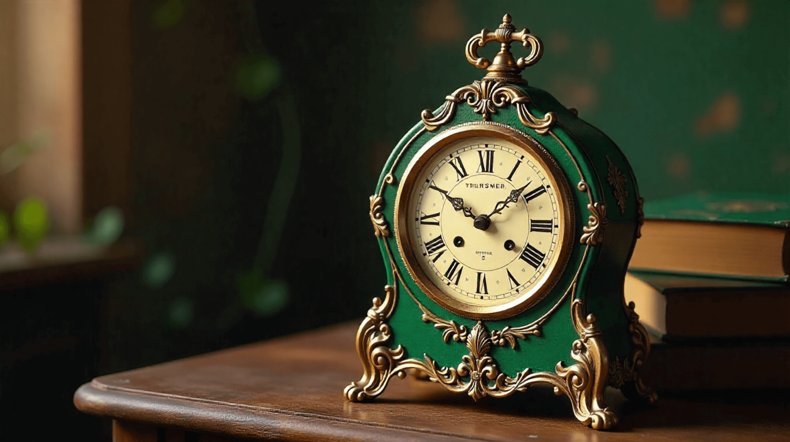
timeless elegance rooted in history
Drama much: the wild history of green
This shade has always had a flair for the dramatic. Ancient Egyptians crushed malachite into pigment, medieval brides wore it for fertility, and Renaissance painters drenched their saints in it. The original It Girl.
But she also had a toxic side. Literally. In the 1800s, Victorian homes were lined with wallpapers laced in arsenic dye. Gorgeous. Deadly. Iconic. This hue has never been boring, and she is not about to start now.


serenity rooted in the earth’s undertones
The personality vibe check
If shades were people, this one is the friend who shows up to brunch in activewear, runs three side hustles, and somehow still looks calm while the rest of us are spiralling. She is grounded, nurturing, but quietly ambitious.
Brands that lean into this tone usually give off:
- Trust. It whispers, “I’ve got you.”
- Calm. Balanced and restorative without trying too hard.
- Prosperity. The energy of money and growth.
- Authenticity. Earthy, grounded, human.
But go too heavy-handed and suddenly you are not serene, you are swamp water. Nobody wants swamp water vibes.

moonah tree capital logo. check out the case study here
Selling with green: why marketers are obsessed
Marketers love this hue because it hits all the sweet spots in your brain. It calms you, sharpens your focus, and low key encourages you to spend. Coincidence that our cash is the same shade? Absolutely not.
Food and beverage – Whole Foods, Subway, Tropicana. It makes everything look fresher, cleaner, healthier.
Wellness and lifestyle – Aesop’s olive tones, boutique skincare brands, every yoga studio on Instagram. This palette sells balance and self-care.
Finance and tech – ING, Robinhood, Fidelity. Prosperity and growth, wrapped in a look that feels safe.
Global icons – Starbucks wants to feel like your daily ritual. Spotify ties the tone to endless creativity. Land Rover rolls up in deep, refined luxury that screams adventure.
Different industries. Same playbook. This shade makes people feel safe enough to buy in.
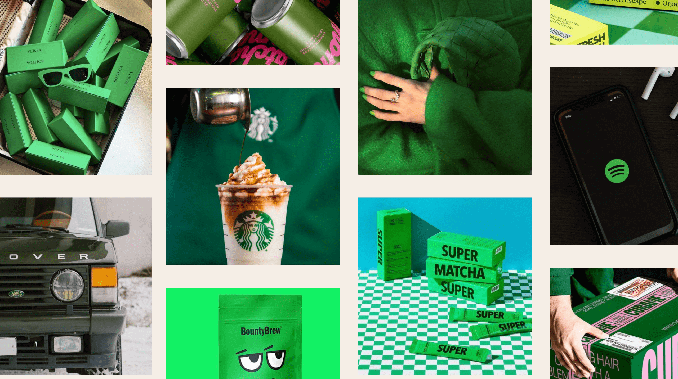
brands who are slaying the use of green
The brand icons who made green sexy
Some brands practically trademarked their shade of choice.
- Spotify – Neon energy and non-stop playlists.
- Starbucks – Deep comfort in a cup.
- Bottega Veneta – That emerald rebrand turned handbags into cultural obsession.
- Land Rover – Rugged prestige wrapped in a classic forest tone.
- BP – Love them or drag them, their bright branding screams eco credibility.
Each one is playing a different character, but the stage is always green.
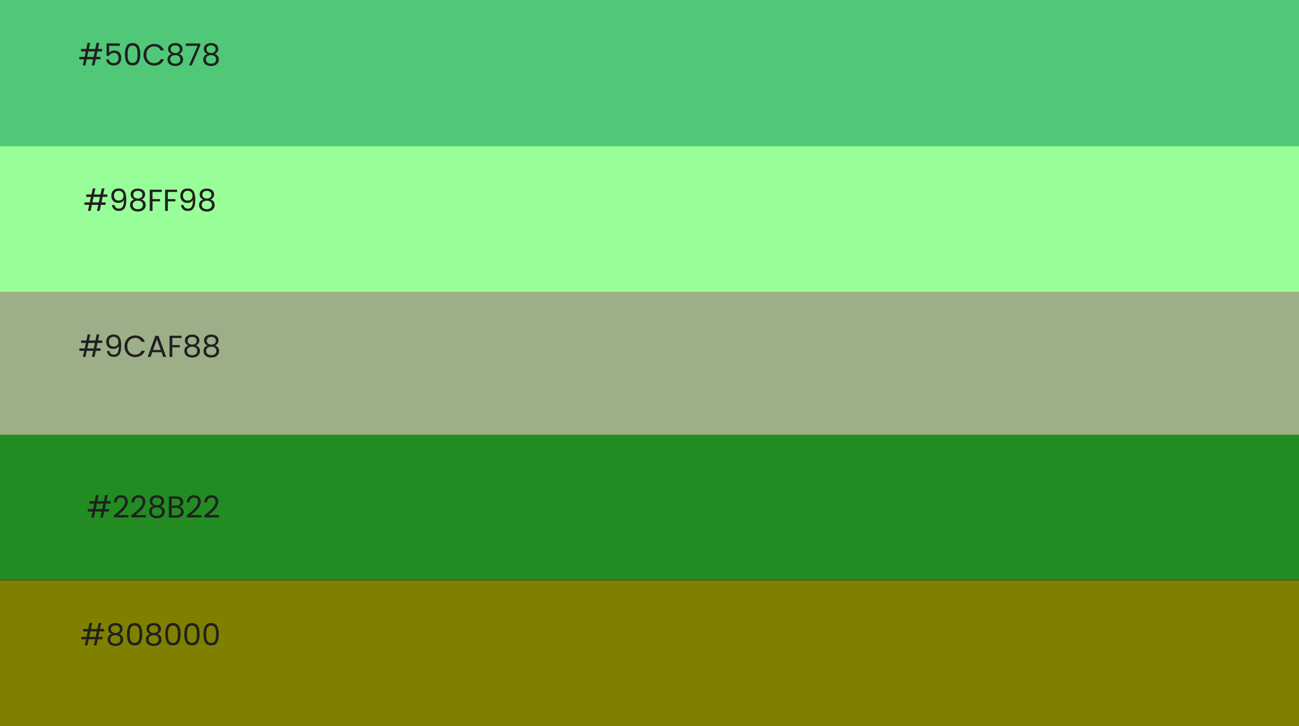
shades of green you might want to save and use for your next project
Shades of green: pick your alter ego
The real magic is in the nuance. Not all shades are created equal and the tone you choose is your story.
- Emerald – Luxe, aspirational, dripping in sophistication.
- Forest – Reliable, established, a little old money.
- Sage – Calm, earthy, wellness retreat vibes.
- Mint – Playful, youthful, TikTok energy.
- Olive – Timeless, grounded, a little bougie.
- Neon – Disruptive, loud, unapologetic.
Choose wrong and it all unravels. Neon for a law firm? Distrust. A deep forest tone for a kids’ cereal? Snooze fest.

calm power drawn fromt he forest
When green goes bad
This shade can be queen or it can be a disaster. Overuse feels clinical. The wrong combo looks cheap. Fake eco vibes get called out fast.
The fix is balance. Pair it with neutrals like cream, black, or metallics. Use it with intention, not as an afterthought. Less slime, more sophistication.
Conclusion
Here is the tea. Green is not for everyone. But when it works, it really works. It can make your brand feel calm, trustworthy, ambitious, or luxurious.
At Fifth Studio, we love green because it can wear so many outfits. Luxe emerald. Fresh mint. Earthy olive. Bold neon. It is versatile without losing credibility. But only when it is used with strategy.

We know you’ll love these blogs too...
Want more of this straight to your inbox?
We're here to keep you in the loop with the essentials for businesses in this digital age. Don't be shy – we know you're curious!


