Happiness has a colour and that colour is yellow. The second it shows up everything feels lighter, brighter, and more alive. Yellow is the shade of sunshine mornings, fizzy drinks, fresh ideas, and the kind of energy that makes you want to dance in the kitchen for no reason at all.
Psychologists say yellow wakes up your brain, lifts your mood, and sticks in your memory. Which is exactly why brands that want to radiate positivity from food and lifestyle to travel and entertainment splash this colour across their logos, ads, and packaging. In branding, yellow is built in optimism.
But here is the catch. Too much of a good thing can flip fast. A whole website or product line drowning in yellow stops feeling joyful and starts feeling overwhelming. Happiness needs balance. When you use the colour with intention, yellow branding is unforgettable. When you do not, it is just chaos in a bottle.

This hue doesn’t wait for permission. From the moment humans started painting caves and crafting golden halos, this has been the shade of spotlight. It’s the shade that says look at me now and the world always does. Whether it’s the taxis on busy city streets, a highlighter pen in your hand, or that friend who shows up in sequins before breakfast, this demands attention.
And here’s the thing: in branding, that can be both genius and dangerous. this shade will never let you fade into the background, but if you don’t use it right, it can tip from sunshine to hazard tape real quick. The real question is not whether this shade works. It is whether your brand has the confidence to pull it off.

soaking up the happy shade under the clear skies
Sunshine energy or panic attack?
It’s like a double shot of espresso. Used right, it sparks creativity, excitement, and focus. Used wrong, it gives jittery chaos that makes people want to look away. That’s why it is so powerful in branding: the line between genius and disaster is razor thin.
Marketers love it because it is literally built to grab attention. Sale signs. CTA buttons. Food packaging. Even a pop in a campaign can make the whole thing feel more approachable and energetic. But let it run wild and suddenly you are giving stress, not sunshine.


confidence, optimism, and a whole lot of sunshine energy
If yellow had a personality test
It’s the friend who texts you at midnight with a crazy idea for brunch. Loud, a little chaotic, but never boring. You remember them because they fill the room, not because they play it safe.
In branding, that makes it perfect for businesses that want to feel bold, playful, and impossible to ignore. If your vibe is polished but fun, confident but not too serious, this is already your wingman.


happiness in full blossom
Places yellow absolutely thrives
It has main character energy in industries that trade on joy. Food, fashion, lifestyle, travel, entertainment. Put it into those spaces and it feels natural, magnetic, exciting.
Think IKEA with its iconic blue and gold combo. Think Bumble flipping the dating narrative into something optimistic and playful. Think Veuve Clicquot turning a champagne label into the definition of luxury celebration. That’s not coincidence. That is pure strategy.
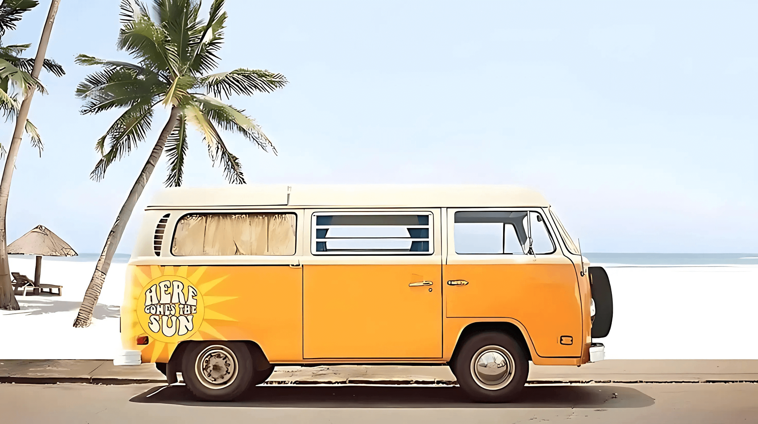
on the way to chasing sunshine
Places yellow crashes and burns
Now for the tough love. Some industries should back away slowly. Imagine a law firm with a neon logo or a financial advisor using sunflower tones on business cards. It feels like a joke, not authority.
It also fails when it becomes the whole identity. Cover a website in it and your audience will click off before they’ve read a word. It’s high voltage energy. It belongs in the right doses, not as the whole meal.
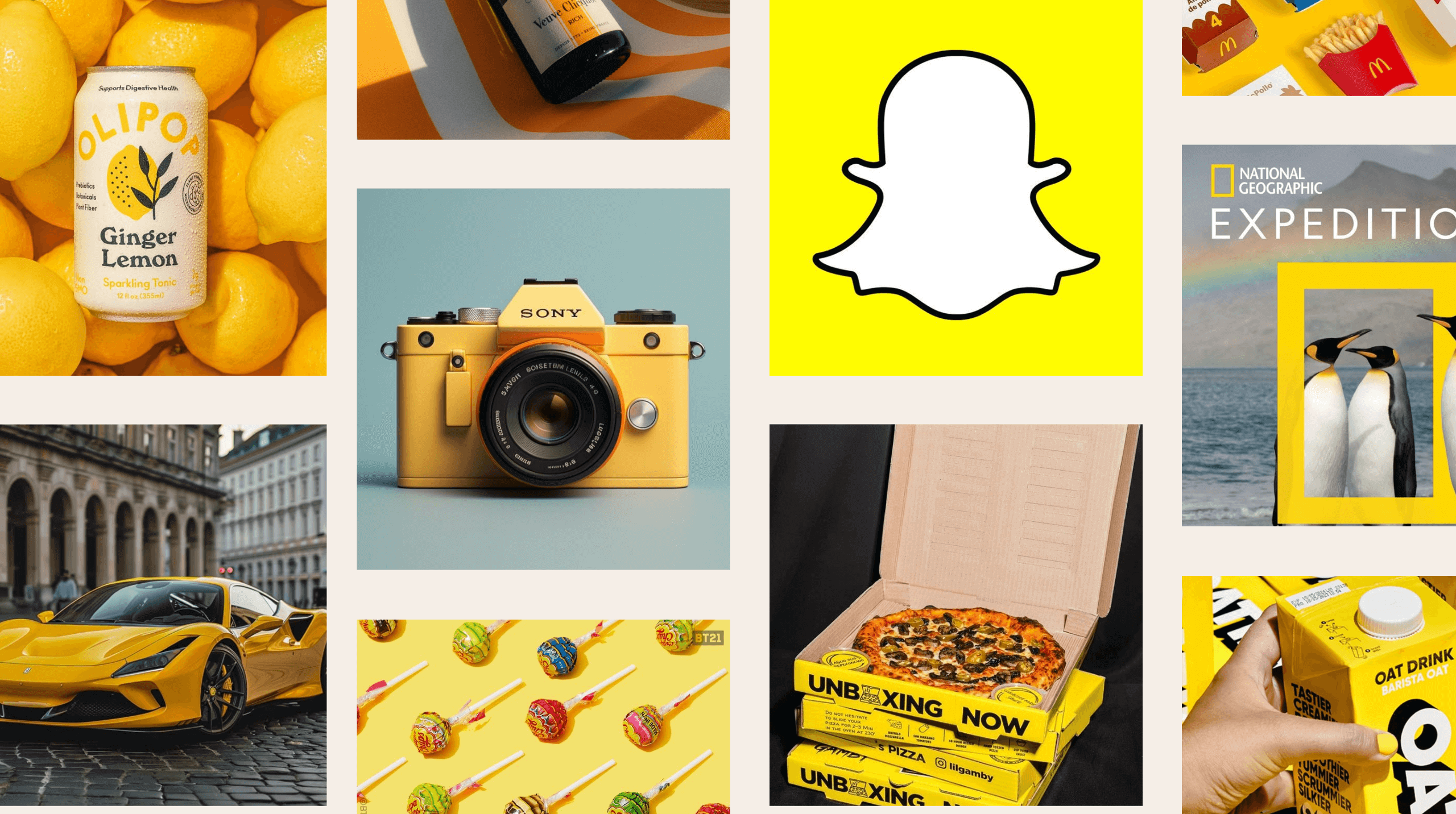
brands that made yellow their whole personality
Brands that nailed it
- Snapchat → An app built on fun and fleeting moments, with a shade that makes it unforgettable.
- Chupa Chups → Candy that owns its playful wrapper like no other.
- Ferrari → The yellow shield is prestige and speed rolled into one.
- Sony → A pop of this shade that says creative, sharp, and confident.
- Veuve Clicquot → This shade’s label so iconic it redefined luxury packaging.
None of these brands picked the shade by accident. They knew the vibe they wanted to own, and it was the only shade that could deliver it.
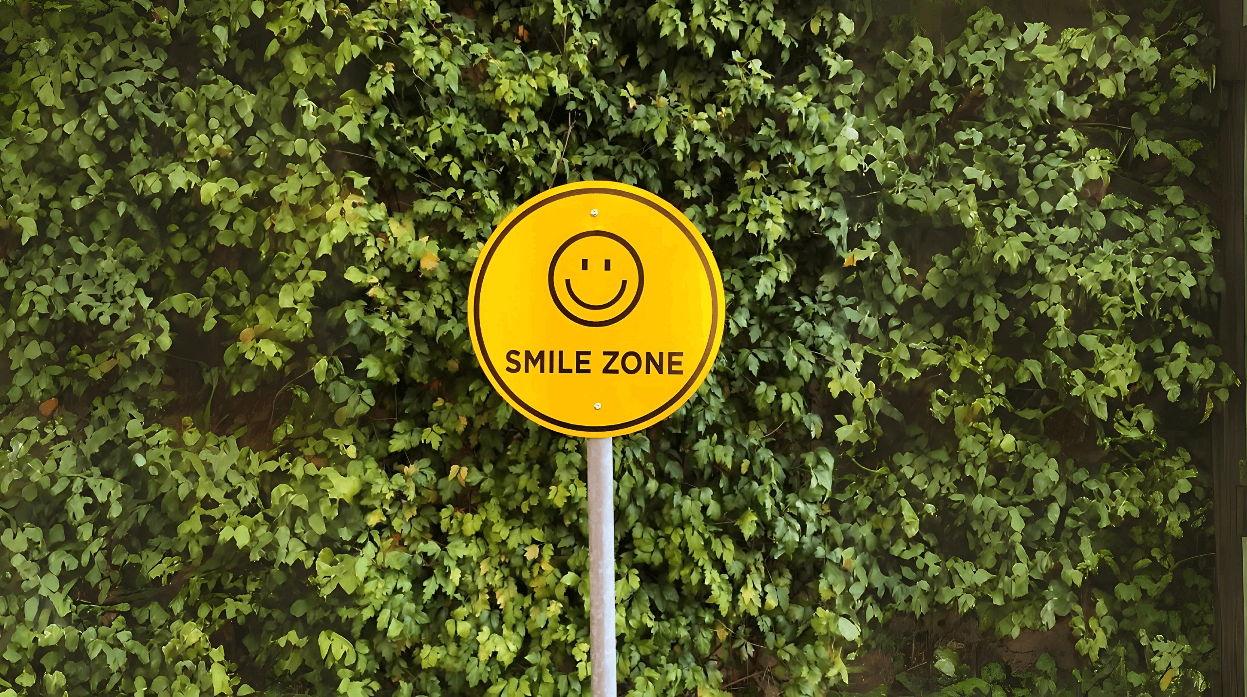
if you needed a sign to smile, this is it
Nerdy but fun: yellow marketing facts
- This is the first hue your eyes notice in daylight.
- It can signal both affordability and exclusivity, depending on how you use it.
- Discount retailers use it to scream cheap deals. Luxury brands spin it as gold. Both work.
- Babies cry more in this shade of rooms because the stimulation is intense.
- It increases memory retention which means people literally remember you more.

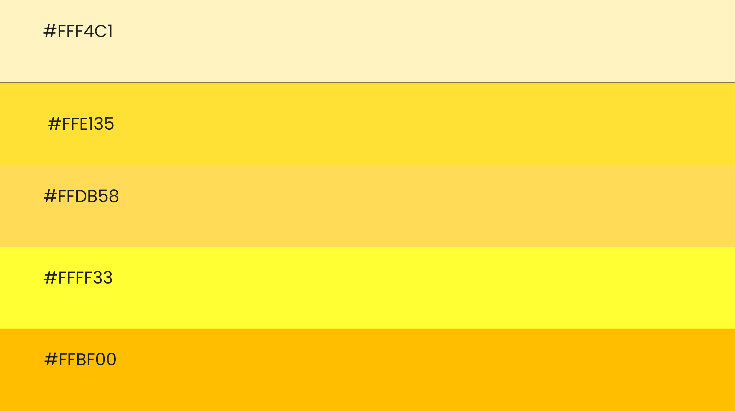
shades of the happy colour to explore
Meet the shades with attitude
- Banana → Fresh and cheeky.
- Gold → Luxe and timeless.
- Mustard → Retro and grounded.
- Neon → Loud, rebellious, unforgettable.
- Butter → Soft and friendly.
- Amber → Warm and creative.
- Sunset → Emotional, nostalgic, magnetic.
Pick the wrong shade and people get confused. Pick the right one and your colour does half the storytelling for you.
Final words
It is fearless. It is playful, bold, and unforgettable. It is not for brands that want to blend in. It is for brands ready to show up, light up the room, and own their story.
At Fifth Studio, we do not just give you a colour swatch and say good luck. We craft palettes that tell your story before you have even typed a word. Palettes that make people stop scrolling, pay attention, and remember you.

We know you’ll love these blogs too...
Want more of this straight to your inbox?
We're here to keep you in the loop with the essentials for businesses in this digital age. Don't be shy – we know you're curious!

