Welcome to 2025, where design is anything but boring...
This year, it’s all about breaking rules, being bold, and making connections that matter.
Forget the safe, cookie-cutter stuff. 2025 is serving up trends that are as dynamic and daring as the brands embracing them. From AI tools that make creativity limitless to bold minimalism that create simple yet impactful designs, the future of design is here, and it’s fabulous.
So, whether you’re ready to experiment, level up, or just have a little fun with your visuals, these 10 trends are your creative playbook for the year ahead. Let’s dive in.

Trend 1: AI-Driven Design
The Future Is Here, and she’s fab
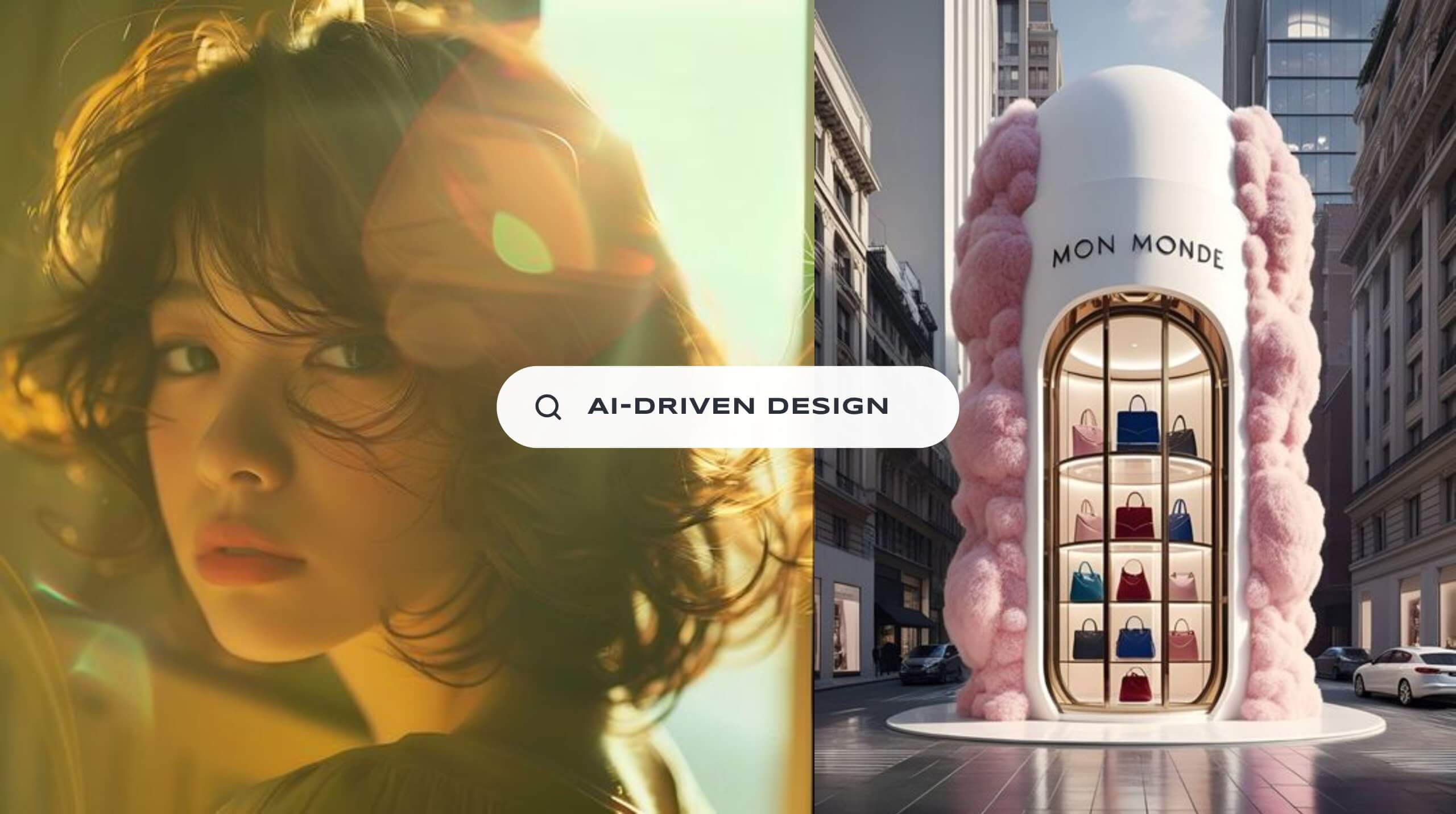
AI-driven design isn’t just some fancy buzzword anymore. It’s the MVP of 2025 for businesses ready to take their marketing game to the next level. Think of it as your creative bestie who works 24/7 (no coffee breaks required) to make your brand look amazing.
And no, this isn’t about robots taking over the world (or design studios). AI is here to help us dream bigger, work faster, and create visuals that make your audience stop scrolling. From jaw-dropping generative art to layout suggestions that actually make sense, AI is transforming the way design gets done.
But let’s be real… AI is only as good as the hands using it. Knowing when and how to sprinkle in that AI magic is the secret sauce. Lucky for you, we’ve got the recipe.
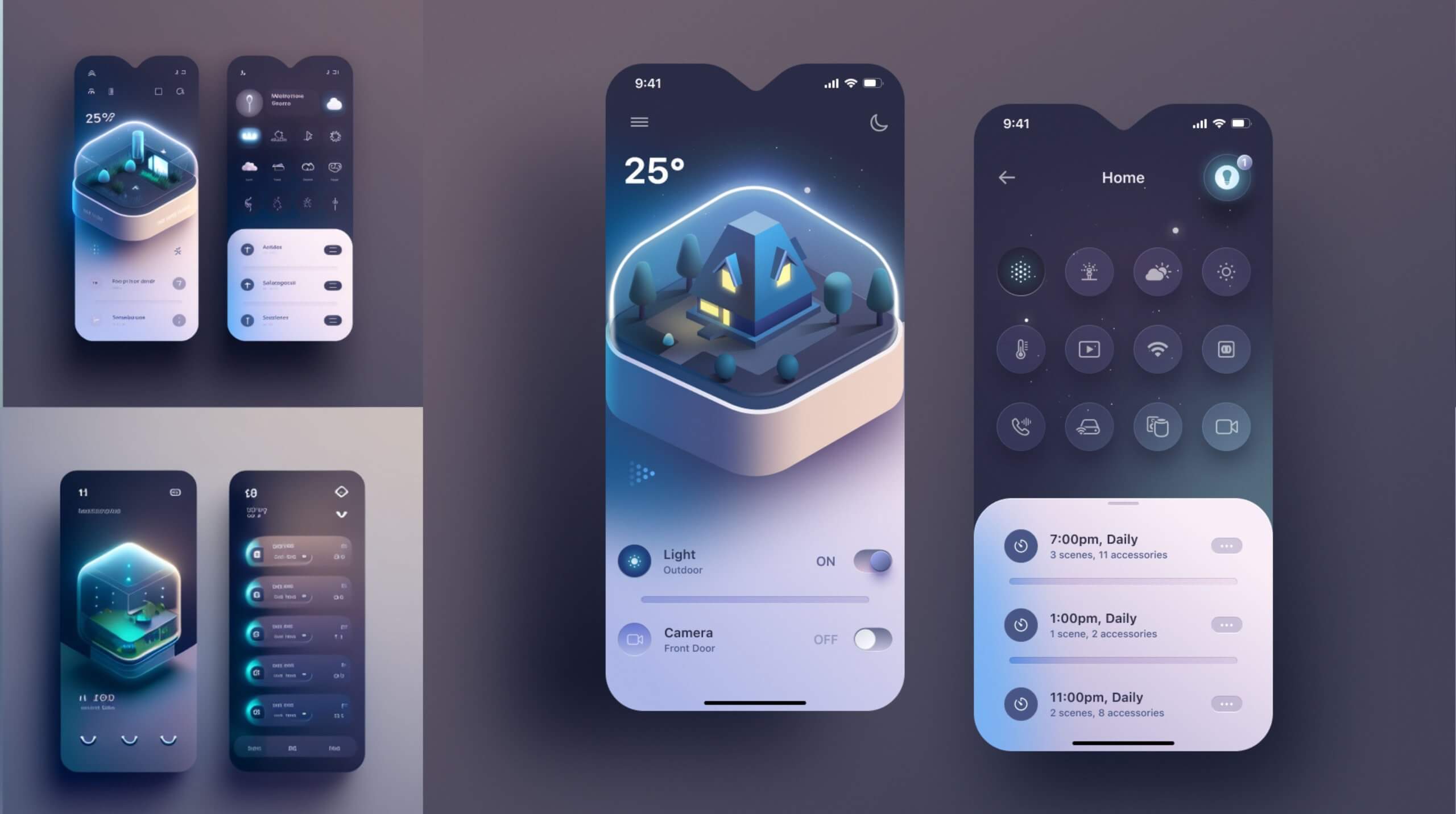
AI-Driven UI Design with Midjourney and Figma
Why AI driven designs work:
AI doesn’t just save time, it unlocks a whole new level of creativity. By handling the boring stuff (like resizing images or generating quick concepts), it lets us get to the fun part faster: creating jaw-dropping visuals for your brand. Plus, AI makes exploring new ideas and bold styles easier than ever.
Here’s why AI design’s are killing it in 2025:
- Speedy Workflows: Think creative concepts delivered faster than you can say, “Can you make the logo pop?”
- Bold Exploration: AI generates out-of-the-box ideas that spark creativity and push designs further.
- Hyper-Personalisation: With AI, every design feels like it was made just for your audience.
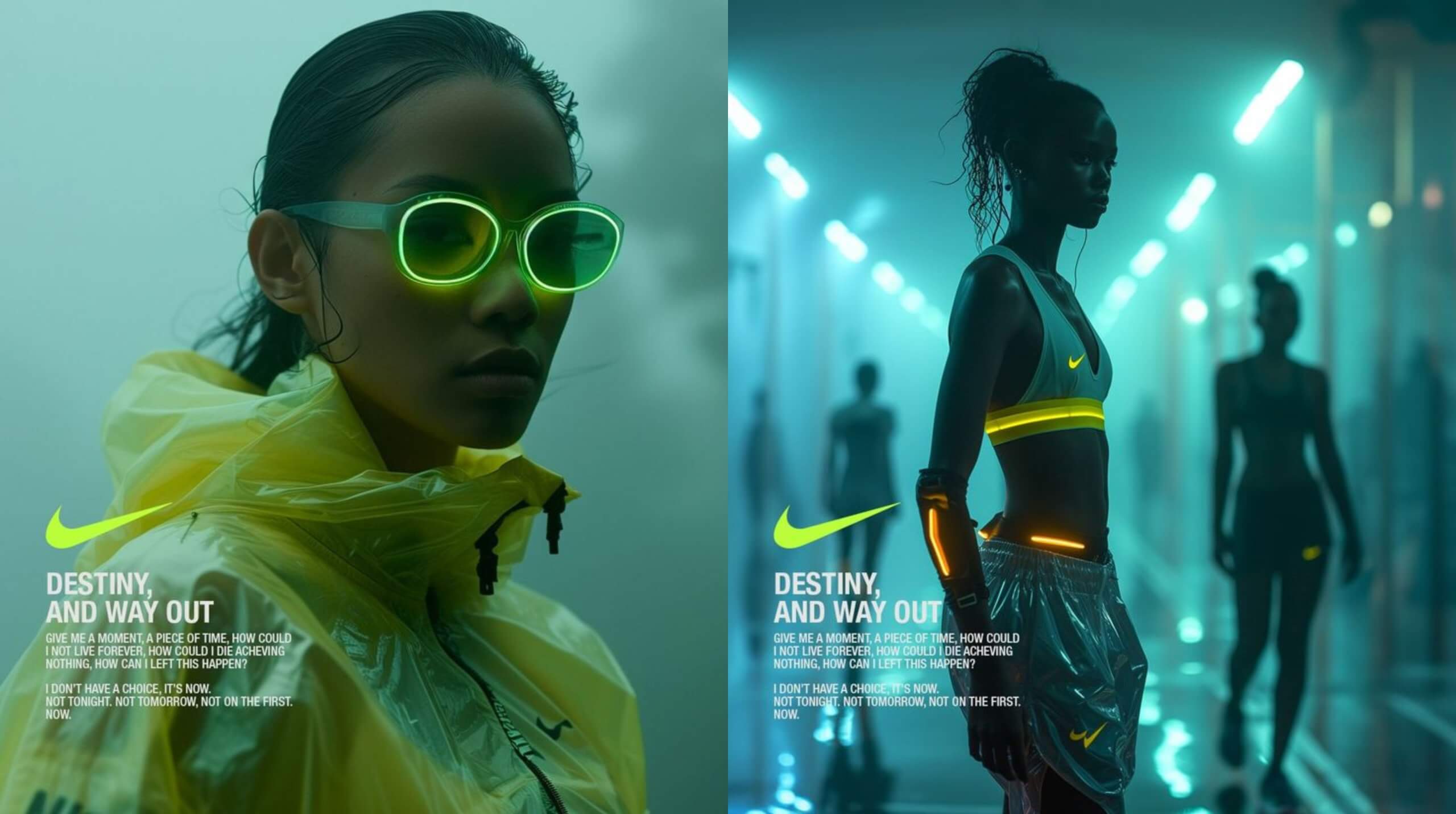
Nike’s AI-Generated Neon Campaign
Brands already crushing it with AI:
- Nike: Their AI-powered Neon campaign has futuristic vibes, glowing gradients, and designs that make you want to hit add to cart.
- Coca-Cola: With their “Create Real Magic” initiative, Coca-Cola let artists remix their assets using AI tools—and the results were chef’s kiss.
- Heinz: Even ketchup got a glow-up with AI-generated designs that stayed true to their iconic branding while still feeling fresh and unexpected.
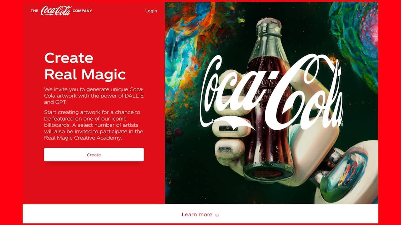
Coca Cola’s AI-Generated “Create Real Magic” Campaign
Where AI really shines:
AI-powered design is like that secret ingredient your competitors don’t have (yet). Here’s where it really levels up:
- Product Campaigns: From concept to final visuals, AI speeds up the process without sacrificing creativity.
- Social Media Content: Let’s be real, your audience is bored of the same old stuff. AI helps create scroll-stopping posts that stand out in any feed.
- Brand Exploration: Whether it’s testing new logos or packaging designs, AI opens up possibilities you didn’t even know existed.
Imagine using AI to not just keep up but lead the pack. That’s the kind of energy we bring to the table.
At Fifth Studio, we’re all about using AI as our creative sidekick. It’s not running the show (that’s our job), but it’s helping us deliver designs that are bold, innovative, and a little extra.
Whether we’re using AI to dream up fresh concepts, fine-tune the details, or just save time for what really matters, one thing’s for sure, your brand is getting the best of both worlds: human creativity and AI efficiency.
Trend 2: Retro-Futurism
where Past Meets Future in a Glow-Up for the Ages
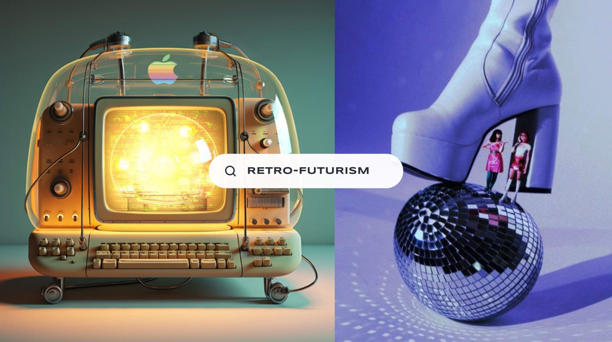
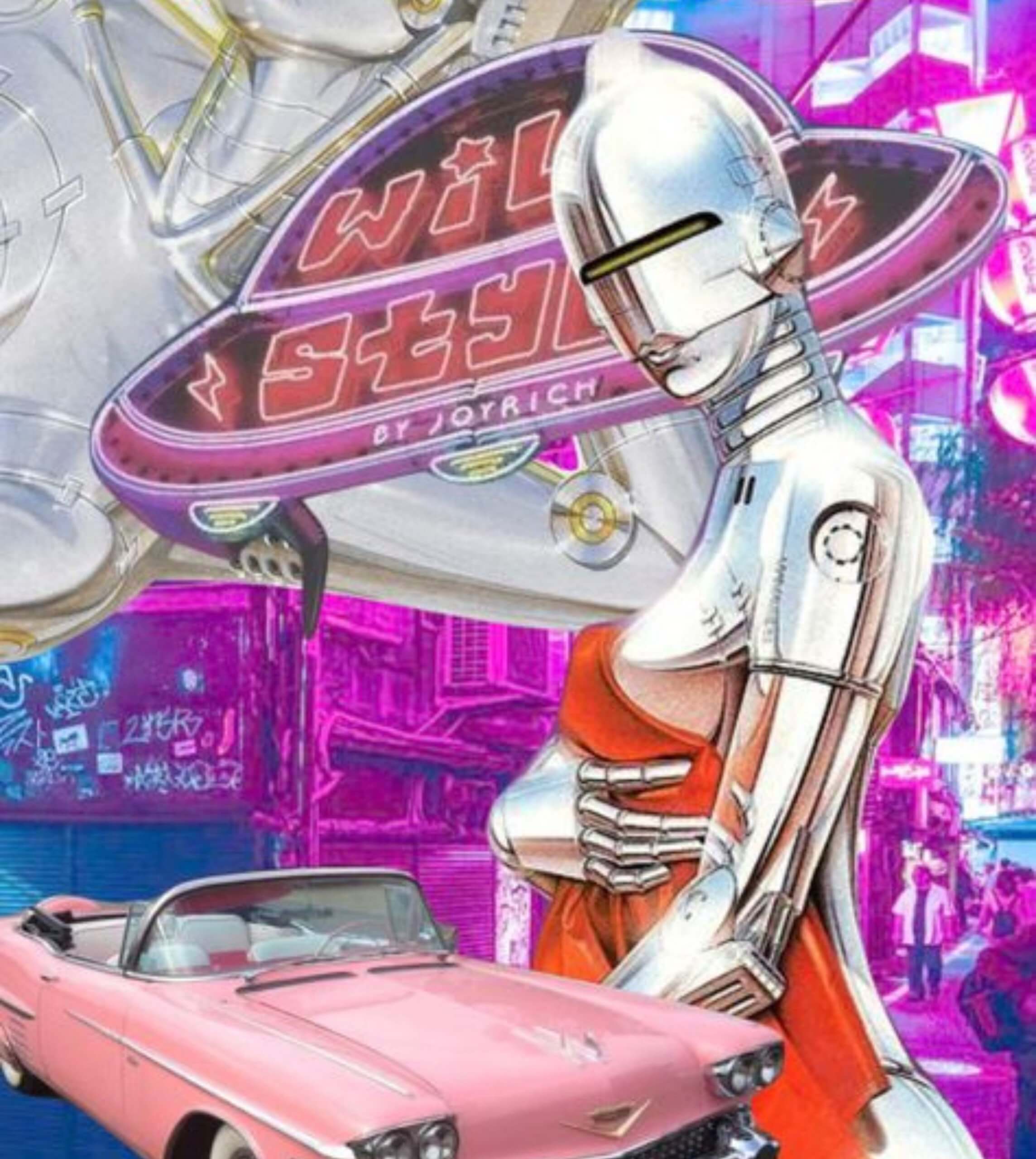
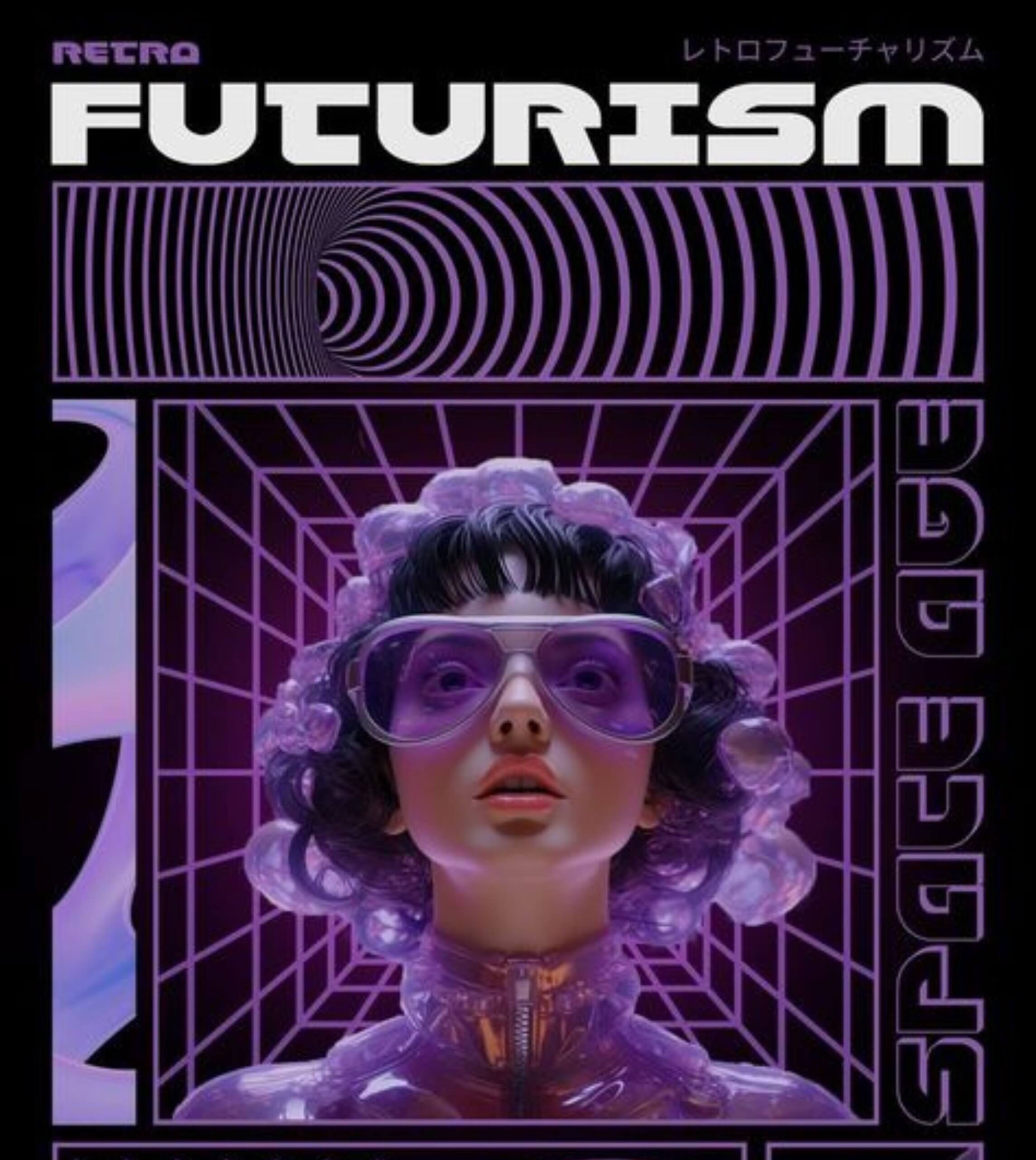
Retro-futurism is like the ultimate design mashup. A lil bit of nostalgia, a whole lot of futuristic flair, and just the right amount of WOW! 😮 It’s bold, vibrant, and full of electric energy, but with a sleek, modern twist that feels more 2080 than 1980. Think neon gradients, shiny chrome textures, and pixelated shapes reimagined in a minimalist, sci-fi dreamscape.
This trend isn’t just for sci-fi movie posters anymore, it’s taking over websites, packaging, and social media. And honestly? It’s about time.
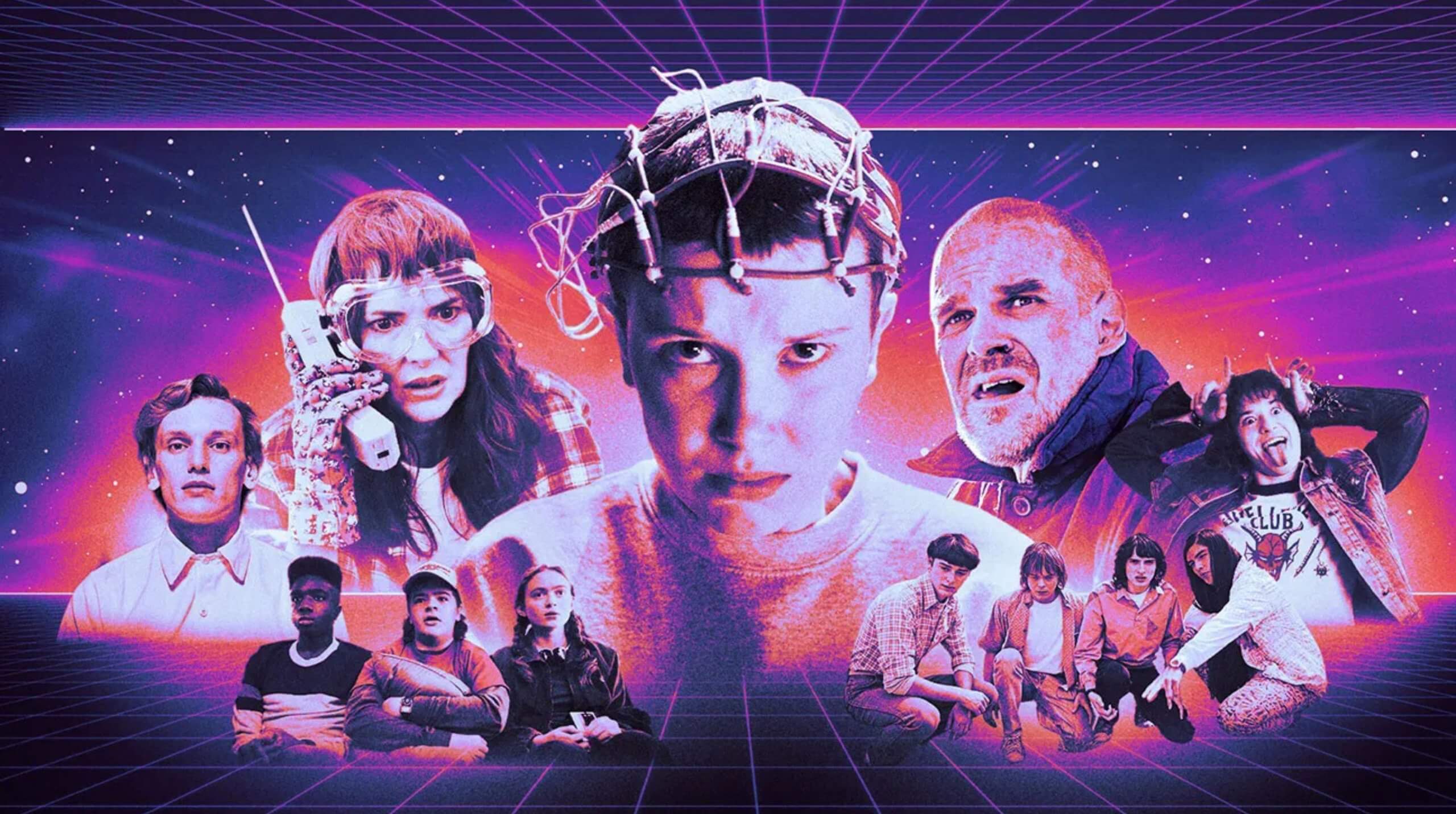
Stranger Things channels retro-futurism with neon grids and 80s-meets-future vibes
Why Retro-futurism works:
Retro-futurism hits different because it balances familiarity with innovation. For some, it’s a nostalgic nod to the 80s (we see you, neon lovers). For others, it’s a glimpse into a tech-inspired future that feels sleek, edgy, and totally aspirational. It’s that duality, old meets new, chaos meets calm that makes this trend so irresistible.
What makes retro-futurism pop:
- Textures: High-shine chrome and metallics paired with matte minimalist elements.
- Colours: Eye-popping neon gradients offset by soft, glowing transitions.
- Imagery: Futuristic shapes and designs with a subtle nod to retro nostalgia.
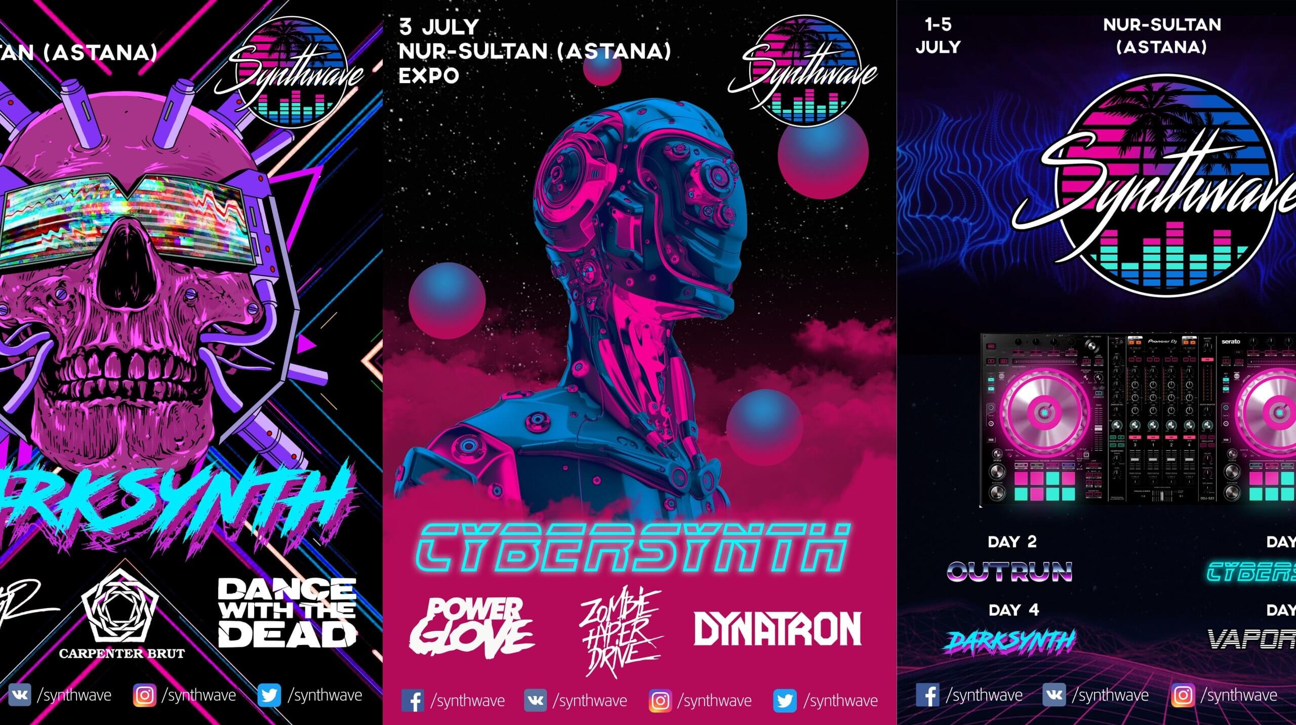
Synthwave branding brings retro-futurism to life with neon palettes, chrome textures, and bold, electric vibes
Brands already owning the retro-futurism look:
- Pepsi: Pepsi has embraced retro-futurism in their 80s-inspired campaigns, blending neon lights, bold gradients, and futuristic typography to give their branding a nostalgic yet cutting-edge vibe.
- Synthwave Festival Posters: The Synthwave music genre is practically a love letter to retro-futurism, with album art featuring neon grids, chrome textures, and futuristic cityscapes. It’s a perfect visual example of how the past and future collide in harmony.
- Stranger Things Merchandise: While grounded in 80s nostalgia, their collabs with tech brands bring just the right amount of futuristic edge, making them masters of this trend.
Where retro-futurism shines:
Retro-futurism is like a party for your brand’s visuals, and it’s perfect for:
- Website Headers: Eye-catching gradients and futuristic animations to pull your audience in.
- Packaging: Give your products holographic finishes or metallic pops that make them stand out on any shelf.
- Social Media Campaigns: Vibrant, sci-fi-inspired visuals that make people stop mid-scroll and think, “I need this in my life.”
Imagine your brand draped in glowing neon, futuristic lines, and just enough 80s throwback to make it timeless and trendy.
We know how to take retro-futurism to the next level without turning your brand into a sci-fi parody. We balance bold gradients, futuristic textures, and nostalgic vibes to create designs that feel fresh, modern, and that’s still totally you.
Whether it’s launching a new product or giving your website a glow-up, we’ll make sure your visuals scream innovation while still staying true to your brand’s personality.
Trend 3: Maximalist Typography
why be basic when you can be extra?
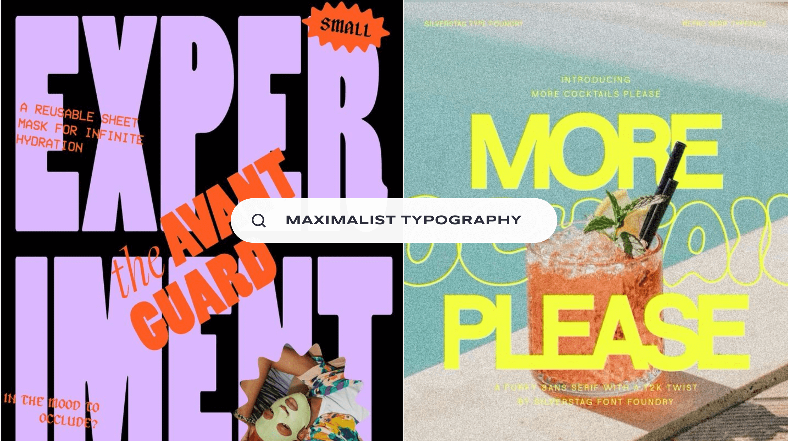
Subtle fonts? We don’t know her. In 2025, typography is going big, bold, and unapologetically extra. Maximalist typography is here to steal the spotlight with oversized letters, funky distortions, and type that doesn’t just sit quietly on your design…it owns the room.
Whether you’re crafting a campaign, designing a website, or creating social content, maximalist typography ensures your message can’t be missed. It’s not just text, it’s art.
Big bold letters in funky colors ensure your message can’t be missed
Why maximalist typography works:
Maximalist typography is loud in all the right ways. It grabs attention faster than you can scroll past it, and when done right, it creates a vibe that’s impossible to ignore. This trend works because:
- It’s Memorable: Big, bold fonts leave an impression that sticks with your audience.
- It Creates Drama: The oversized and distorted forms demand attention and evoke curiosity.
- It’s Versatile: Maximalist typography can scream luxury, playfulness, or power—whatever matches your brand’s vibe.
And let’s not forget, it’s just straight out fun! Why settle for boring text when your typography can be the life of the party?
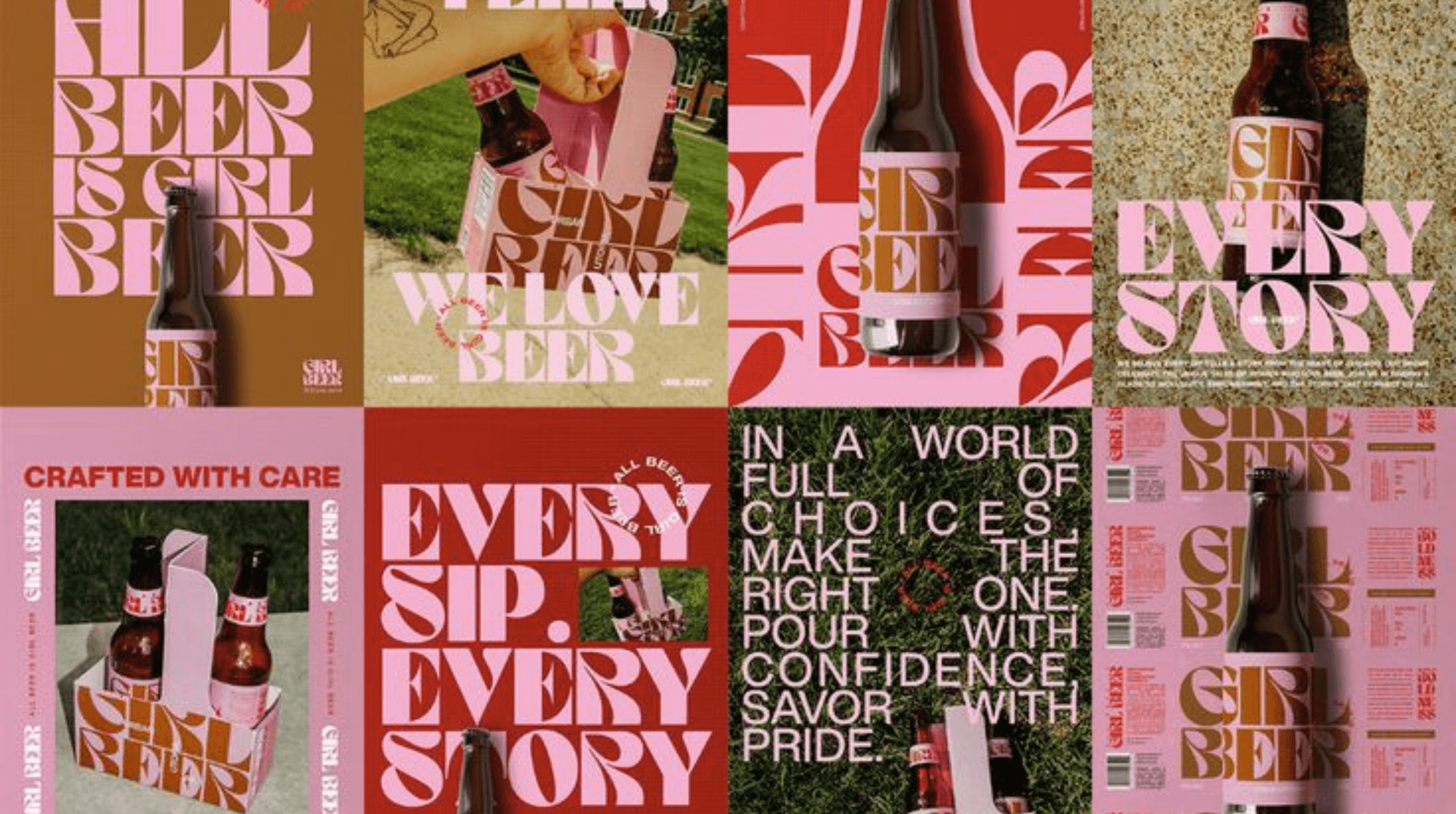
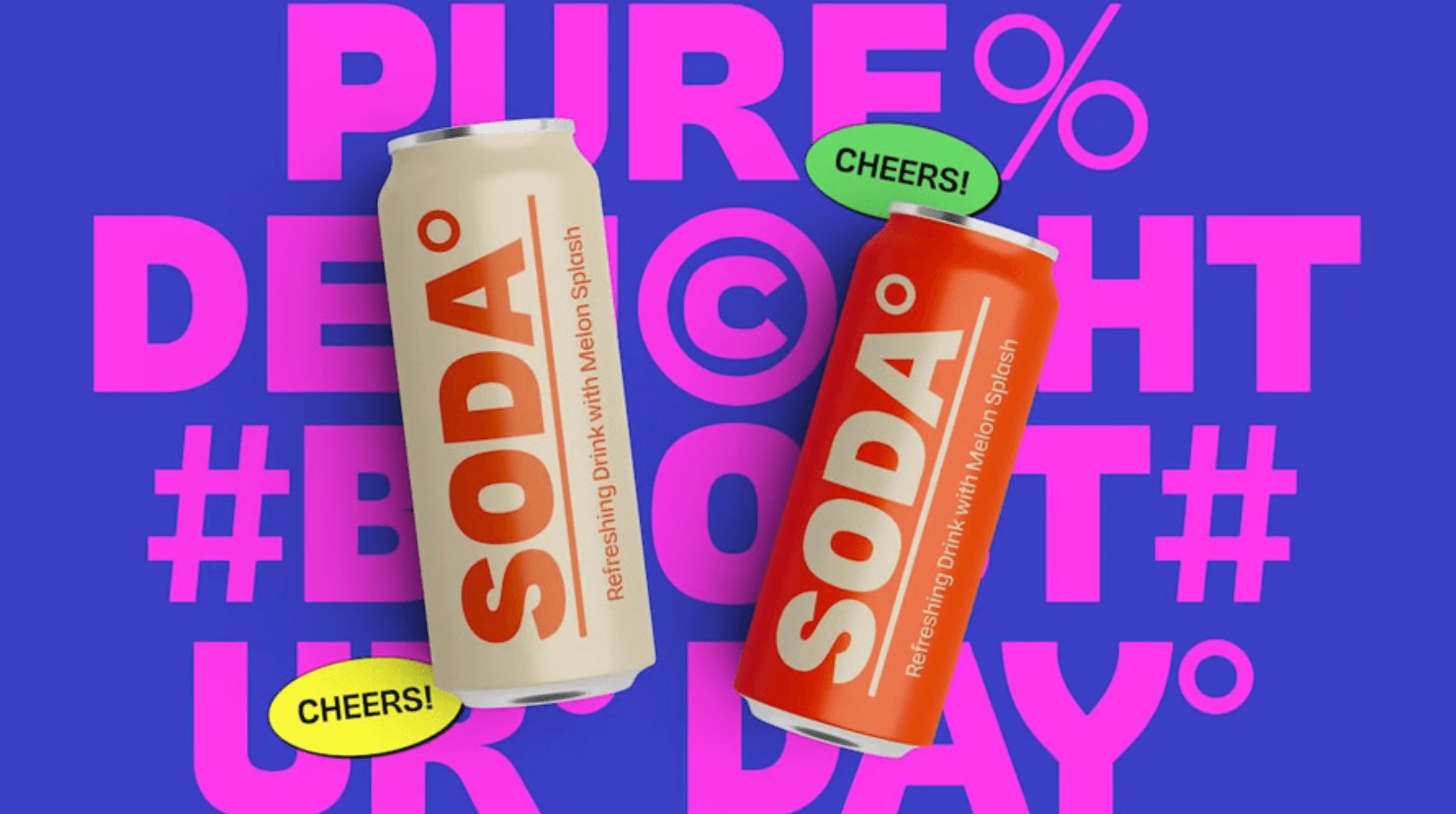
Maximalist typography creates eye-catching visuals for brand campaigns
Brands already owning the maximalist typography look:
- Spotify: Their campaigns are known for bold, oversized fonts paired with vibrant color blocks, making every message pop.
- Adidas: Their streetwear collections embrace bold, blocky fonts that speak directly to their edgy, urban audience.
- Gucci: From their ads to their store designs, Gucci’s dramatic use of maximalist type screams high fashion and confidence.
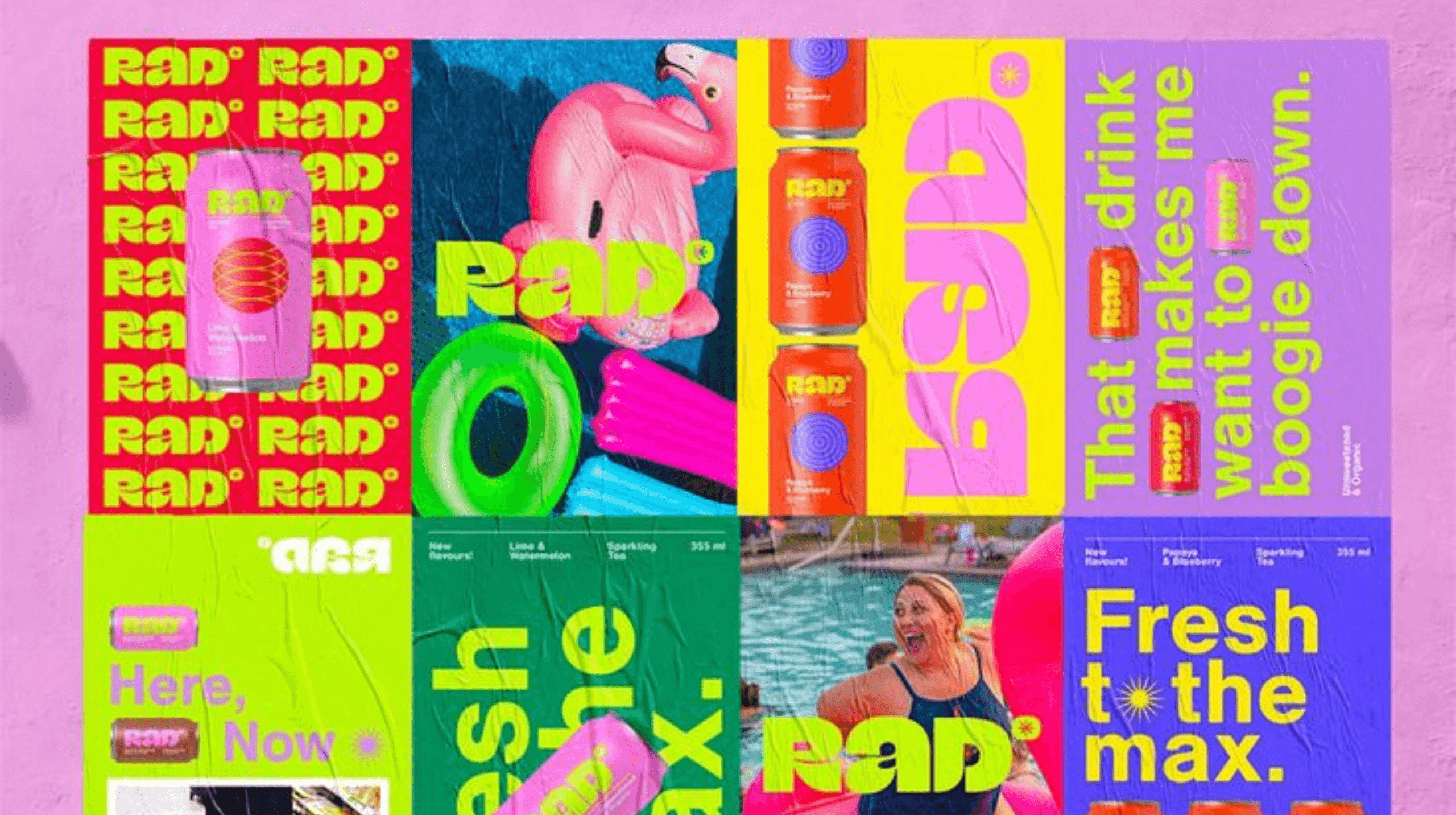
Where maximalist typography shines:
Maximalist typography isn’t for the faint of heart, but when used strategically, it’s pure gold. Here’s where it shines brightest:
- Billboards and Posters: When your type is larger-than-life, it stops traffic—literally.
- Social Media Graphics: Big, bold fonts cut through the noise and make your message impossible to miss.
- Packaging Design: Add drama to your product’s look with typography that’s just as bold as the product inside.
Our team specialises in balancing bold typography with clean layouts to ensure your designs are eye-catching and easy to read. Whether you’re launching a campaign, revamping your packaging, or creating content for social, we’ll help your brand stand out with typography that’s as unique as your story.
Trend 4: Textured Grains
A little bit of spice never hurt nobody
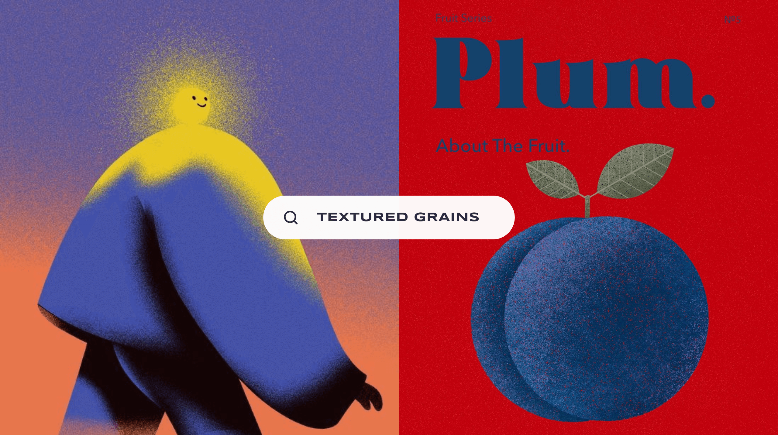
A graphic design staple is making a huge comeback in 2025. If your graphics are looking a little… meh, then add a bit of spice to your visuals with textured grains.
We love textured grains because we can easily add visual interest and depth without distracting away from the main focus of the image. This year, we’re embracing subtle elements that make our graphics pop and look more dynamic. Because who has time for boring?
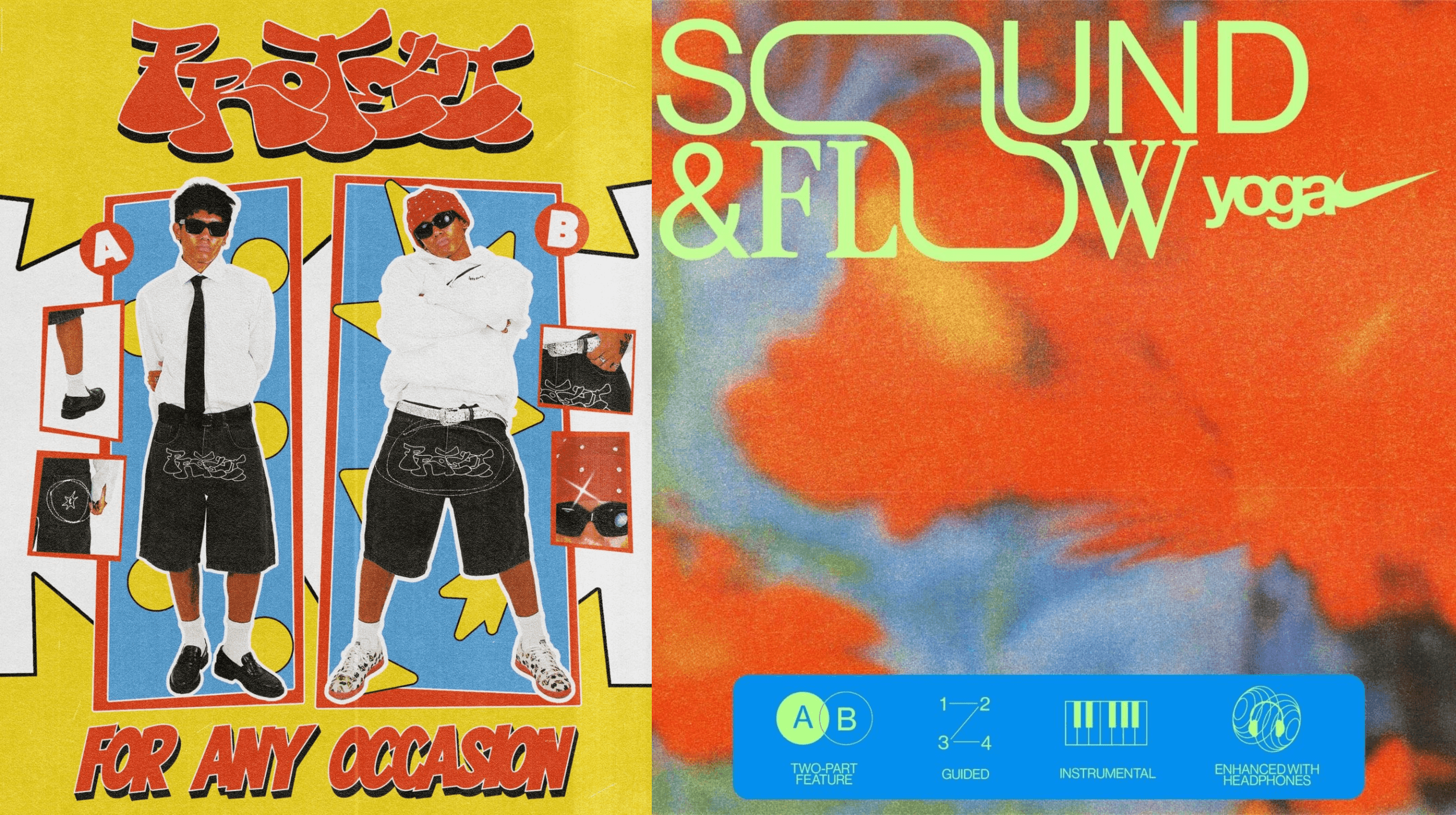
Textured grains up the nostalgia factor and give designs movement and flow.
Why maximalist typography works:
Although a simple design element, textured grains create dynamic graphics, adding tactility, nostalgia, and movement to your design.
- Tactility: Digital graphics can sometimes feel a bit flat, especially in print and web design, but textured grains add depth and make graphics feel more tactile.
- Nostalgia: Textured grains are reminiscent of earlier forms of media, like film photography and photocopied zines, giving a sense of nostalgia to designs.
- Focus: Textured grains add a sense of movement in the design and can guide the eyes towards elements you want the audience to focus on.
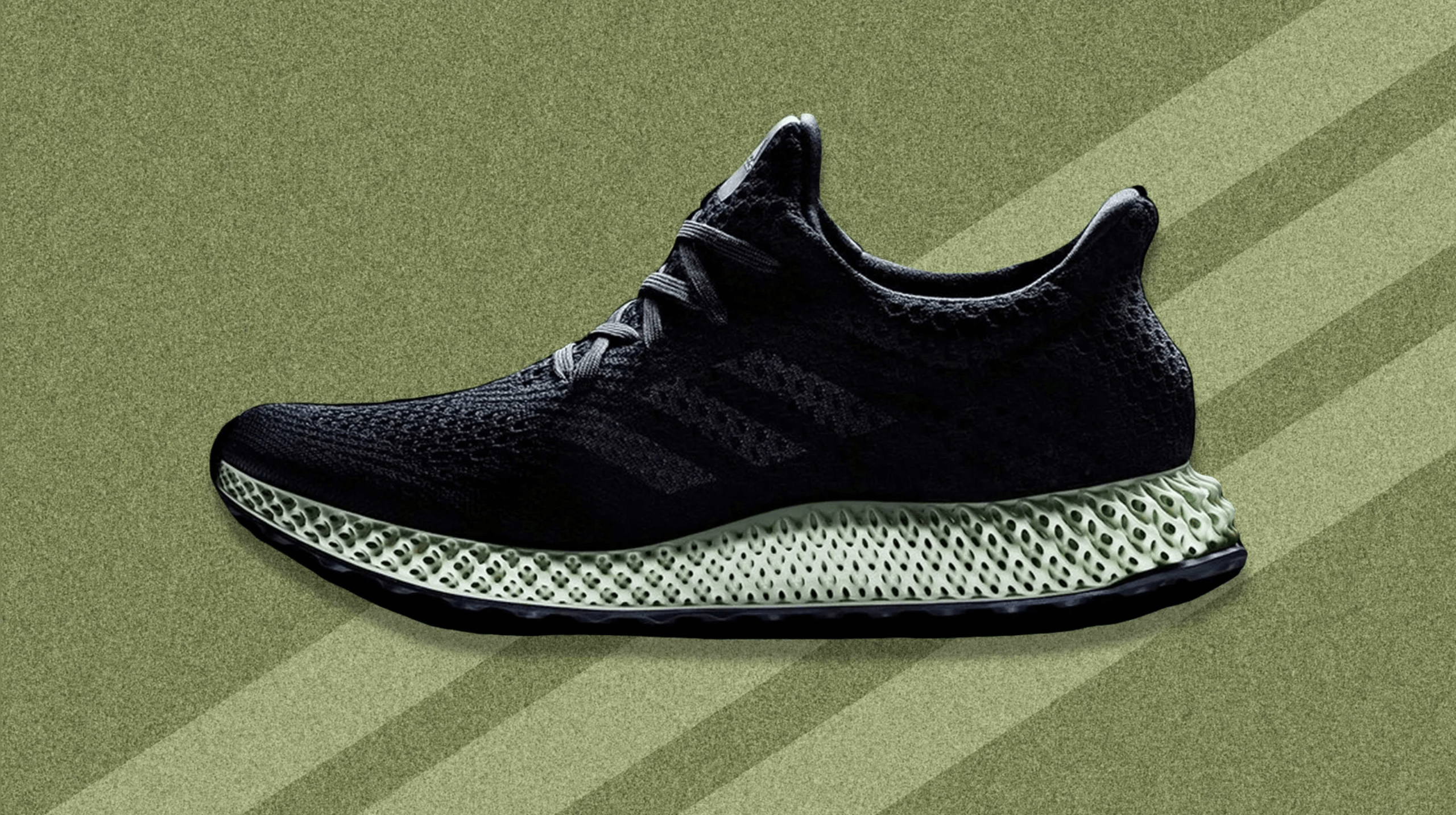
Who’s the star of the show? Textured grains allow products to shine in marketing materials.
Brands already owning the textured grains look:
- Adidas: The brand’s Futurecraft campaign used textured grains in the background to make the shoe the focal point of the image.
- Spotify: Always into fun and cool graphics, the brand uses textured grains to make their social posts more aesthetic.
- Levi’s: The brand used textured grains in the campaign for their vintage collection to embrace nostalgia.
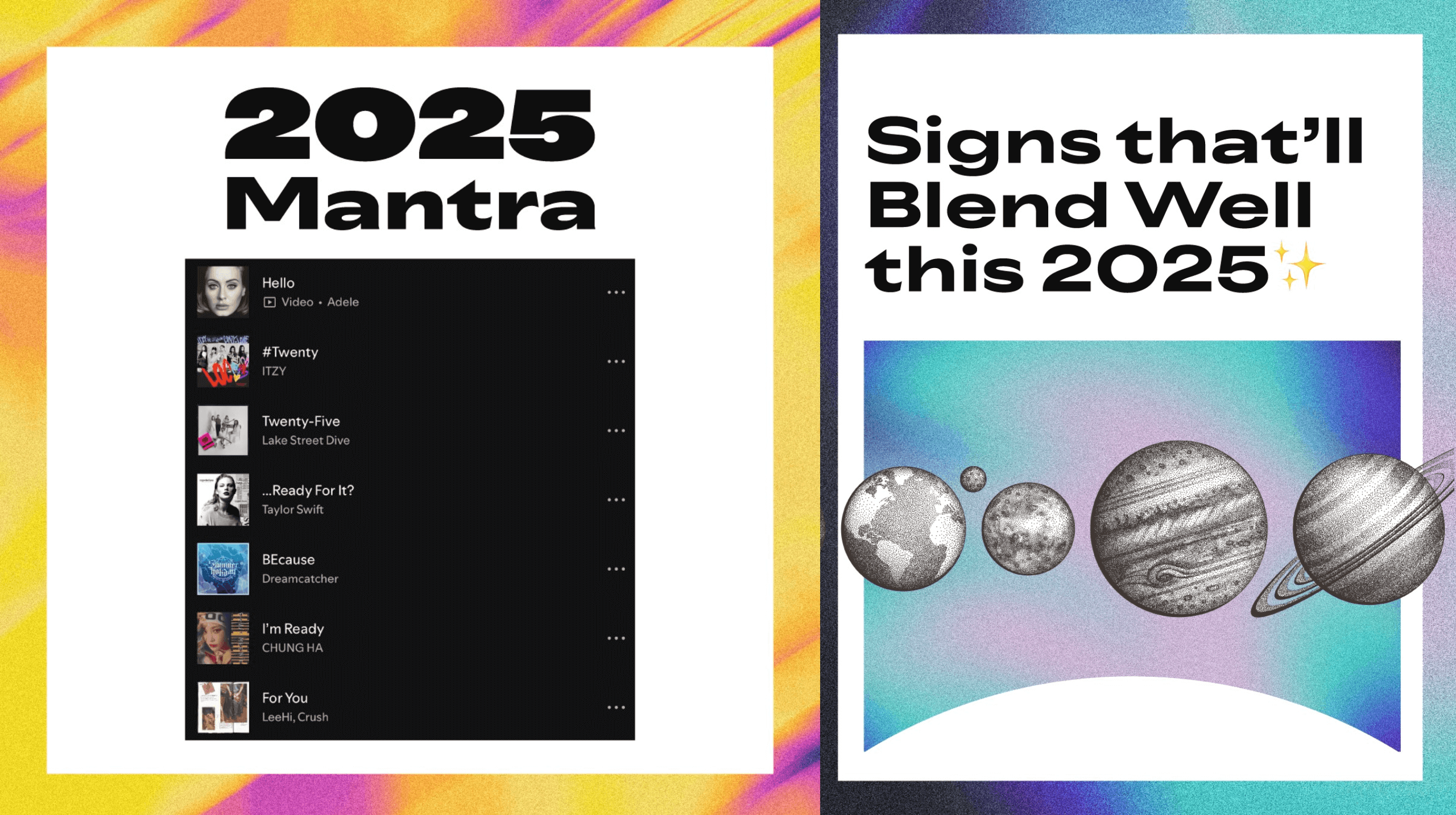
Spotify embraces dynamic graphics with textured grains
Where textured grains really shine:
Textured grains are simple enough to mix-and-match with different designs. But to really make the most out of it, why don’t you try it with:
- Text-heavy graphics: Let the audience focus on the message without losing visual interest.
- Product images: Make the product the focal point of the image.
- Illustrations: Say goodbye to flat drawings and hello to dynamic illustrations.
Our team loves using textured grains when we want our designs to have more jush. (You know? Just a little bit more oomph! A little bit more ahh!) This simple design element is like pepper adding just the right amount of kick to your favorite dish, so you can enjoy all the other flavors with every bite.
Whether you want your visuals to be more product-focused or to simply look more dynamic (or both?), we can help you achieve your vision by putting together the right design elements to catch your target audience’s attention.
Trend 5: Bold Minimalism
Bring the “very demure, very mindful” vibe into 2025
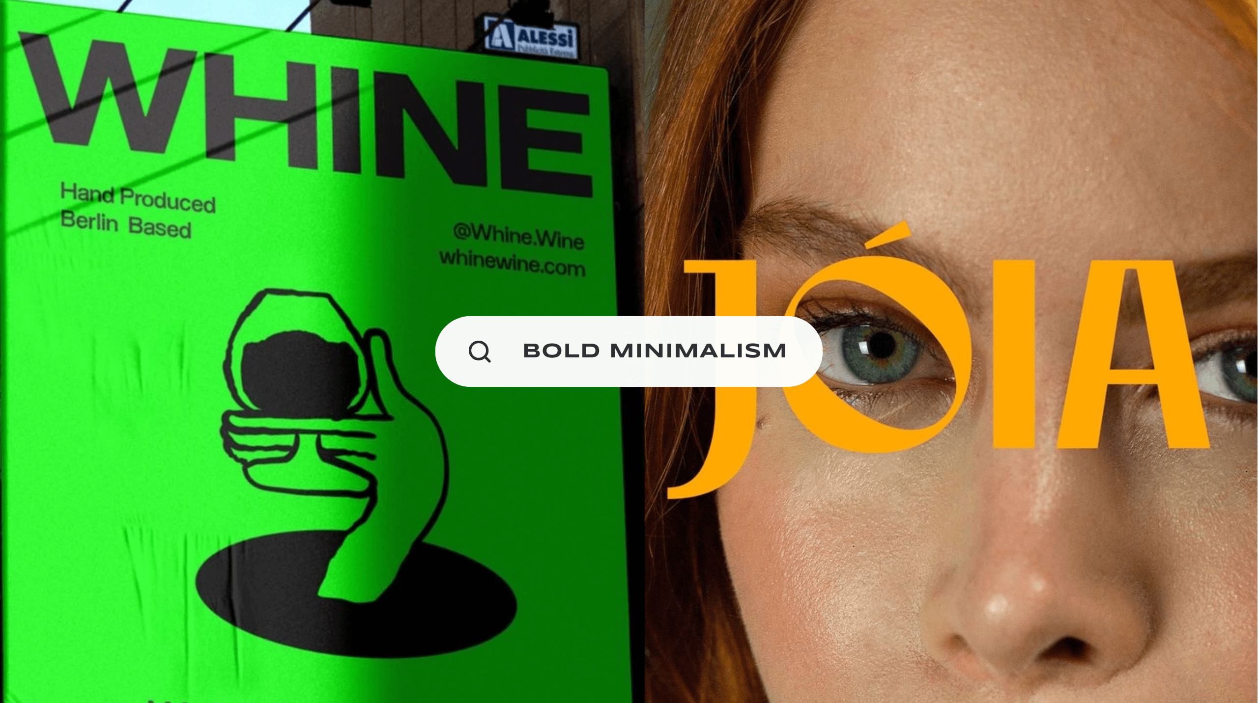
Don’t mistake simplicity for boring. Bold minimalism is here to make a loud statement without overcomplicated design elements, allowing your brand identity to stand out.
We’ve seen this design trend rising in popularity over the last few years, but we think 2025 is when it will truly shine, especially with influential celebrities like Kim Kardashian and Hailey Bieber embracing bold minimalism in their ad campaigns and product packaging designs.
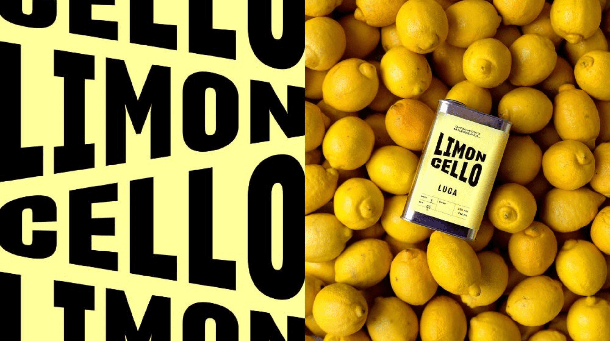
Bold minimalist formula: simple typography over bright-coloured background
Why bold minimalism works:
In a market oversaturated with big and small brands, standing out from the crowd can be a real challenge. But bold minimalism, although mistaken for plain and boring, can actually make your message more memorable, leaving an instant impact with its flexibility and clear delivery. Here’s why it works:
- Instant Impact: Strong yet simple visuals grab attention quickly, allowing your message to instantly make an impact.
- Flexible: From modern to classic, hip and young to quiet luxury, bold minimalism’s flexibility can bring any design vision to life.
- Clarity: Send a clear message with simple design elements that allow you to speak directly to your target audience.
Minimalist designs can seem too simple for some, but if you combine it with bold design elements (like bright colours, interesting typography, and unique packaging), you can really make an impact with your visuals.
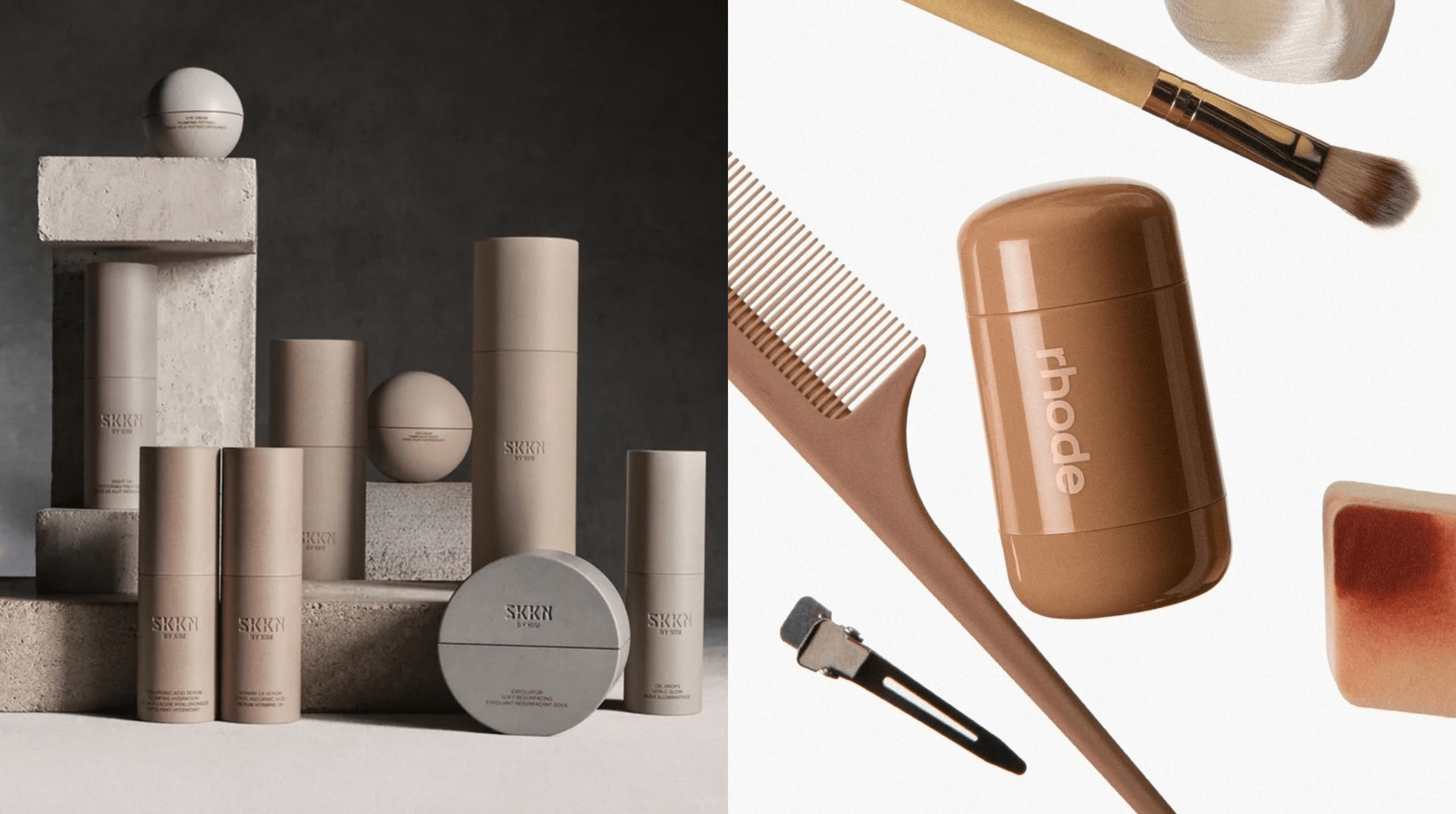
Kim Kardashian and Hailey Bieber prove that bold minimalism looks great with neutral colours, too
Brands already owning the bold minimalist look:
-
SKKN:
Kim Kardashian’s personal aesthetic is reflected on the bold minimalist packaging of her skincare brand SKKN.
- Rhode: Hailey Bieber’s Rhode takes a more youthful approach to the bold minimalist design trend with its unique packaging.
- Apple: This brand has long been a fan of bold minimalism from its product packaging to its ad campaigns, allowing their products to take center stage with simple yet impactful designs.
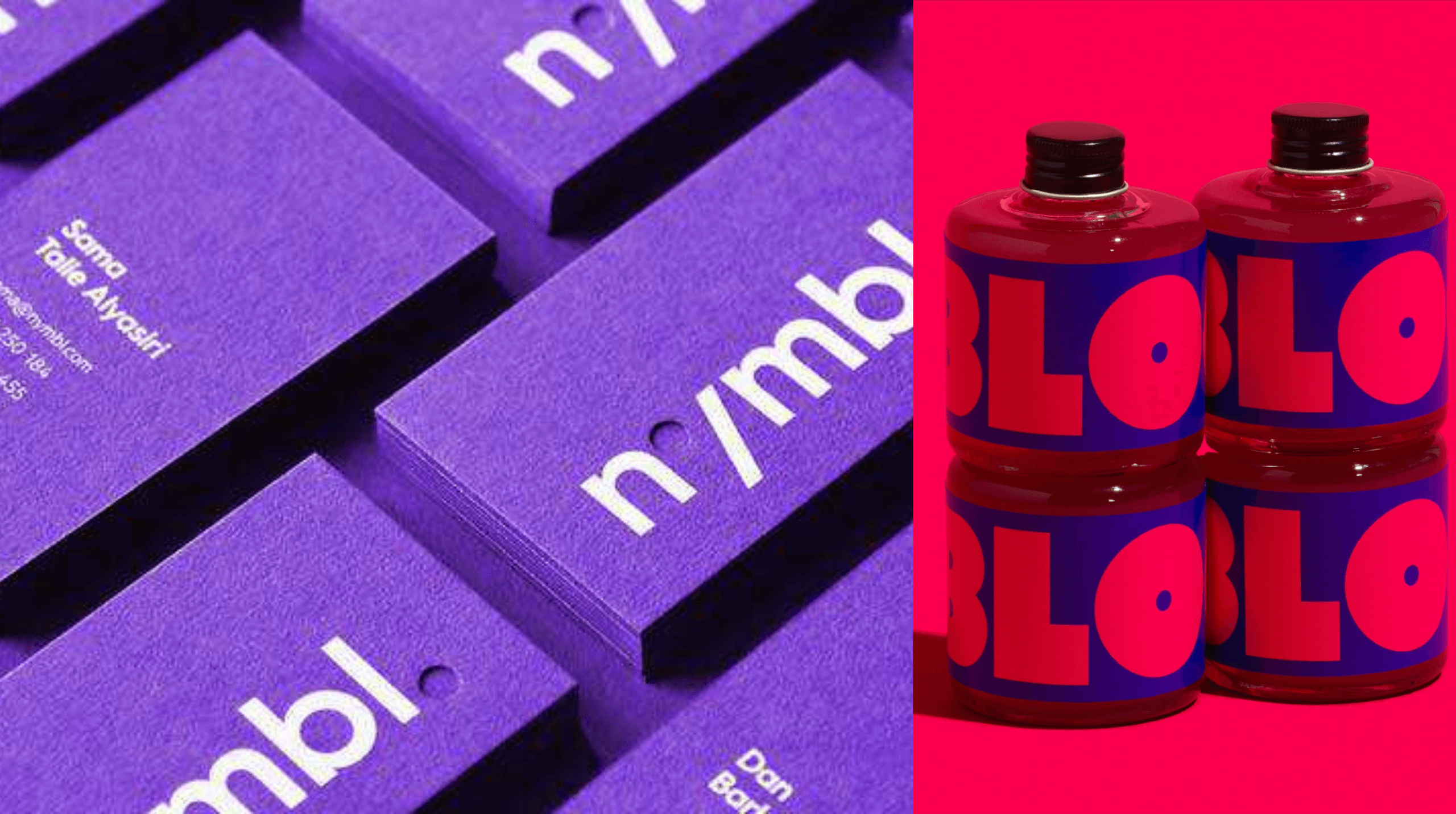
Create memorable business cards and product packaging with bold minimalism
Where bold minimalism shines:
Bold minimalism may be very demure, but she knows how to make an impact. But if you really want to take full advantage of this design trend, here’s where it really shines:
- Product Packaging: Bold minimalism makes your products memorable with sleek designs and clutter-free designs.
- Billboards: Billboards are all about making an impact, and bold minimalist design elements can capture attention in an instant.
- Business Cards: Bold minimalism delivers your message without distractions, making it the perfect design trend for simple yet striking business cards.
We love using this design trend for clients who want their brands to be memorable but straight to the point. Like yin and yang, bold minimalism is the perfect balance of impactful and simple.
And that’s what our team loves to do. We help our clients turn their vision into reality with perfectly balanced design elements that resonate with their brand identity.
Trend 6: Digital Scrapbooking
Unapologetically imperfect adds a human touch
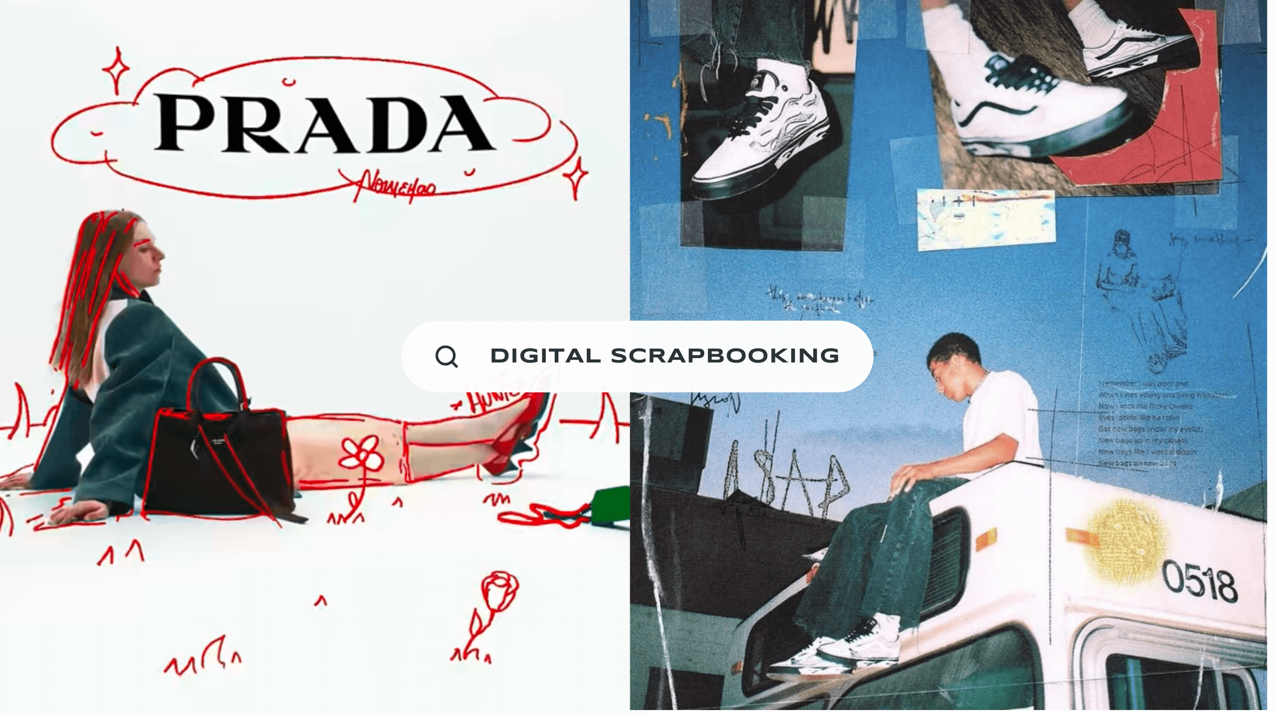
We’re saying goodbye to polished perfection in 2025. Brands are ditching the sterile, digital look and opting for something more fun, raw, and unfiltered.
Digital scrapbooking brings a sense of authenticity to any design. Cut-and-paste collages, hand-scrawled typography, and gritty textures create graphics that are undeniably human, resulting in a more personalized aesthetic and attracting audiences searching for real connections with brands online.
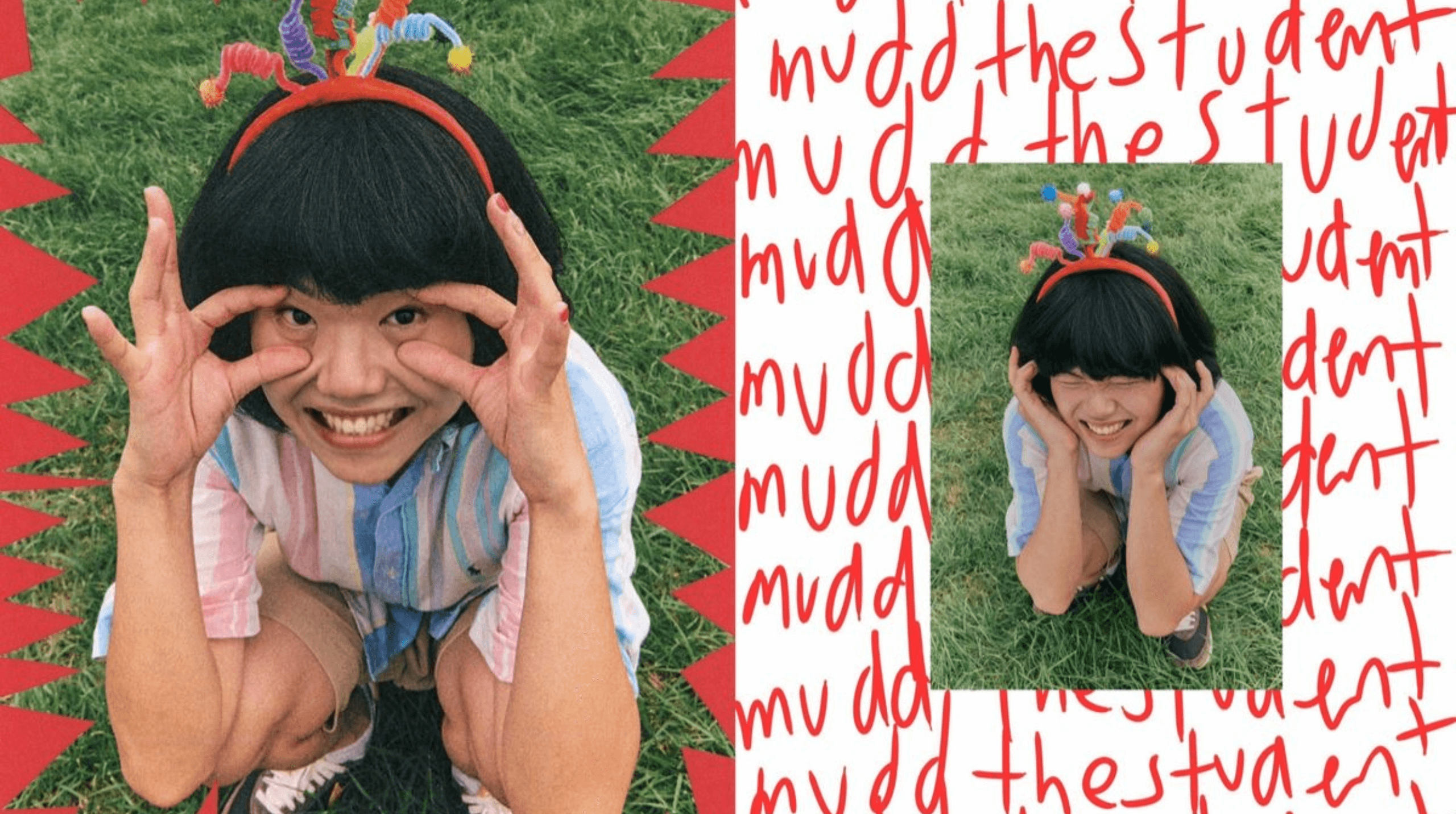
Hand-scrawled typography and cut-and-paste collages make designs unique
Why digital scrapbooking works:
Messy, raw, and perfectly imperfect, that’s what digital scrapbooking is all about. Here’s why it works:
- Nostalgic: Digital scrapbooking is another 2025 graphic design trend that brings the nostalgia factor into a design, tapping into the audience’s emotions and creating a sense of personal connection.
- Authentic: Adding to the personal touch, digital scrapbooking makes designs look more authentic and human.
- Unique: Digital scrapbooking thrives on creative experimentation, combining fonts, patterns and other visual elements to create a unique look.
Digital scrapbooking is not only fun to look at, but it also creates designs that look hyper-personal to a broad audience, thanks to its nostalgic, authentic, and unique elements.
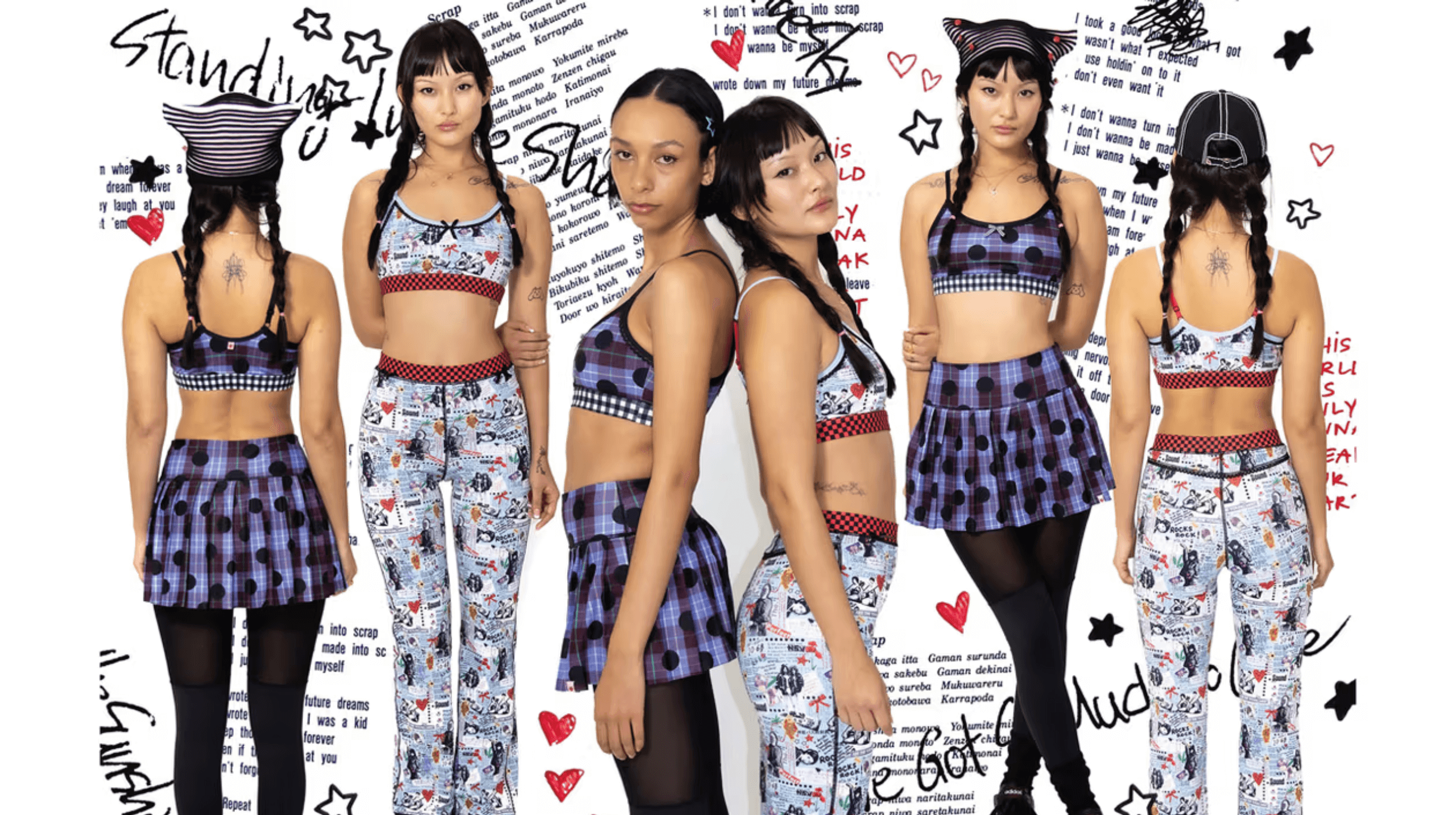
Strawberry Western embodies the digital scrapbooking look
Brands already owning the digital scrapbooking look:
- Glossier: This brand is not new to mixing fonts, polaroid-style images, and handwritten annotations on their social posts and brand campaigns.
- Urban Outfitters: This brand likes nostalgic cut-and paste aesthetics not only in their campaigns but also their website.
- Strawberry Western: This brand loves using zine-like cutouts, paper-like textures, and hand-scrawled typography in their campaigns.
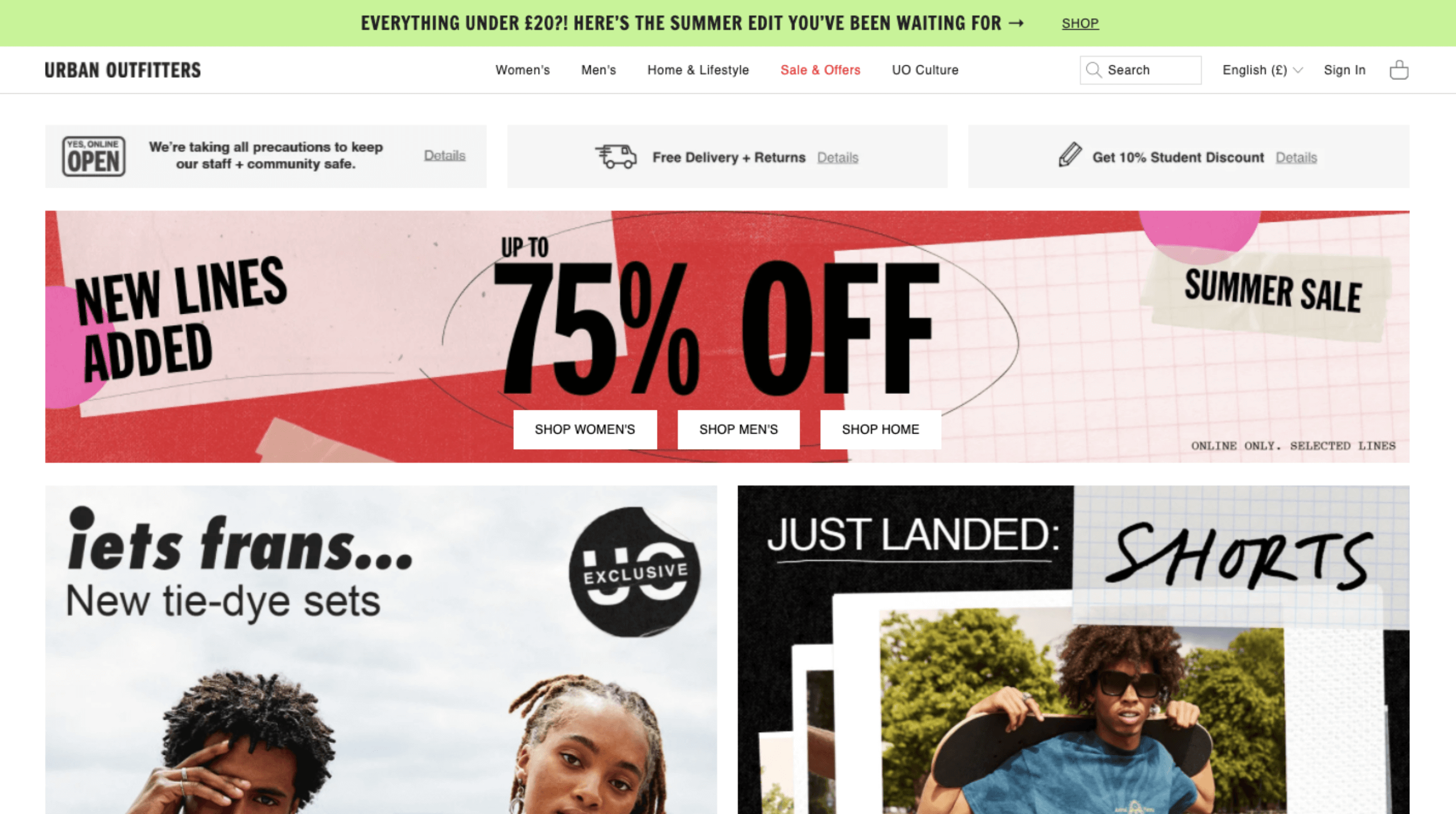
Urban Outfitters show the broad application of digital scrapbooking
Where digital scrapbooking shines:
Brands who want to feel more personal, nostalgic, and artistic should embrace digital scrapbooking. For us, we love using this trend when we want to not only grab attention but also to capture it. Here’s where this aesthetic shines the most:
-
Social Media: Social media users are always looking for authenticity in the brands they follow because they want their online connections to feel real, which is why digital scrapbooking works well in social media posts.
-
Brand Storytelling: Taking advantage of the nostalgia factor of digital scrapbooking, brands can effectively tell their mission, vision, and origin without looking sterile and corporate.
-
Event Promotions: Brands can make their event promotions feel more personal and inviting with digital scrapbooking.
We love digital scrapbooking because it balances nostalgic and modern creativity, turning promotional campaigns and social media posts into a more personal experience not just for the brand but also their audience.
We help clients who want to create a more authentic connection with their audience by suggesting design trends (like digital scrapbooking) that allow them to stay true to their brand identity. With our expertise, we’re able to match brands with design trends that resonate with who they are and speak to their target audience.
Trend 7: Vibrant Colour Combinations
Neutral? We don’t know her!
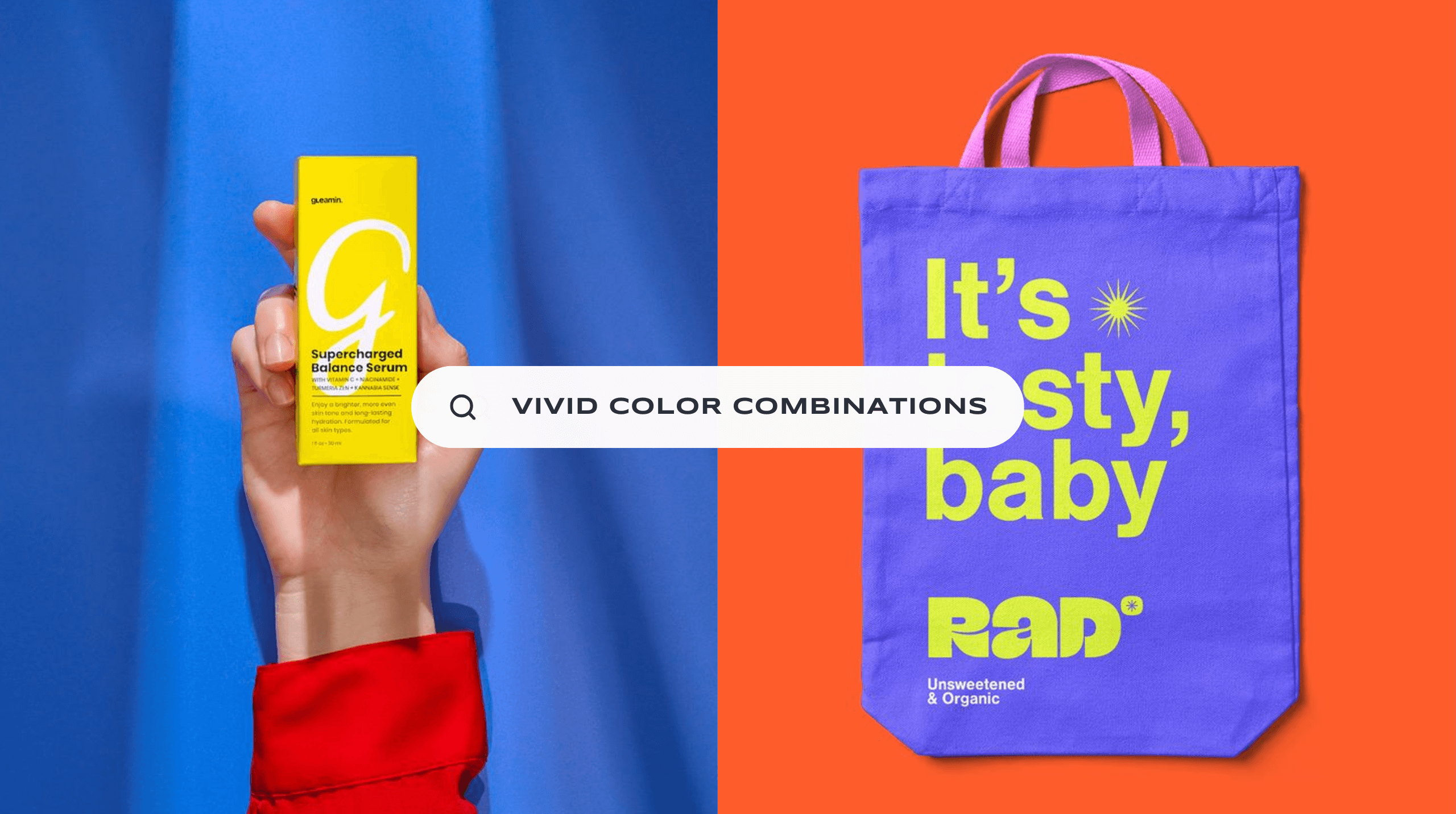
The year is 2025. The Pantone Colour of the Year is Mocha Mousse, a muted brown colour that sparked some debate online for being too plain. Some people even called it “sad beige.” While we personally love Mocha Mousse for its quiet but luxurious feel, we think that soft, muted palettes are taking a back seat this year as bold, fearless colour combinations take over.
Think electric blues against fiery oranges, neon pinks clashing with deep purples, and ultra-saturated gradients that pulse with energy. This trend isn’t just about being bright—it’s about using colour to evoke emotion, capture attention, and make brands feel alive.
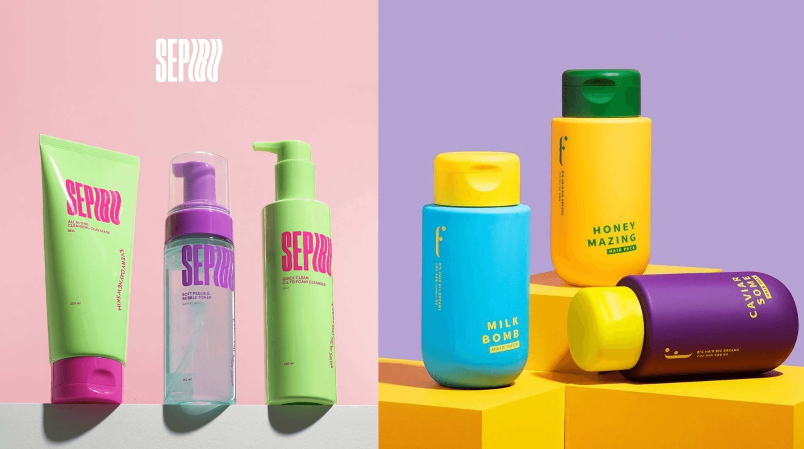
High-contrast colour combinations make product packaging stand out on the shelves
Why vibrant colour combinations work:
Colour is one of the most powerful tools in design. It’s one of the first things people notice before they even read the text on a graphic or fully grasp the picture they are seeing. Here’s why vibrant colour combinations work:
- Instant Impact: Vivid hues stand out in a sea of safe, neutral branding.
- Strong Emotional Impact: Colours can feel playful, rebellious, energetic, or luxurious, setting the mood instantly.
- Defies Expectations: Daring colour choices help brands feel fresh, youthful, and full of personality.
We love using vibrant colour combinations because the right one can instantly capture the attention of our clients’ target audience, allowing their brand to shine above their competitors.
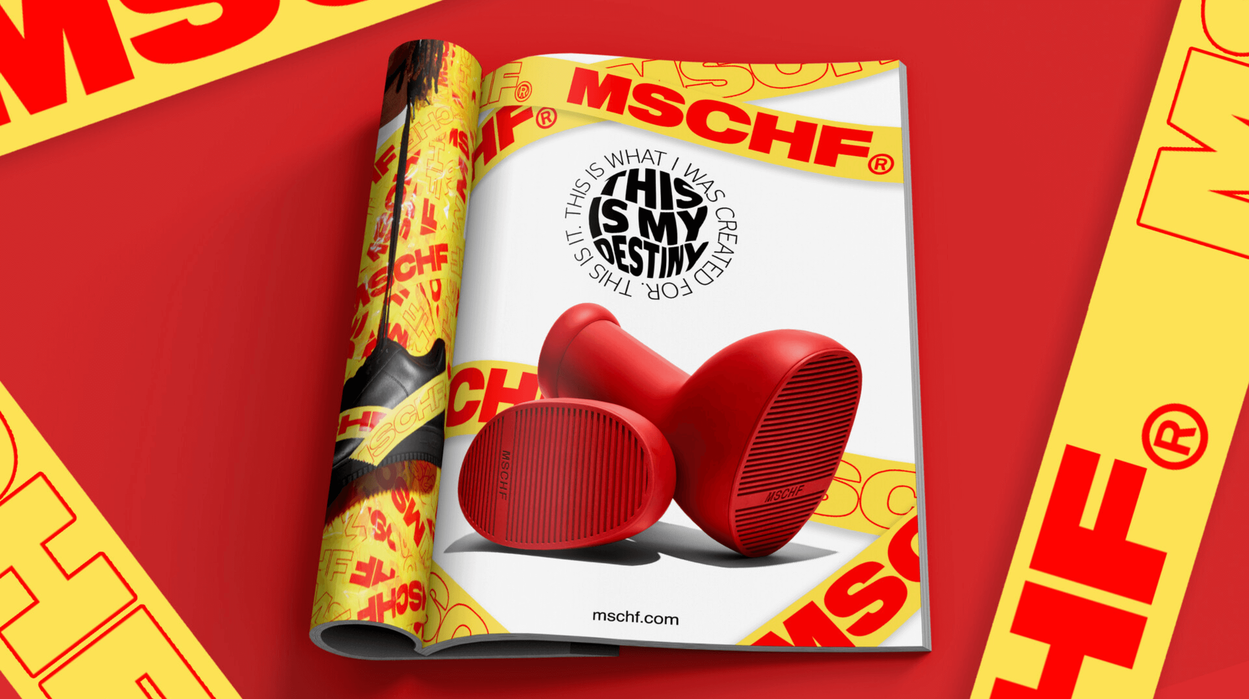
MSCHF is known for its bold product designs and even bolder colour choices
Brands already owning the vibrant colour combinations look:
-
MSCHF:
This brand is known for its unique products. Coupled with bold colours in their campaigns, they’re sure to make a splash.
- Glossier: This brand is known for being cutesy and demure, but they also love to make a statement with vibrant colour combinations in some of their ad campaigns.
- Spotify: What can we say? Spotify loves jumping on graphic design trends to cater to their mostly young demographic, and vibrant colours are a sure way to reach their target audience.
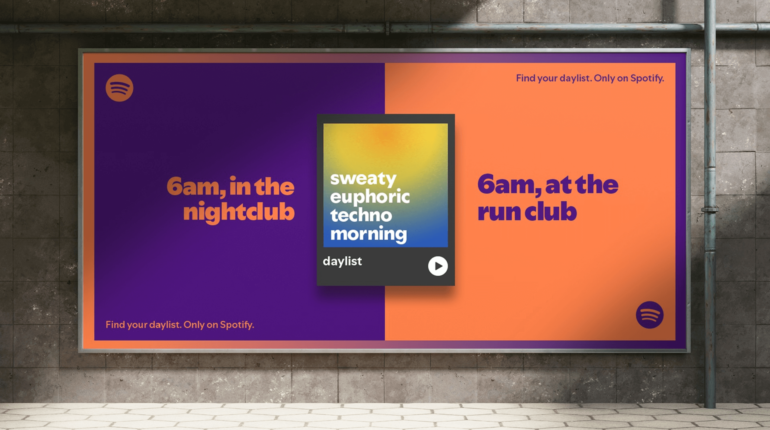
Spotify combines graphic design trends to capture the attention of their target audience
Where vibrant colour combinations shine:
Vibrant colour combinations thrive in high-visibility, high-energy design spaces where the goal is to introduce yourself in a bold and fearless way. Here’s where this trend shines:
- Social Media Posts: Bright, striking colour palettes stop the scroll and demand attention.
- Advertising & Packaging: Vivid hues make products pop on shelves and digital screens.
- Web & UI Design: Strong colours create playful, immersive digital experiences that engage users.
Vibrant colour is more than a trend—it’s a visual language that makes brands unforgettable. We love using unexpected colour pairings, neon accents, and high-contrast palettes to create designs that energise, inspire, and demand attention. Whether it’s packaging, campaigns, or digital branding, bold colours make sure our clients never fade into the background.
Trend 8: Brand Characters
not made for kids but for brand impact
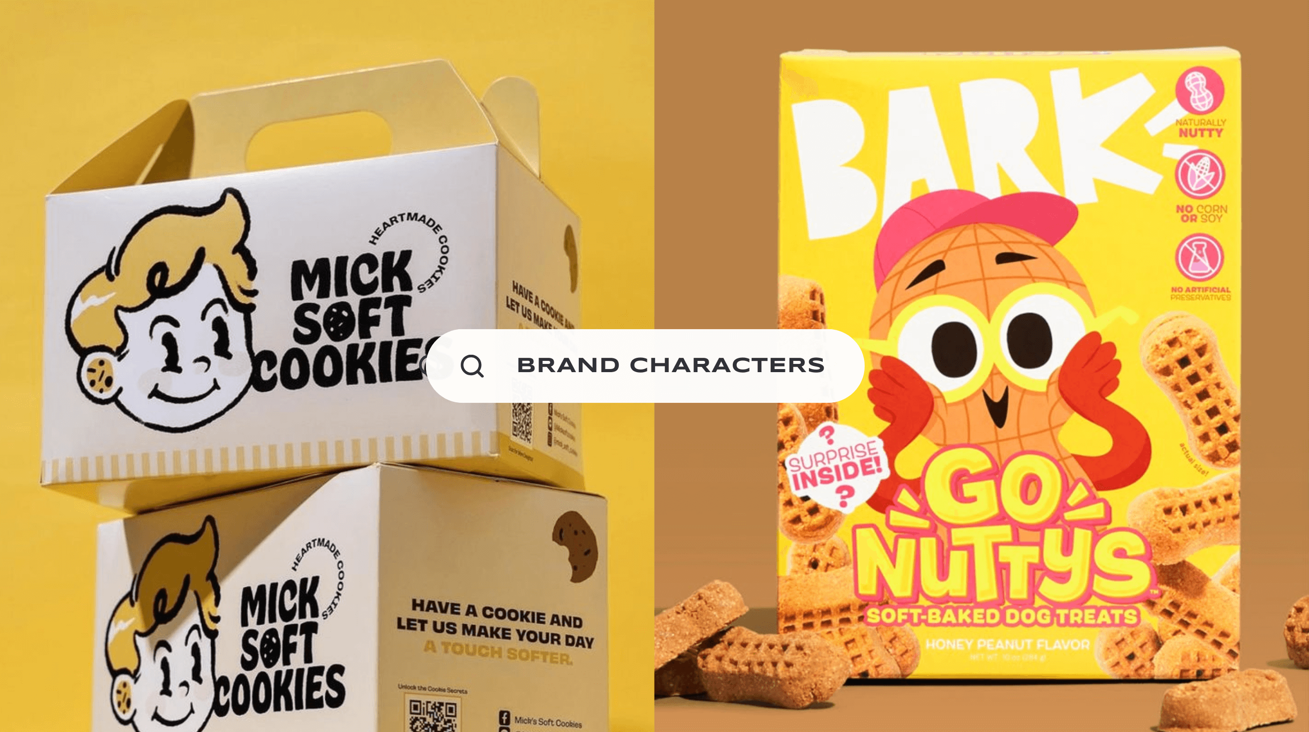
In 2025, brands are embracing characters as storytellers, icons, and instant mood-setters. They bring a sense of fun, familiarity, and emotional connection that. In a world where consumers crave authenticity and personality, these characters turn brands into something more than just a logo—they become alive.
Product packaging come alive with brand characters taking center stage
Why brand characters work:
A well-crafted brand character does more than entertain—it builds loyalty and recognition. Here’s why they shine:
- Brand Identity & Recall: A memorable character can stand in for a logo and be just as iconic.
- Brand Storytelling: Characters make brands feel human, relatable, and emotionally engaging.
- Social Media: Playful, expressive mascots are highly shareable and perfect for social media and campaigns.
Here at Fifth, we provide custom illustrations as part of our services, and we would love to bring your brand to life with a custom character that embodies your brand identity and tells an engaging story.
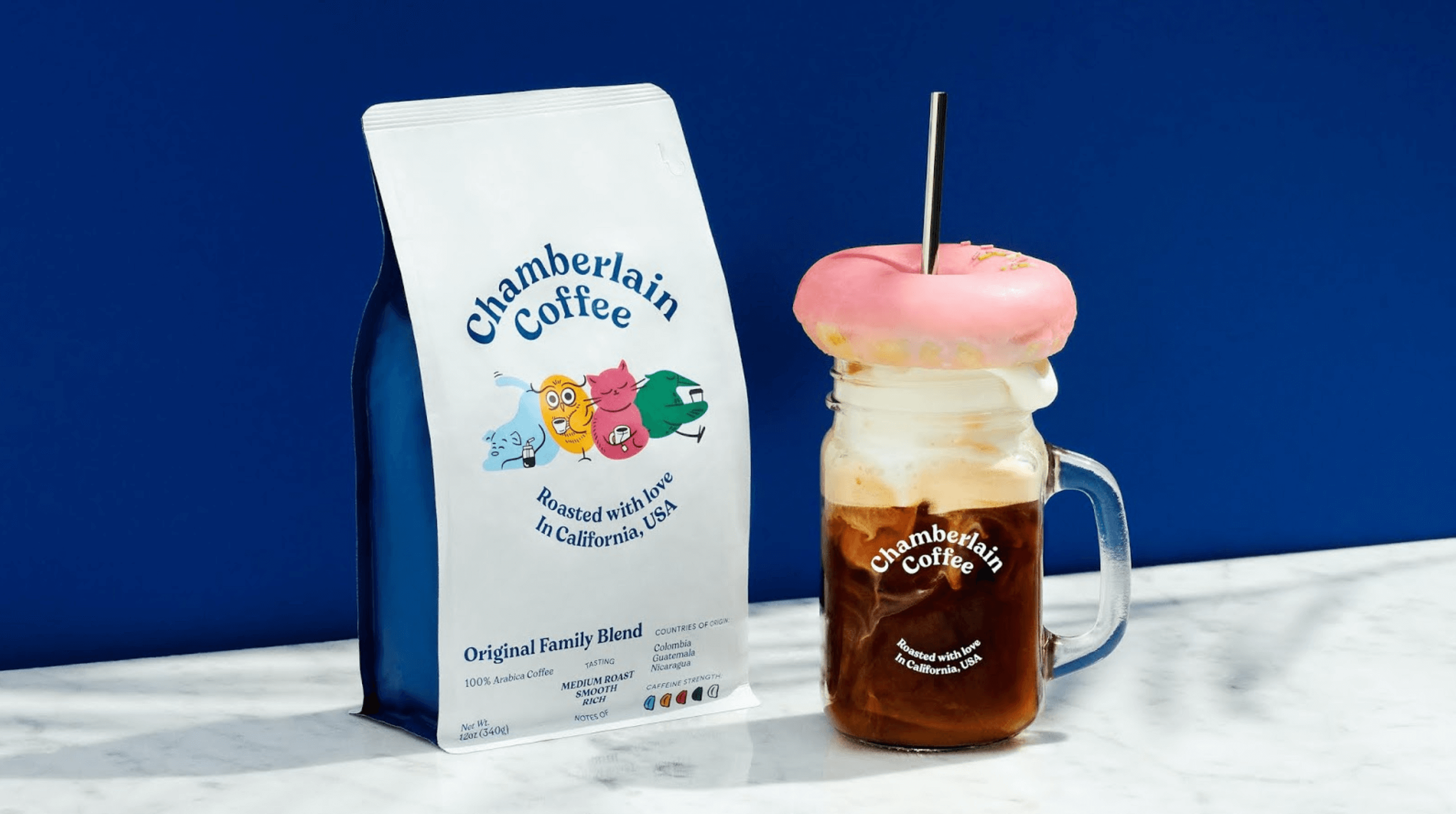
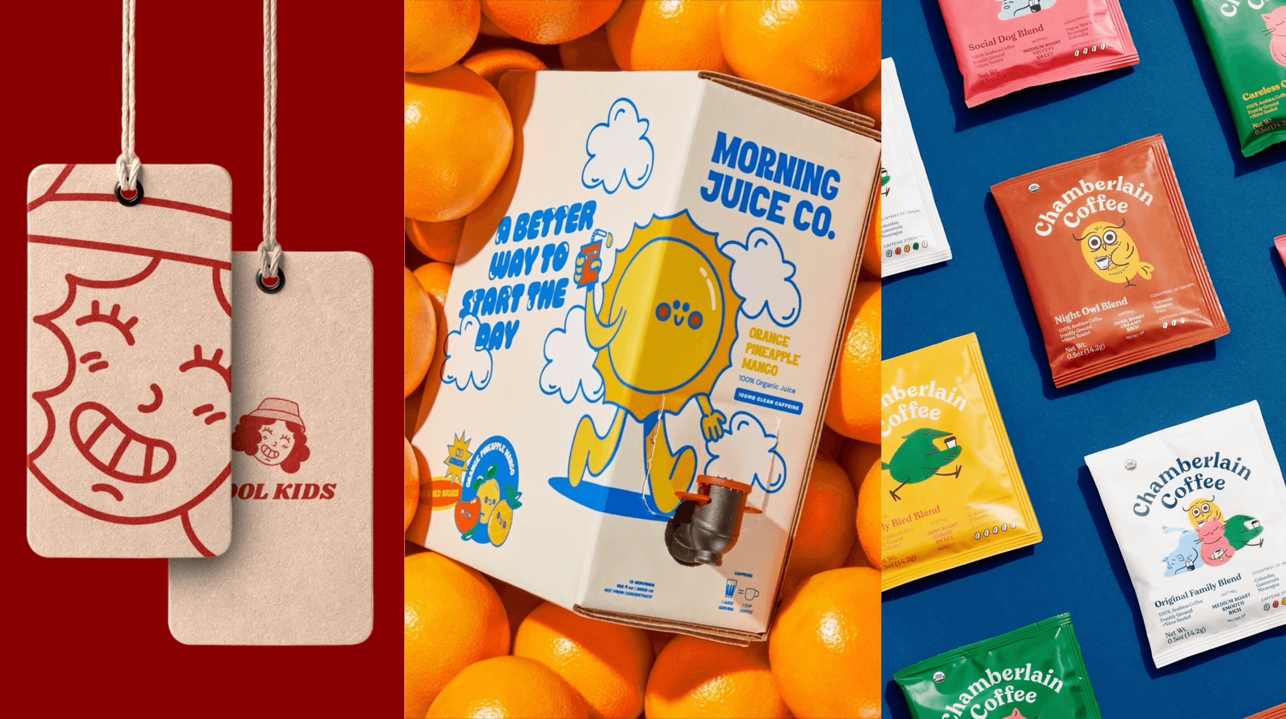
Chamberlain Coffee makes coffee more fun with its various brand characters
Brands already owning the brand character look:
- Chamberlain Coffee: Emma Chamberlain, founder of the brand, first made a splash on YouTube and is continuing to make a wave in the coffee industry with her cute brand characters taking center stage.
- Moncler x Maya: A sleek, futuristic penguin that adds playfulness to high-fashion branding.
- Food Industry: From Ronald McDonald to the Taco Bell chihuahua, popular fast food chains have long embraced brand characters, but we’re also seeing more of this trend in smaller businesses, particularly the neighborhood cafes and restaurants looking to stand out from the crowd.
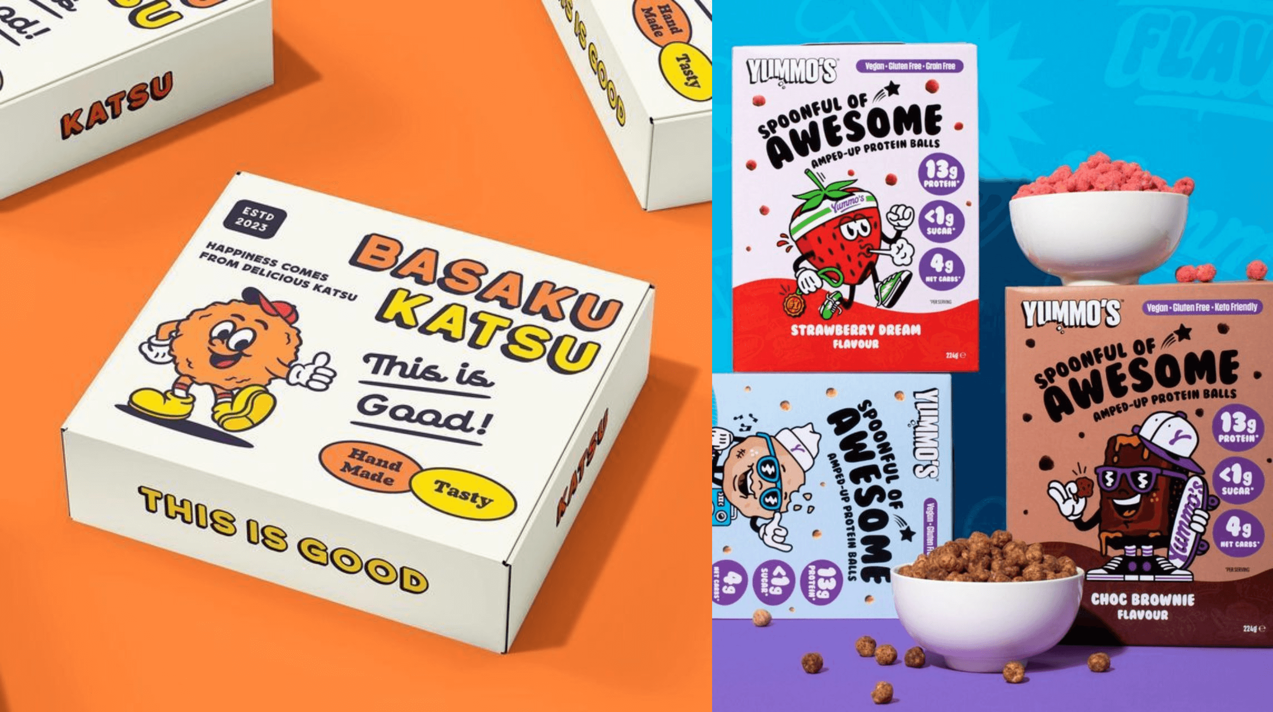
The food industry loves using brand characters as part of their brand identities
Where brand characters shine:
Brand mascots work best in spaces where personality and engagement matter most. Here’s where they shine:
- Advertising & Campaigns: Playful, expressive characters make brands feel approachable and fun.
- Packaging & Merchandise: A well-designed character can become a collector’s item, strengthening brand loyalty.
- Apps & UX Design: Digital mascots guide users and make interactions more engaging and memorable.
Brand characters bring emotion, humour, and storytelling into graphic design. For us, we use illustrations and expressive character designs to help brands stand out, connect with audiences, and build a unique identity. Whether it’s a mascot-led campaign, a playful packaging refresh, or an animated brand story, characters make sure brands feel engaging, and unforgettable.
Trend 9: Sustainable Design
For brands that want to look good and do good
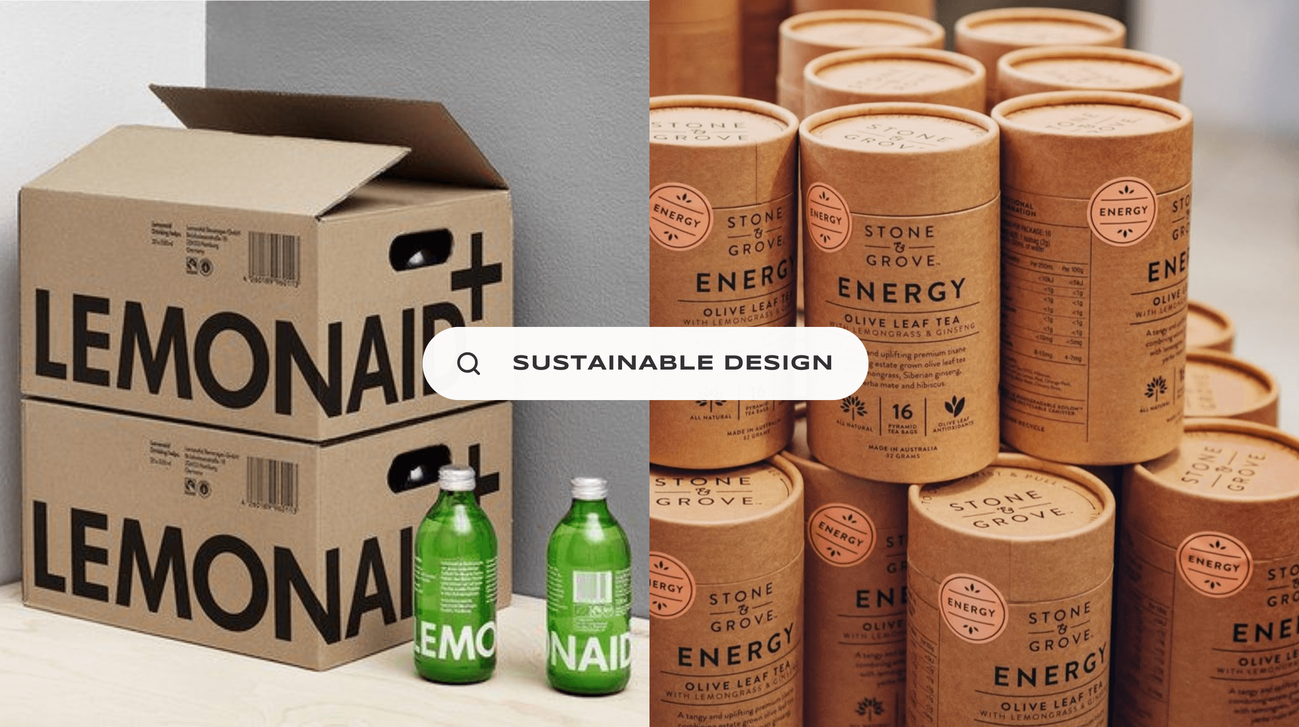
In 2025, sustainability isn’t just a buzzword. It’s become a non-negotiable. As brands face growing pressure to reduce waste and embrace ethical practices, design is evolving to be more eco-conscious, resourceful, and intentional.
From minimalist packaging to biodegradable materials and digital-first branding, this trend proves that creativity and responsibility can go hand in hand.
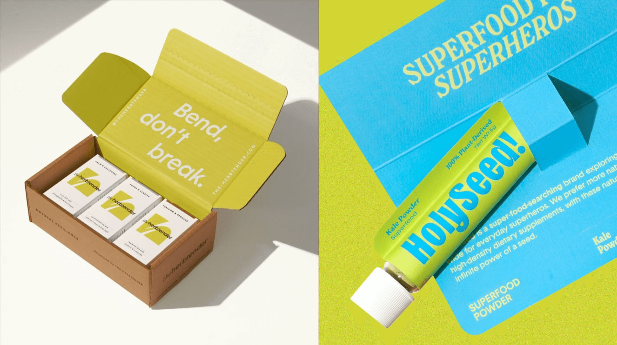
Mixing other graphic design trends with sustainable design lead to visual impact
Why sustainable design works:
Good design should not only be good for profits but also for the planet. Here’s why the shift towards sustainable design matters:
- Environmental Impact: Prioritising recyclable materials, eco-friendly printing, and digital solutions help brands reduce their waste.
- Timely and significant Today’s audiences actively support brands with sustainable values. It’s not just a trend. It’s a movement towards a greener planet.
- Encourages Smart, Timeless Design: Sustainable aesthetics favour minimalism, durability, and multi-use packaging over over-the-top packaging and design that leads to tons of waste.
While creating a positive environmental impact is the main goal of sustainable design, we also love the fact that it can lead to smart and timeless designs that not only meets consumer expectations but also creates a better world for everyone.
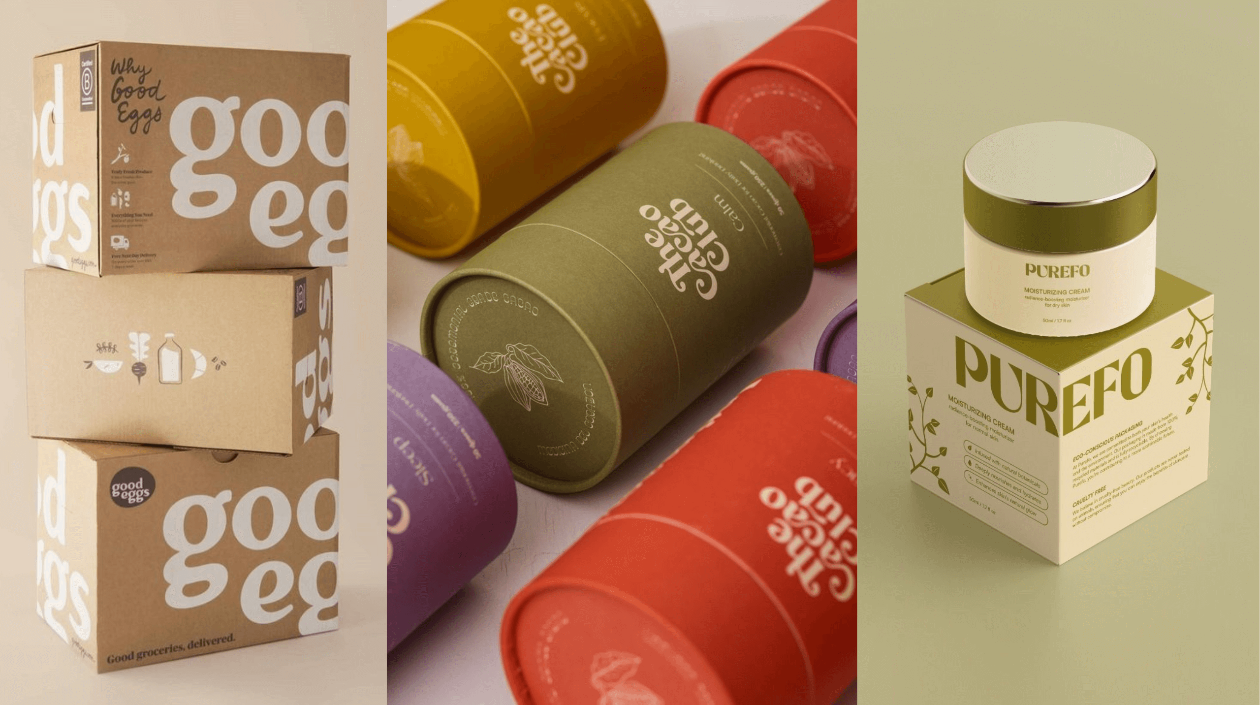
Sustainable product packaging minimise environmental impact
Brands already owning the sustainable design look:
- Patagonia: Their minimalist, no-fuss branding that reflects its commitment to environmental activism.
- Aesop: This brand uses recyclable, reusable, and biodegradable packaging without compromising on elegance.
- IKEA: A pioneer in sustainable materials, modular design, and waste-reducing production, this brand has stayed true to its identity, keeping sustainability at the forefront of its business.
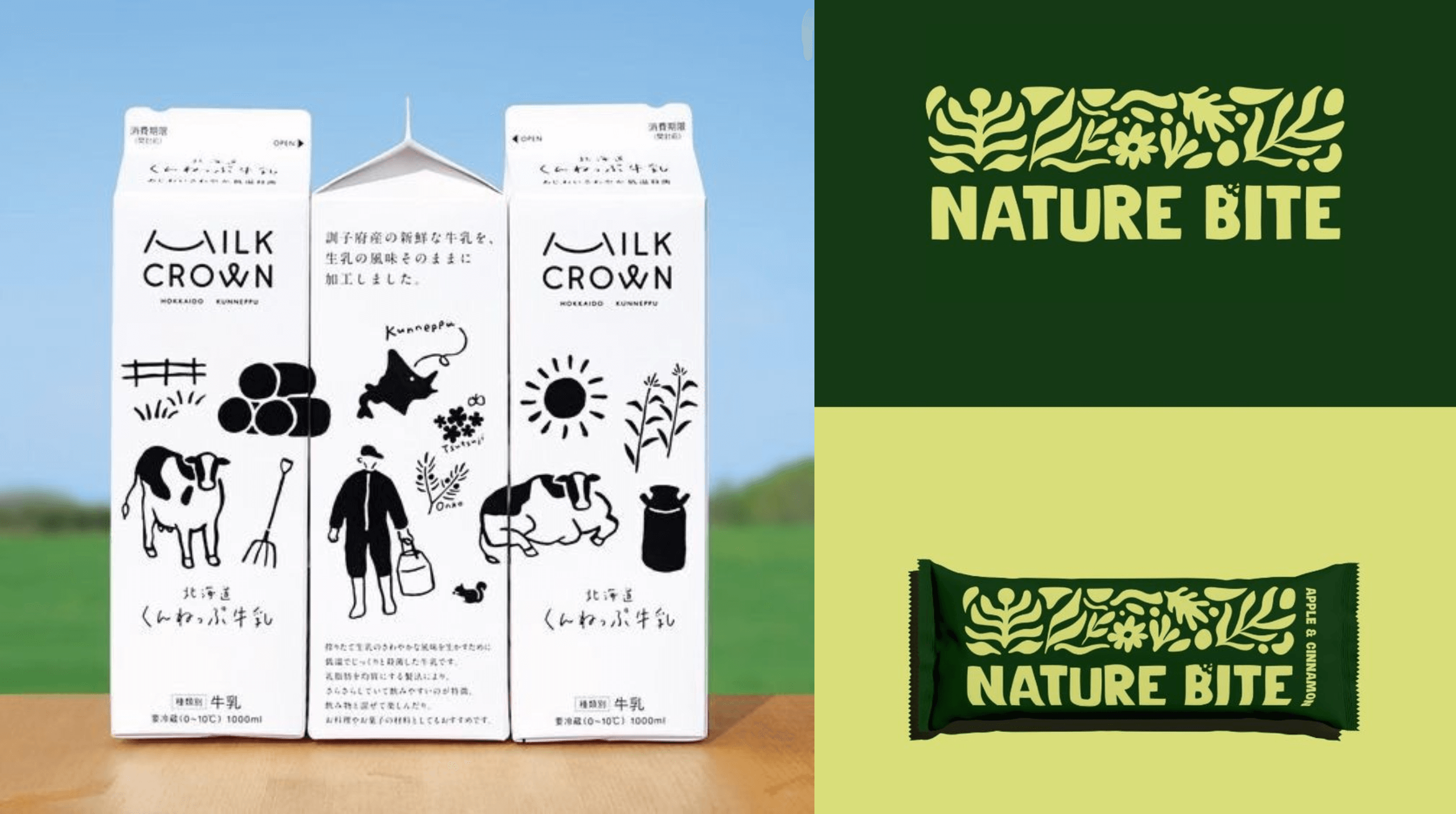
Fun illustrations give sustainable design more visual interest
Where sustainable design shines:
Eco-conscious branding thrives in industries where impact matters most, but small to medium businesses who deeply care about the environment can also hop on this trend. Here’s where you can use sustainable design:
- Packaging & Print Materials: Using compostable, reusable, or minimal designs to cut waste.
- Product Design: Materials and form factor that reduce carbon footprint while staying beautiful lead to a positive environmental impact.
- Customer Service: Shifting from physical to digital experiences can reduce excess. For example, going paperless when sending invoices reduce waste.
Sustainable design challenges us to be more thoughtful, innovative, and resourceful. These are qualities that push creativity to new heights. If sustainability is one of your core values as a business, we would love to help you bring your vision to life with minimalist designs suitable for green packaging yet are still captivating.
We believe that great design shouldn’t just look good. It should also leave a lasting, positive impact on the world.
Trend 10: Shape Theory
Inspiring movement while telling a story
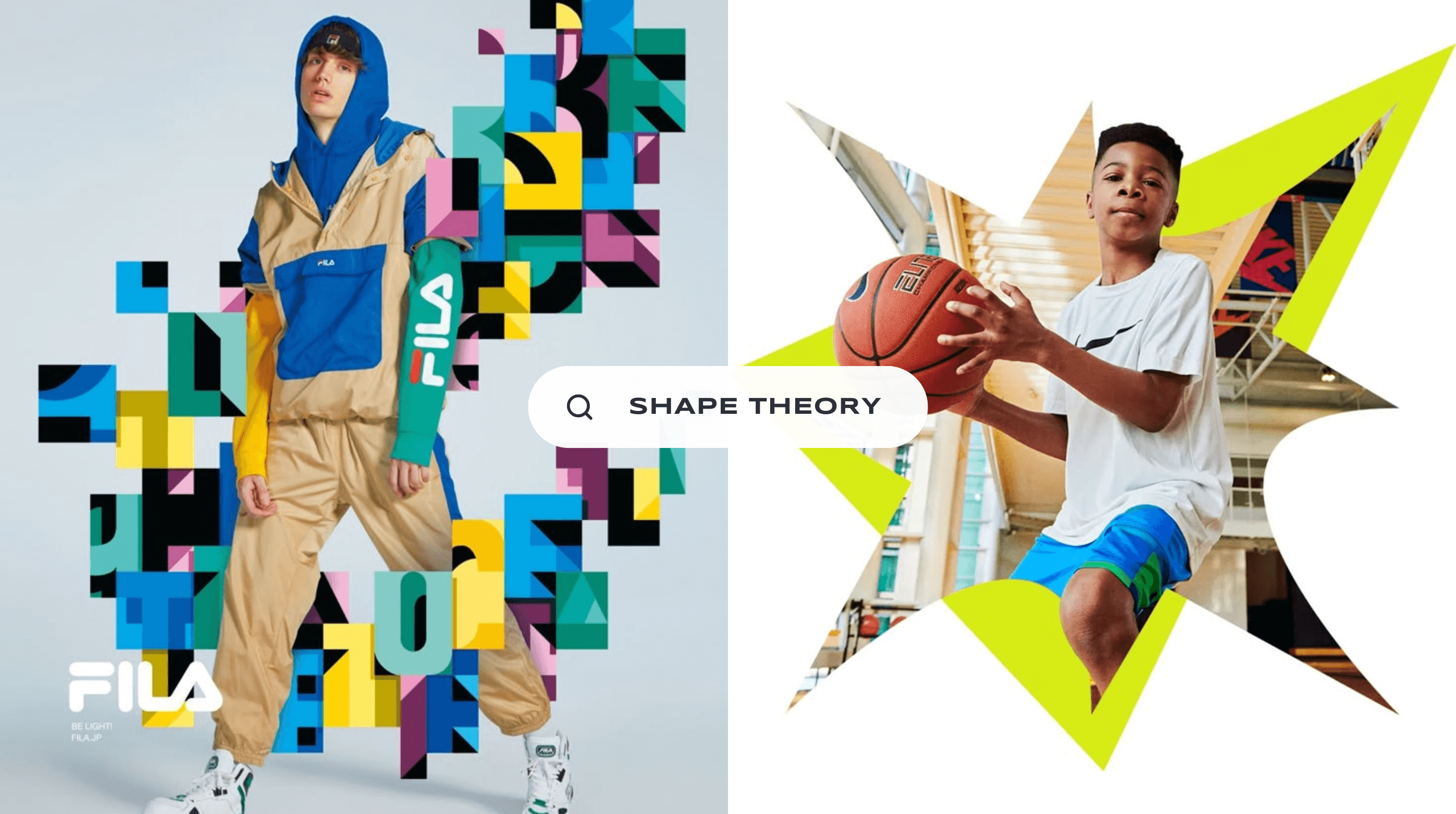
Being intentional with the way we use shape is taking center stage this year, with designers embracing the psychology of form to build stronger brand identities. Shape can inspire movement, guiding the eyes towards important details of a design, while also telling a story that touches the audience’s emotions.
Whether it’s soft, organic curves that feel welcoming, bold geometric structures that convey stability, or abstract asymmetry for an avant-garde edge, shape theory is proving that visual form is just as powerful as colour and typography.
Shapes create movement in the design and help tell a story
Why shape theory works:
Shapes influence perception, emotion, and brand messaging—here’s why they matter:
- Communicates Emotion: Rounded edges feel friendly, while sharp angles create a sense of strength and precision.
- Guides the Eye: Intentional forms can lead the viewer’s focus and create visual hierarchy, inspiring movement in the design.
- Reinforces Brand Identity: The right geometric language helps brands feel approachable, luxurious, or cutting-edge.
Shapes may be the most basic design element you can think of. But when used the right way, it can add movement and emotion to your design, allowing you to convey a strong message about who you are as a brand.
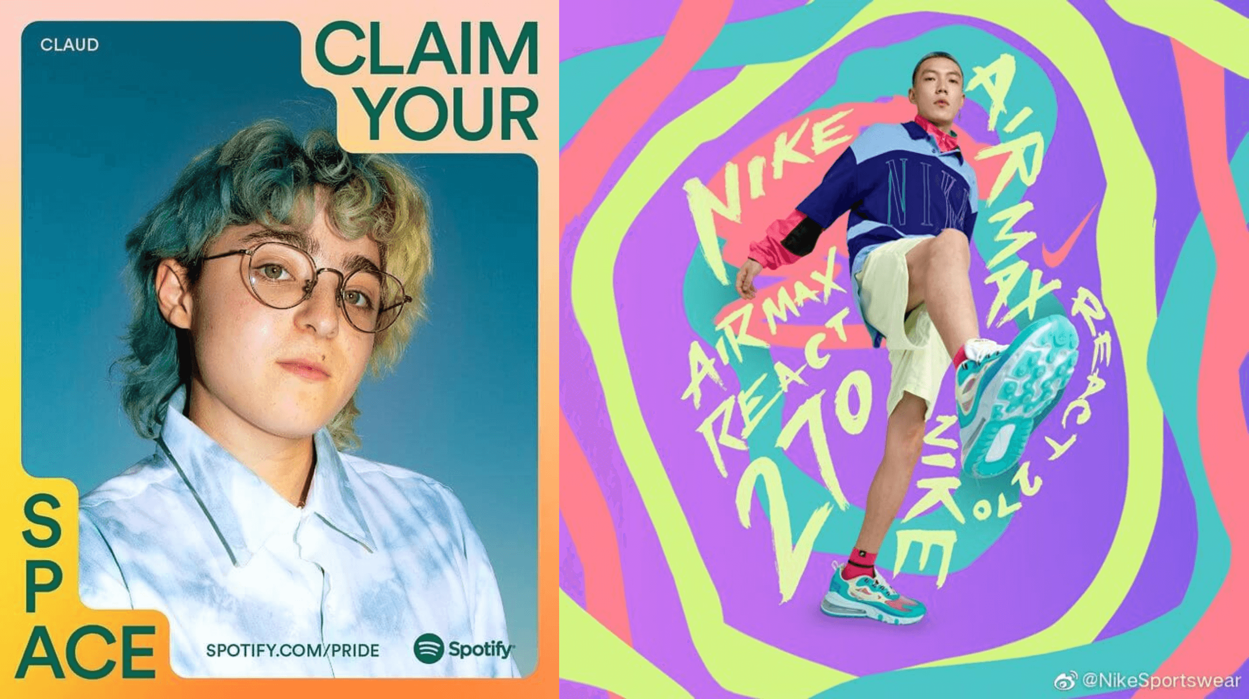
Spotify and Nike perfectly showcase the power of shape theory
Brands already owning the shape theory look:
- Nike: This brand is not afraid to use shapes to tell a story through its campaigns.
- Adobe: This brand’s sharp, angular “A” logo conveys precision, creativity, and digital innovation.
- Burberry: This brand’s bold, typographic logo with clean geometric forms that feel modern and timeless.
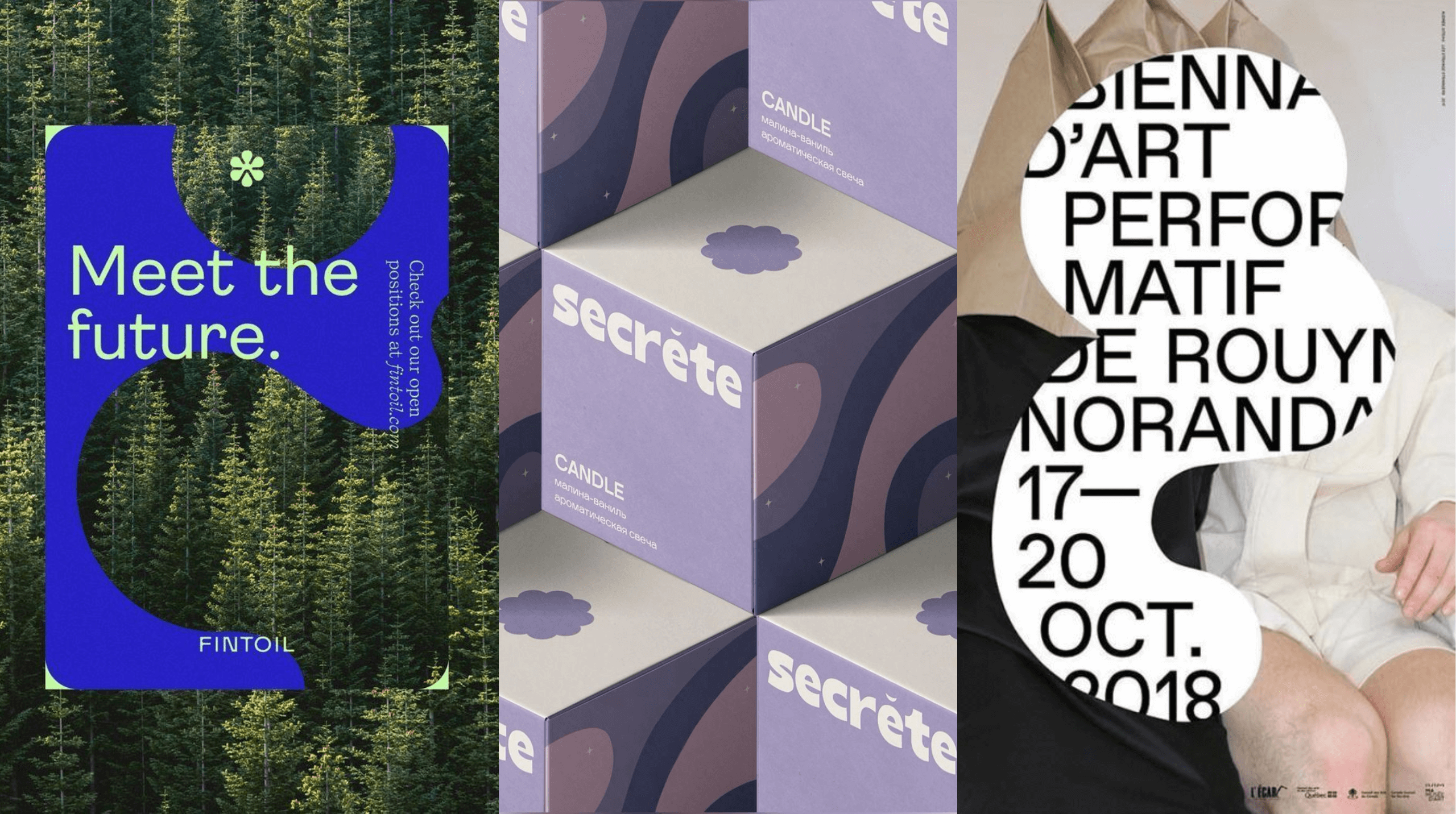
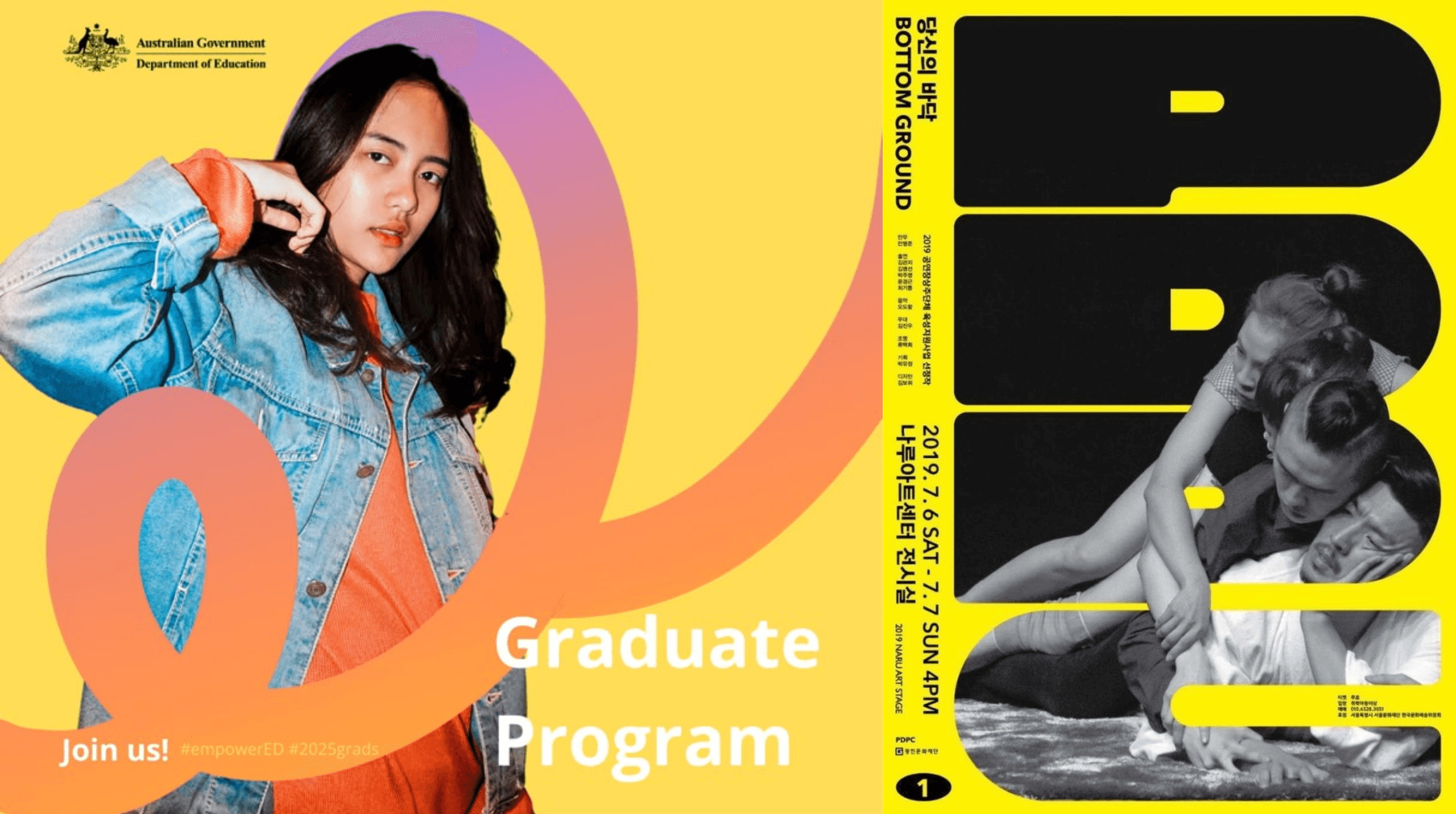
Organic shapes helps tell a story and touch people’s emotions
Where shape theory shines:
Strategic use of shape can enhance design in a wide range of areas, but here’s where we think this trend shines the most:
- Logos & Branding: Use forms that subtly (or boldly) communicate brand values through shape psychology.
- Packaging & Print: From custom dielines to unique label layouts, shape makes products instantly recognisable.
- UI/UX Design: Rounded buttons, sharp grid layouts, and asymmetrical placements all impact user experience.
Shape theory is the unspoken language of design, and we love using it to craft brands that connect on a deeper level. We love experimenting with fluid, organic shapes for playful brands, strong geometric grids for corporate identities, and unexpected form combinations for brands that want to push boundaries.
Whether it’s through logo design, web layouts, or product packaging, we know that the right shapes can make a brand feel instantly recognisable and unforgettable.
What are your predictions?
The year has just begun, and we’re so excited to see more of our graphic design trend predictions in the coming months! From bold colour palettes to nostalgic design elements, we expect a diverse range of creations from our graphic design community. We want to see how other creatives in the space use these trends to elevate their designs and grab attention. We’re also curious as to which brands will take these trends for a spin and which will pave their own visual and design path this year. There’s just so much to look forward to this 2025!
What about you? Do you agree with our graphic design trend picks? Connect with us on the ‘gram and let us know what you think!
We know you’ll love these blogs too...
Want more of this straight to your inbox?
We're here to keep you in the loop with the essentials for businesses in this digital age. Don't be shy – we know you're curious!


