They say every brand has a personality, but some colours don’t just support it, they become it. And this one? She doesn’t wait for an introduction. Before anyone’s read your tagline or scrolled your feed, she’s already made her entrance and set the tone.
Bold, unapologetic and impossible to ignore. She’s the friend who owns the room before you’ve even spotted her, the one you can’t stop looking at, even if you’re not sure why. Think love, power and a dash of drama wrapped up in a shade that’s been turning heads for centuries.
But here’s the thing: this hue isn’t a casual choice. Get her right and she’s magnetic. Get her wrong and she’ll drown out everything else you’re trying to say.
In this deep dive, we’re unpacking what makes this colour such a force in branding, how she’s earned her main character status, and why she could be the energy your business has been craving.
Thinking of using red in branding?
Let’s get one thing straight: red isn’t just a colour. It’s a main character.
She’s been making an entrance for thousands of years. The very first pigment humans ever created was ochre, brushed across cave walls and even onto their own bodies. Later, it draped royalty in rich fabrics, symbolised sacrifice and fire in medieval art, commanded attention in Renaissance portraits, and waved on flags during political revolutions. Fast forward to today and she’s still the one everyone notices when she arrives, from the glamour of the Hollywood carpet to the logos that demand attention.
the colour that’s been making power moves for centuries
The history of red in branding – drama that spans millennia
Red isn’t new to the spotlight. She invented it.
Prehistoric: The very first pigment humans created, used to decorate caves, tools and bodies.
Middle Ages: A colour loaded with symbolism, representing both holy sacrifice and hellfire.
Renaissance: Painters relied on it to draw the eye directly to the most important figure in a scene.
19th Century: The shade of revolutions, waving proudly on flags and propaganda posters.
Modern day: In branding, it’s a global signifier for luxury, urgency, passion and emotional connection — all depending on how it’s styled.


vintage built for the spotlight
Colour psychology of red – what this shade really means
Red doesn’t do subtle. It walks into a room, looks you dead in the eye, and says, “Pay attention.” In colour psychology, it’s one of the most stimulating shades, capable of raising your heart rate, sparking urgency and igniting emotional responses instantly.
You’ll spot it everywhere: from Ferrari’s racing stripes to Valentine’s Day roses to the STOP sign at the end of your street. Why? Because it triggers instinct. It can say “I love you” or “watch out” all in the same breath.

effortless. unbothered. unforgettable.
The personality of this colour – the good, the bad, the extra
Positive traits:
- Love and romance – The official colour of passion, attraction, and desire.
- Power and dominance – Carpets, luxury sports cars, and commanding outfits.
- Passion and drive – Fuels ambition and sparks action.
- Confidence and charisma – Makes a memorable impact without even trying.
Potential downsides:
- Aggression – Too much red can feel like you’re shouting at your audience.
- Competitiveness – Inspiring in sport, off-putting in trust-led industries.
- Overstimulation – Wall-to-wall bright red can cause anxiety instead of excitement.
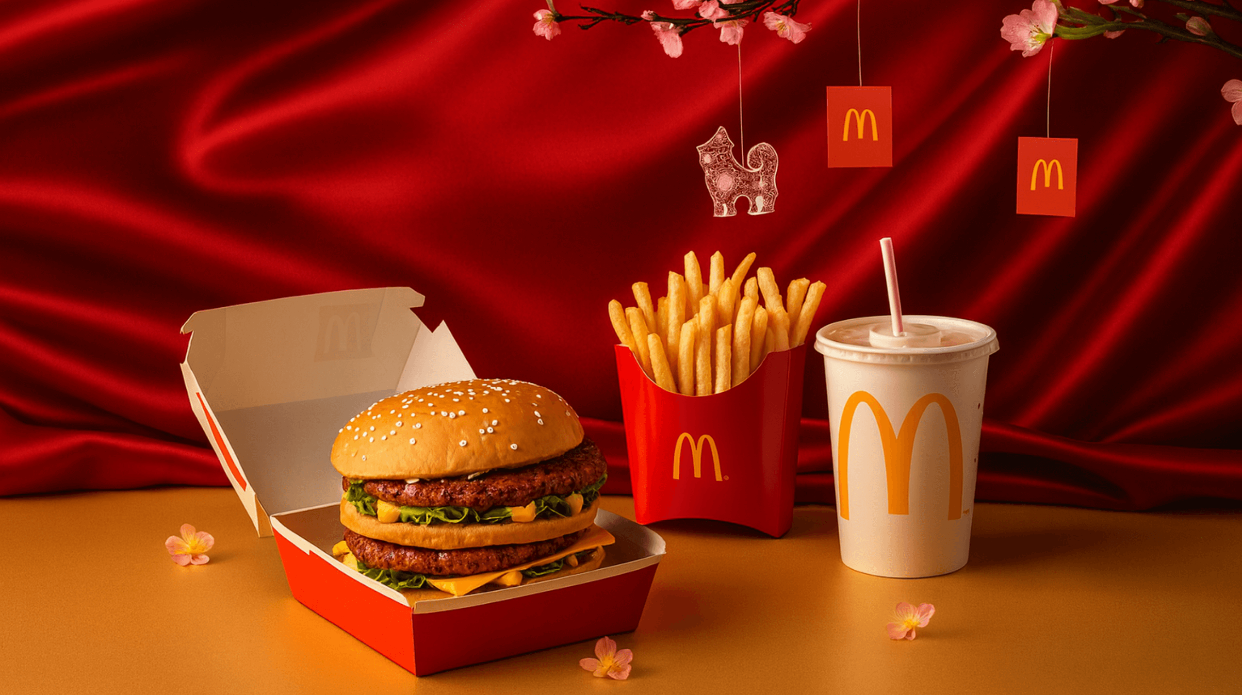
you can taste the brand before the first bite
Red in business & branding
In brand colour strategy, this shade is the go-to when you want attention, action and emotion. That’s why:
- Fast food and hospitality lean on it to boost appetite and create urgency (McDonald’s, KFC, Pizza Hut).
- Sports and entertainment use the hue to excite and energise (YouTube, ESPN, Nintendo).
- Luxury houses prefer deeper tones to communicate heritage, sophistication and exclusivity (Cartier, Louis Vuitton, Netflix).
But it isn’t for everyone. In calm, trust-focused industries like healthcare, finance or wellness, the effect can feel pushy or high-pressure. In those spaces, cooler palettes such as blue or green may align better with your brand personality.
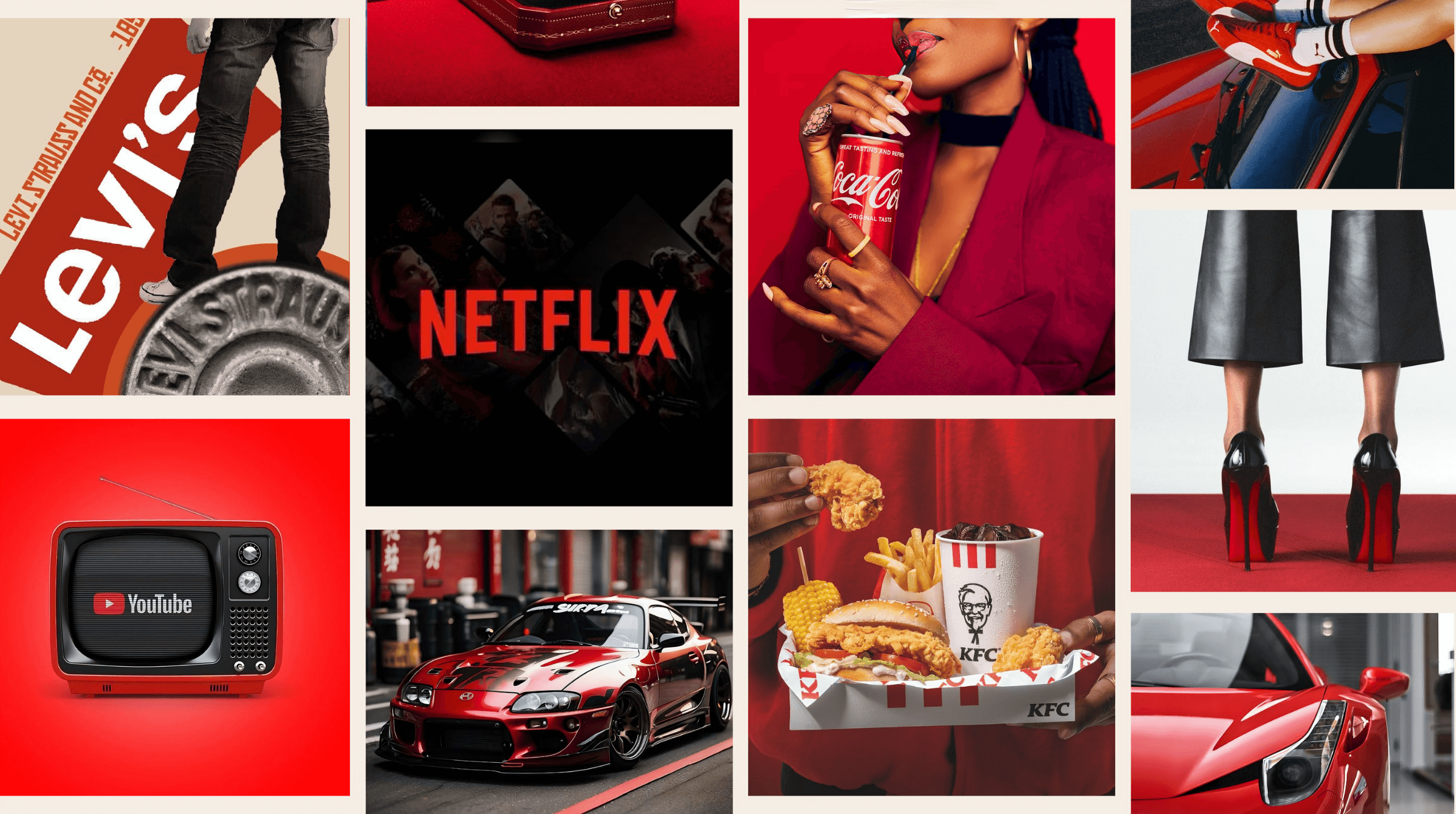
iconic Brands that are slaying red
Brands who are slaying the red game
Coca-Cola – 130+ years of global recognition built on one perfect shade.
Netflix – A single bold “N” that’s instantly iconic.
Christian Louboutin – Soles so famous they’re trademarked.
YouTube – That unmistakable play button.
Ferrari – A racing colour so legendary it’s practically its own personality.
Cartier and Louis Vuitton – Deep tones used sparingly for ultimate luxury impact.
not sure if your colour palette’s pulling its weight? get to know us and how we can help
How we use red without letting it take over
Red is our main character, front and centre in the logo and brand presence, but we keep her styled so she feels powerful, not overpowering. Here’s how we do it:
- Anchor the shade with neutrals like black and cream so it stands out without competing for attention.
- Dial the depth: richer tones for heritage and elegance, brighter variations when we want more punch and energy.
- Make it the signature in the logo so it’s instantly tied to the brand and impossible to forget.
- Refine the exact hue to hit the sweet spot between luxe impact and visual comfort, because in branding, tone is everything.
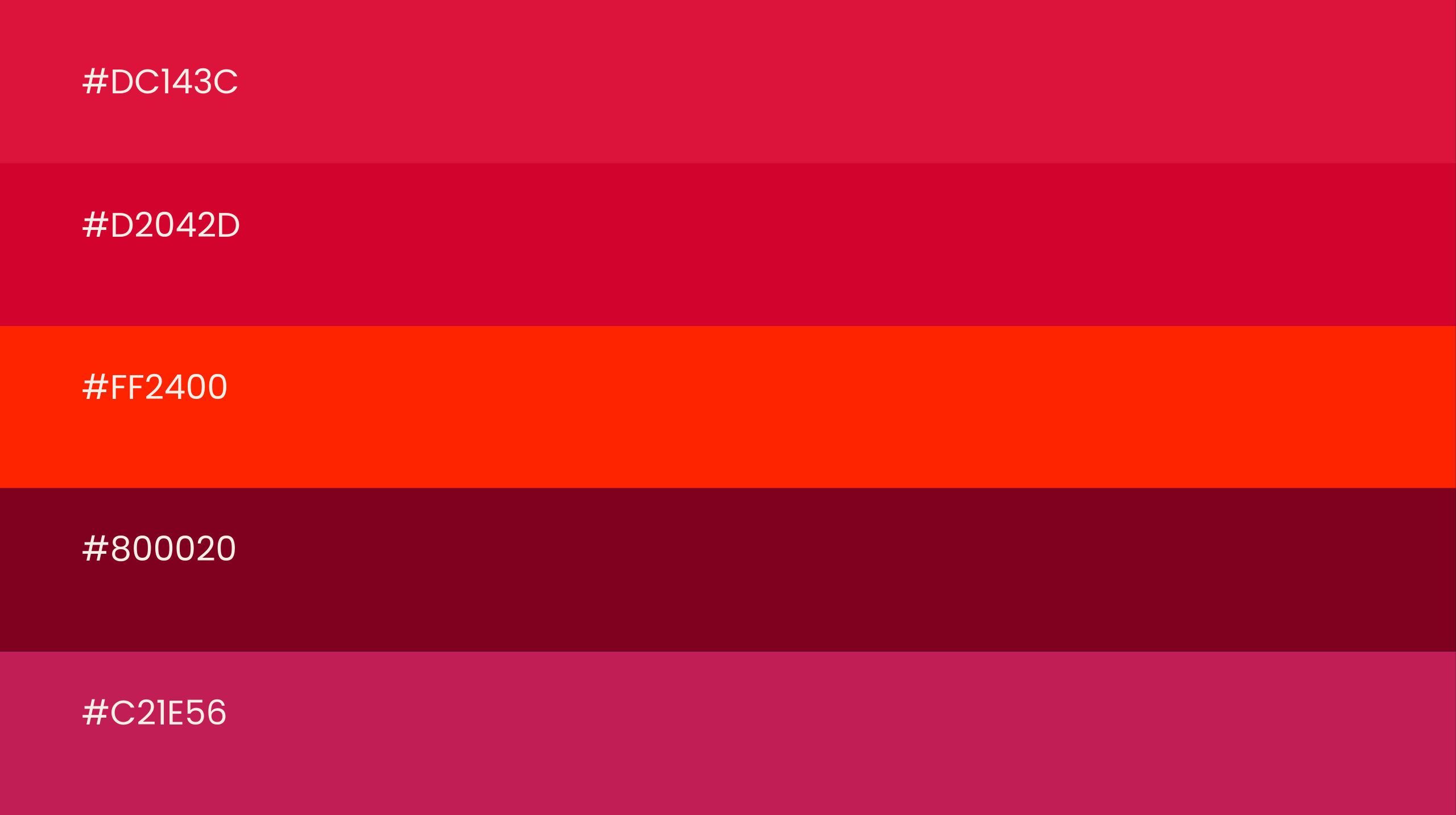
find the shade that speaks your rband language
Shades of red we recommend for branding
Not all reds are created equal. In colour psychology for branding, different tones create very different moods:
Bright crimson – Energetic and youthful, ideal for sports or entertainment.
Cherry – Friendly and approachable, perfect for retail or hospitality.
Scarlet – Attention-grabbing with warmth, great for bold campaigns.
Burgundy / Oxblood – Rich, refined, timeless, perfect for luxury branding.
Rose – Romantic and soft, perfect for lifestyle, fashion, or beauty brands.
The Bottom Line
Red is the friend who makes you feel alive but also drinks all the champagne at the party. She’s bold, high-maintenance, and unforgettable when styled right. She can be the reason people remember your brand or the reason they run from it. The trick is strategy, balance, and a little restraint.
If you’re ready for a brand colour palette that’s not just pretty but powerful, we can make it happen. At Fifth Studio, we design brand colour strategies that tell your story, connect with your audience, and keep you unforgettable for all the right reasons.
Ready to choose colours that make your brand unforgettable?
We know you’ll love these blogs too...
Want more of this straight to your inbox?
We're here to keep you in the loop with the essentials for businesses in this digital age. Don't be shy – we know you're curious!

