Pantone's 2024 Colour of the Year - Peach Fuzz
If you didn't know already, Pantone announced the 2024 colour of the year to be this peach fuzz. Although might not have been the colour we would have chosen, as graphic designers, we're inspired by the soft elegance and versatility of the colour and how easily it can be paired with other colours to be transformed into a powerful brand statement.
In a world that's forever changing, Pantone, the renowned colour authority, has once again captured the collective spirit of our evolving society with the announcement of the Colour of the Year for 2024 – "Peach Fuzz." This warm and comforting hue radiates optimism and solace, embodying our shared yearning for emotional nourishment and a return to simplicity.
Image Source: pinterest.com

The Essence of Peach Fuzz:
It’s been four years since Pantone introduced a peach-inspired colour to its array of trends. In contrast to the vivid Living Coral of 2019, 2024’s Peach Fuzz is a gentle blend of pink and orange tones, creating a soft, nurturing presence. Its delicate nature not only induces calmness but also provides a soothing touch, making Peach Fuzz an ideal choice for spaces aiming to foster a cosy and welcoming atmosphere.
Peach Fuzz in Your Colour Palette:
The versatility of Peach Fuzz lies in its ability to effortlessly harmonise with various colours, adding a soft touch to any palette. Whether combined with earthy neutrals or vibrant shades, this colour brings warmth and tranquility to spaces, making it an easy choice for interior design enthusiasts seeking balance and comfort.
A Reflection on Well-being:
Pantone’s choice of Peach Fuzz goes beyond aesthetics; it reflects a deeper understanding of our current societal challenges. In the midst of turmoil, the need for nurturing, empathy, and compassion has become increasingly apparent. The gentle embrace of Peach Fuzz serves as a balm for these conflicted times, invoking a sense of community and togetherness.

Source: Archdaily.com
A Reflection on Well-being:
Pantone’s choice of Peach Fuzz goes beyond aesthetics; it reflects a deeper understanding of our current societal challenges. In the midst of turmoil, the need for nurturing, empathy, and compassion has become increasingly apparent. The gentle embrace of Peach Fuzz serves as a balm for these conflicted times, invoking a sense of community and togetherness.
Here’s three colour palettes we would pair Peach Fuzz with:


Earthy Blues:
Sticking with the earthy tones, we would pair it with beautiful blue tones.
Inspired by a sunset over the ocean
Deep Tones Elegance:
Our final pick brings Peach Fuzz together with deeper tones – think deep salmon, honey, and red-orange. This combo not only ties it all together but ensures your text stands out vibrantly on the Peach backdrop.
Minty Fresh:
For a touch of edge, We are pairing Peach Fuzz with a delightful mint green. Soft, inviting, and just the right amount of contrast without stealing the spotlight.
Conclusion:
As we navigate the evolving landscape of our world, Pantone’s choice of Peach Fuzz for the Colour of the Year 2024 serves as a gentle reminder to prioritise our inner selves. Through its calming and nurturing presence, Peach Fuzz invites us to create spaces that resonate with tranquility, fostering a sense of community and well-being in the midst of challenging times.
Did you have a favourite colour palette?
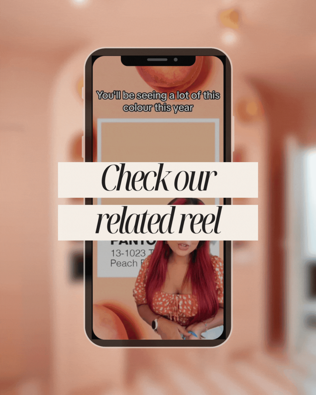
You can also check our latest post on Instagram for our insight on the Pantone’s colour of the year and the process of creating these moodboards.
We know you’ll love these blogs too...


Want more of this straight to your inbox?
We're here to keep you in the loop with the essentials for businesses in this digital age. Don't be shy – we know you're curious!

