It’s not always the logo. Or the colours. It’s your typeface doing the talking, quietly setting the mood before anyone’s read a single word.
It’s that blink-and-you-miss-it moment when your audience thinks: this brand gets me... or hmm, something’s off.
That gut feeling? It’s not random. It’s design doing its job or not.
Fonts hold emotion. They set the tone. They shape how your brand feels before a single headline is read.
The right one builds trust without trying. The wrong one confuses. Distracts. Makes your brand feel off even if everything else is on point.
Most people won’t know why. They’ll just scroll past.
Let’s make sure your fonts are saying what you actually mean.
Spoiler: that trendy typeface might be your biggest mistake
Fonts say more than you think. They’re not just decorating your brand. They are your brand.
Before anyone reads your tagline or your about page or that beautifully crafted caption you wrote at 11 PM, your typography has already spoken. And sometimes? It’s saying the wrong thing.
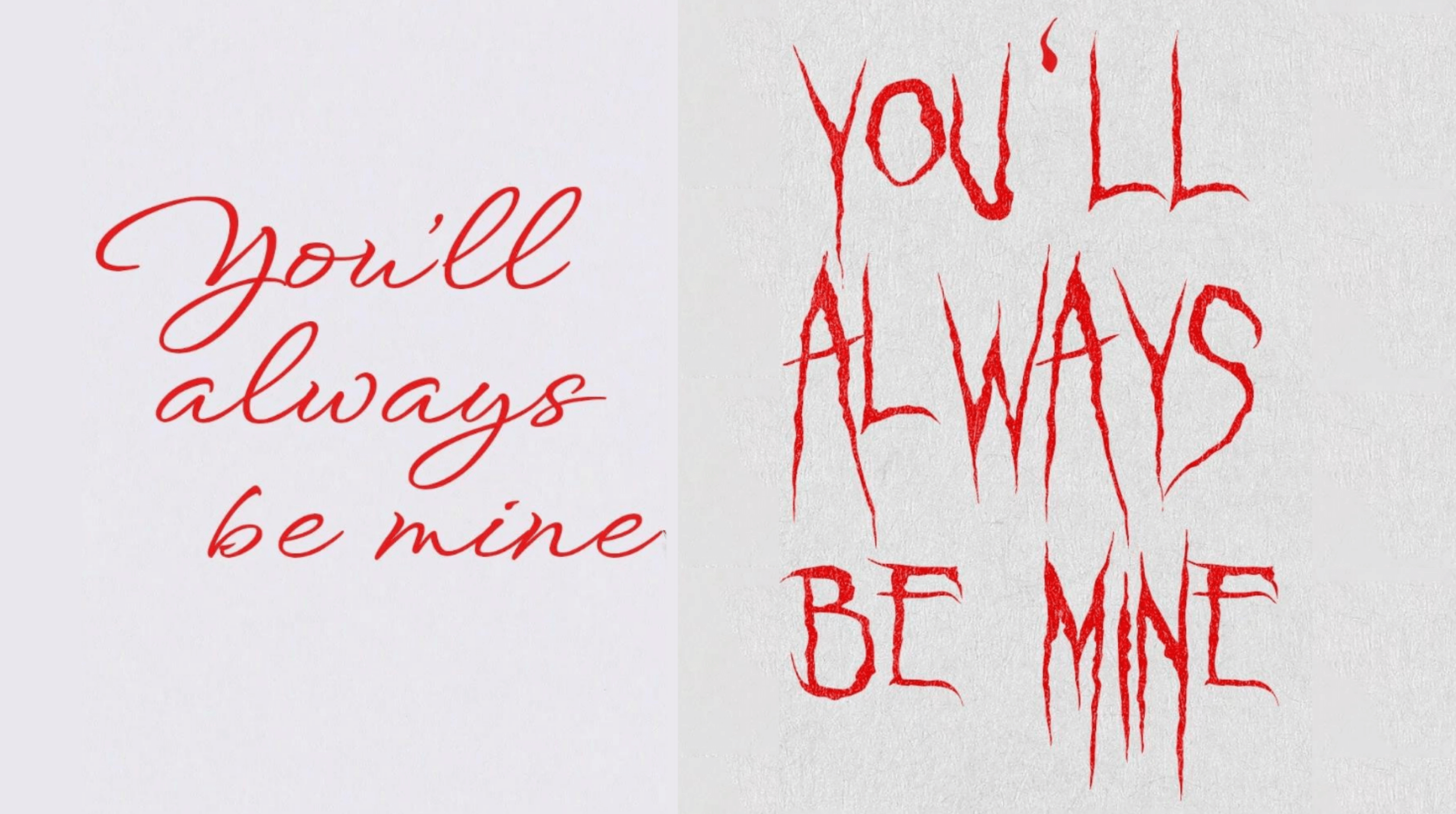
comparison of two fonts with different emotional tones
Bad typography kills good branding fast.
Same words. Same colours. But change the typography, and suddenly one version feels like a love letter while the other feels like a horror film poster.
That’s the impact of typography in branding. Fonts don’t whisper. They speak loudly. They influence brand perception, express emotion, and set the overall tone. Whether your font is saying timeless and trustworthy or designed this in Microsoft Word, the typography you choose can be the difference between someone scrolling past or stopping to engage.

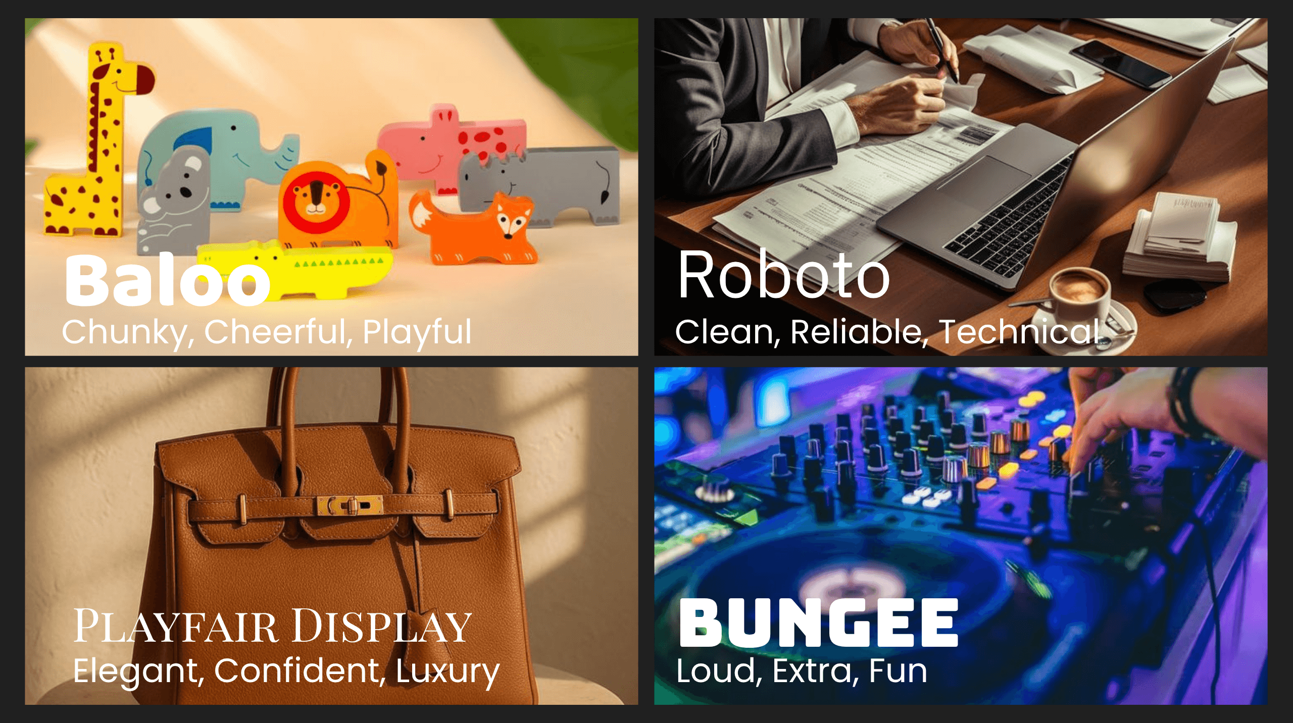
A quick visual guide to matching fonts with brand tone
Typography in branding should match your personality
This is where so many brands quietly miss the mark. You’re aiming for high-end, but your font’s giving party invite. Or you’re a playful, creative business stuck with something stiff and overly corporate.
Let’s do a quick vibe check:
- Rounded bubble letters?
Perfect for a kids brand or a cheeky lip gloss line. Not ideal for your accountant.
- Elegant serif with breathing space?
Says luxury. She has a waitlist. She knows her worth.
- Bold, geometric sans serif?
Screams startup. Hustle. Scale. Let’s go.
Your typography should feel like your brand voice made visual. If it doesn’t match your energy, it’s working against you.
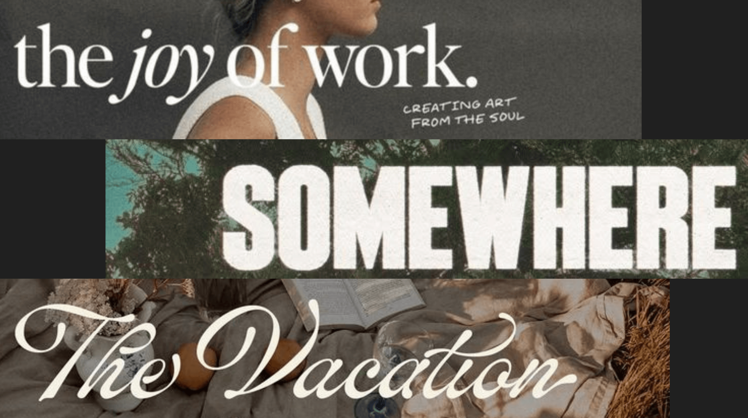
not sure which fonts actually suit your brand? Our logo & branding package sorts it for you
Pinterest isn’t your creative director
Look, we love a beautiful Behance case study as much as the next design studio. But saving fonts because they look cool is not the same as building a brand identity.
Trendy fonts have their place. Campaigns. Posters. Maybe a merch drop.
But if you want a brand that lasts longer than this quarter’s aesthetic, your fonts need purpose. Not just Pinterest pins.
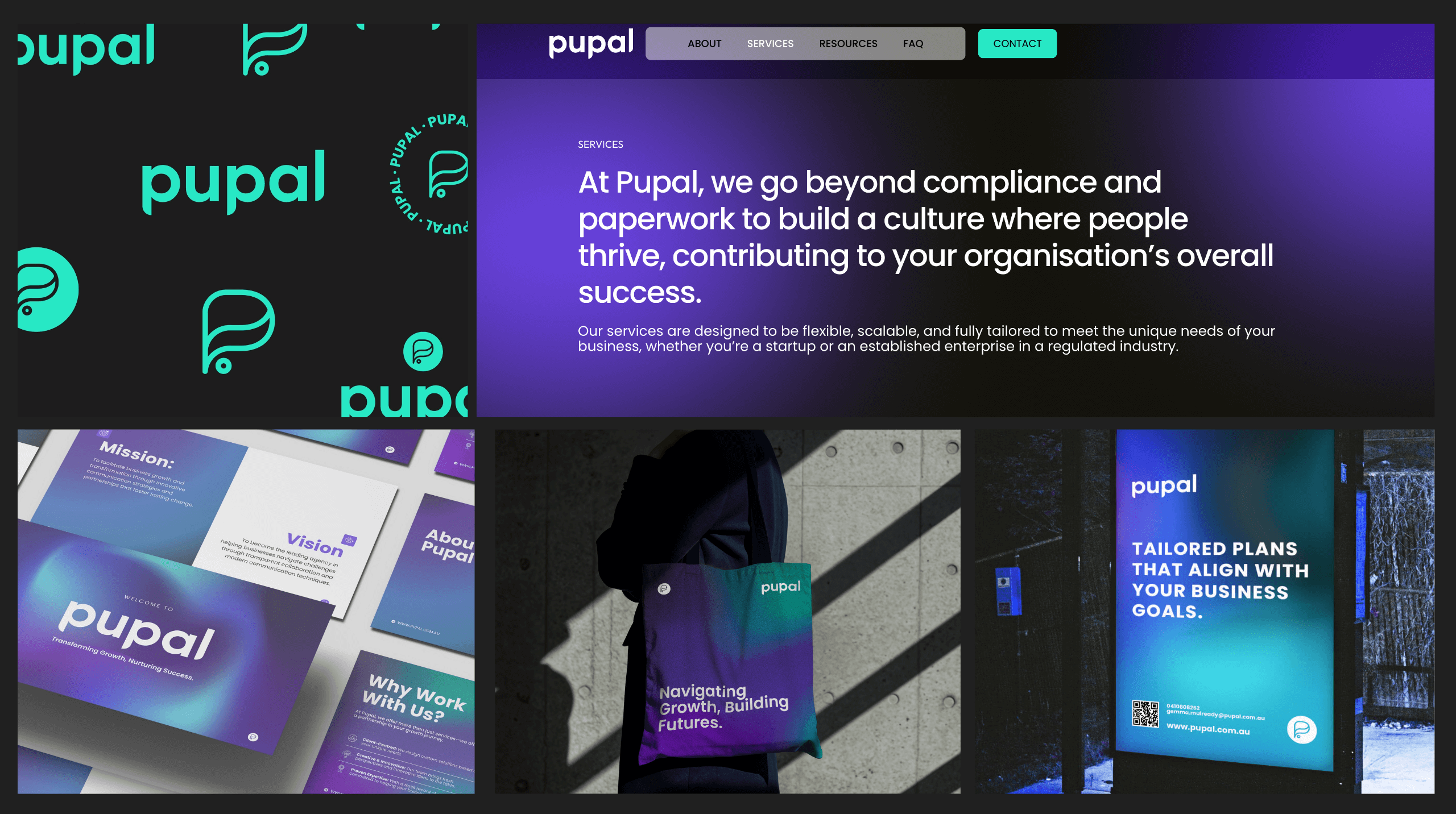
a full brand identity for pupal built to lead with clarity and confidence
Chaos is not a brand system
If you’re using one font on your socials, another on your website, and something random in Canva every other week, your audience can feel the confusion. And confused doesn’t convert.
Consistency is what makes a brand feel legit. When your typography flows across your marketing, socials, and sites like it was always meant to be there? That’s the moment people start to trust you. Remember you. Choose you.
Want to see it in action?
👉Have a scroll through our Pupal project. Same fonts, styled right across web, socials, and marketing. That’s the system.
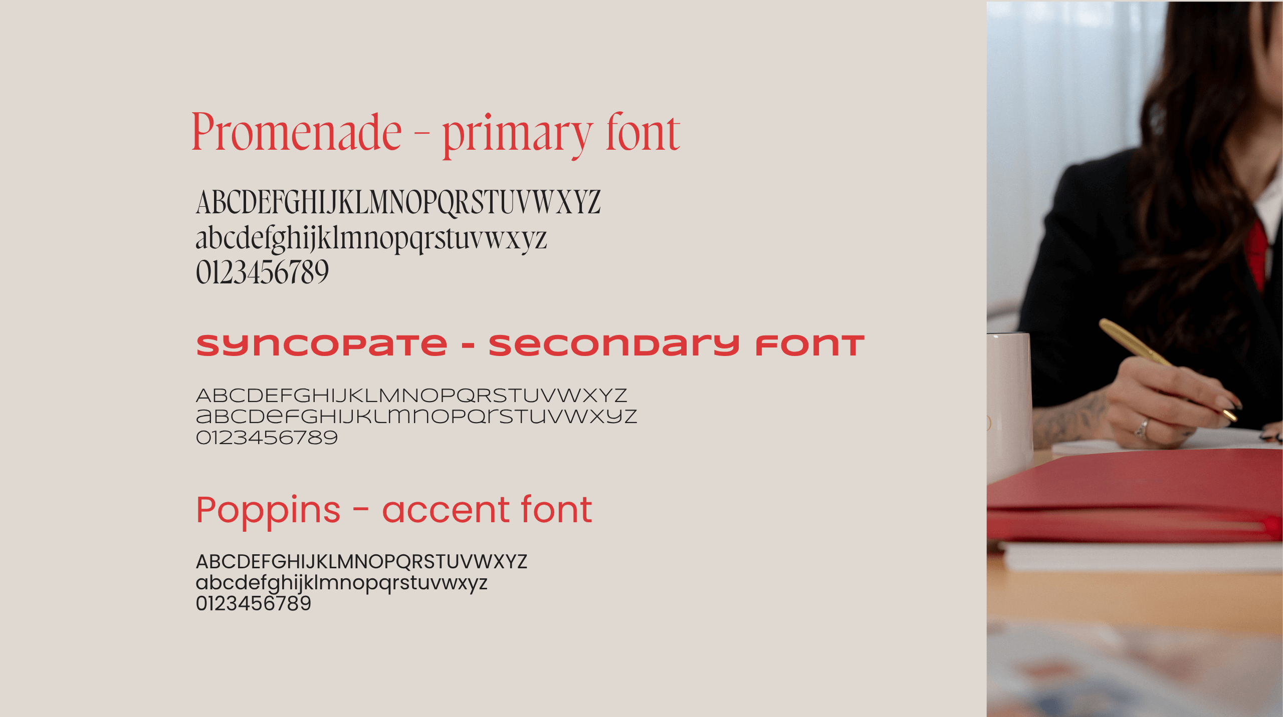
our go-to font trio behind the fifth studio brand
Your brand doesn’t need 12 fonts. Just the right 2 or 3.
You don’t need a font collection. You need a font system.
- Primary font — for bold, scroll-stopping moments
- Secondary font — for the info that actually needs to be read
- Accent font — optional, but great for personality when used with purpose
Pick two or three max. Use them everywhere. And for the love of consistency, save them somewhere better than that random Canva file from 2022.
Typography is your first impression. Make it count.
Your font is talking. Make sure it’s saying the right thing.
Typography isn’t just decoration. It’s messaging, trust, and your brand’s vibe before anyone reads a word.
So next time you’re about to download that cute new typeface, ask yourself
- Is this actually saying what I want it to say?
- Does this feel like us?
- Will we still like this in six months?
If the answer is no, it might be time to rethink your font game.
The bottom line: Fonts are just the beginning.
At Fifth Studio, we’re not just choosing fonts that look cute.
We’re building strategic typography systems that reflect your voice, support your message, and elevate your brand.
This is your reminder to pause and ask
Are our fonts helping people trust, remember, and choose us?
If not, let’s fix that.
Ready to align your brand visuals with fonts that actually do the work?
We know you’ll love these blogs too...
Want more of this straight to your inbox?
We're here to keep you in the loop with the essentials for businesses in this digital age. Don't be shy – we know you're curious!


