When was the last time you clicked through your own site and thought, “Yes, this looks like us”? If your answer is somewhere between “not recently” and “never,” you are not alone. Too many businesses let their digital presence sit untouched, collecting dust while competitors are busy upgrading.
The truth is, people are judging your brand within seconds. If it feels clunky, outdated, or harder to use than it should be, your dream clients are already clicking away. And here is the part that stings, they are clicking over to a competitor who looks more polished, more professional, and more trustworthy, even if you do the job better.
From broken links to poor design, there are five clear signs your online presence is holding your brand back. Spotting them early means you can finally stop losing business to competitors with better sites and start turning your own into a growth machine.

Let’s be real. If your site is looking dusty, loading like it is stuck on dial up, or worse, not bringing in a single enquiry, it is time for an intervention.
Your website is not just a digital business card. It is your brand’s front door, your first impression, and your best salesperson all rolled into one. If it is failing on any of those fronts, you are basically leaving money on the table and handing your dream clients over to someone else.
So how do you know when it is time to call in a glow up? Here are the five biggest red flags that your website is sabotaging you.

Old bwd group website. check out how we transformed the new bwd group website
1. The glow down: when your website looks outdated
Still rocking a site that looks like it was built the same year Gangnam Style went viral? That is not vintage, it is a liability.
Your visuals are doing the talking before you even get a chance. If your site looks tired, cluttered, or like it was thrown together in WordPress circa 2010, people assume your business is the same. And trust us, no one is handing over their credit card to a brand that looks like it has not upgraded since dial up internet.
 Wanna learn more? Deep dive on Glide’s Why Your Outdated Website Is Costing You More Than You Think

moonah tree capital’s site. explore their full case study here
2. Small screens, big problem: not mobile friendly
It is 2025. If your site still freaks out when someone opens it on their phone, we need to talk.
More than half of all web traffic is mobile. That means if your site is making people pinch, zoom, and rage quit before they can even find your contact button, you are not just behind, you are invisible. And Google is already giving you a side eye by dropping your ranking.
A mobile optimised site is not a nice bonus. It is the bare minimum. If your website cannot handle small screens, your business will not handle big growth.

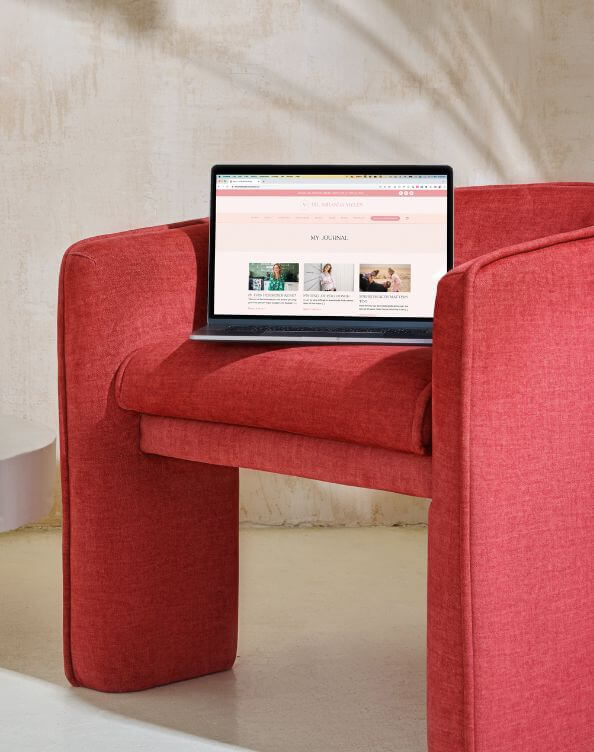
clients view your website for 3 seconds only. if loading takes longer, they’re gone
3. The three second test: slow sites kill vibes and sales
This shade thrives in spaces where trust is currency. Finance, healthcare, technology, education. It signals authority and keeps everyone calm.
But put it on a party label, kids’ toys, or a tequila brand and suddenly it is giving corporate presentation instead of fun. Not every vibe is meant to be dressed in this colour.

a glitchy site screams neglect and sends potential CLIENTS running to competitors
4. Broken promises: hard to update, harder to trust
If uploading a blog post feels like hacking the Pentagon, your site is broken. If your contact form glitches every second week, your site is broken. If you are embarrassed to send people to it, guess what. Your site is broken.
Visitors do not care that the plugin broke again. All they see is a brand that cannot keep its digital house in order. And if you cannot keep a website tidy, why should they trust you with their money?
You should be able to update a headline in five seconds flat, not five business days. Your website should be working for you, not against you.

fifth studio site. explore our services for custom website design
5. Silent treatment: when your site does not bring enquiries
Let’s cut to the chase. At Fifth Studio, we see websites as more than a vibe check. They are built to be sales tools. If a site is not bringing in enquiries, it is not doing its job.
Pretty graphics and glossy images will only get you so far. What matters is strategy. We design sites to act like your hardest working team member. Clear in communication, confident in design, and always guiding visitors towards action.
No fluff. No wasted clicks. Just sites that work.
Reality check
If even one of these signs hit a little too close to home, it is not just a gentle nudge, it is a wake up call. Your site is costing you opportunities every single day you let it slide.
At Fifth Studio, we are not here to give you just a pretty site. We design websites that do the heavy lifting. Strategic, stunning, and seriously effective. The kind of site that makes your competitors wonder how you leveled up so fast.
 Ready to stop hiding behind a website that makes you cringe and start showing up with one that makes you proud?
We know you’ll love these blogs too...


Want more of this straight to your inbox?
We're here to keep you in the loop with the essentials for businesses in this digital age. Don't be shy – we know you're curious!

