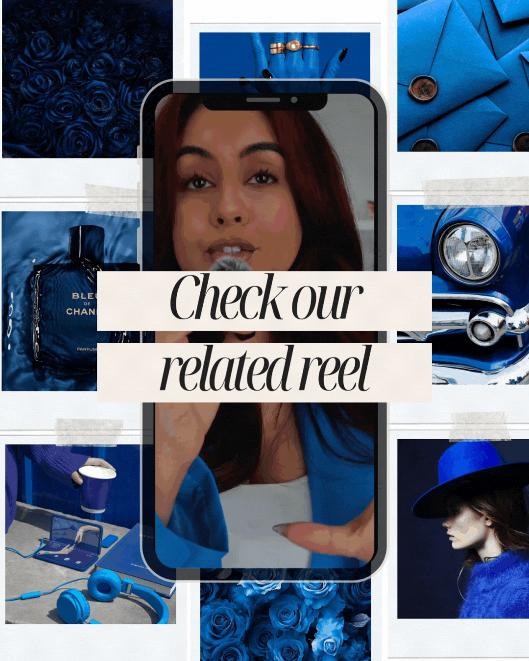
You’re not prepared for this one. Blue isn’t just a colour, it is the world’s favourite. From ancient royalty to today’s tech giants, it has always carried weight. Psychologists say it slows your pulse and calms the mind, which is why banks, hospitals, and corporations practically swim in it. Blue signals safety, trust, and authority before you have even spoken a word.
But here is the catch. When half the world is using it, blue can go from powerful to predictable fast. What should feel timeless can suddenly feel cold, corporate, or forgettable. The magic is not in choosing blue, it is in making it unforgettable, and that only happens when you use it with intention.

Since the first splash of pigment hit ancient pottery, blue has been that colour. Royals wore it to look untouchable, religions painted it into the heavens, and the ocean and sky basically claimed it as their signature look. Fast forward to today and you can’t scroll, shop, or even check your inbox without bumping into it. Half the world’s biggest brands are drenched in it. The question isn’t whether blue has power, it’s whether your brand is using it with purpose or just hiding behind the default setting.

the first splash of pigment on clay
The Psychology of Blue: calm, cool, collected
This colour slows your pulse and tells your brain to relax. That’s why banks, hospitals, and tech companies practically bathe in it. It whispers stability, trust, and clarity. But here’s the catch: drown your brand in blue and you’ll start to feel cold, clinical, and forgettable. The magic is in the balance.
 Wanna know more about blue? Check out Verywell Mind’s The Color Blue: Meaning and Color Psychology

personality of blue if it were a person
If blue were a person…
It’s the mate who always brings the charger, knows the Wi-Fi password, and shows up ten minutes early. Reliable, trustworthy, put together, but not exactly the one lighting up the dance floor. In branding terms, it is the safe choice, and safe can either be genius or generic.

professional branding that speaks before you do. meet bjt business advisors
Where blue belongs and where it bombs
This shade thrives in spaces where trust is currency. Finance, healthcare, technology, education. It signals authority and keeps everyone calm.
But put it on a party label, kids’ toys, or a tequila brand and suddenly it is giving corporate presentation instead of fun. Not every vibe is meant to be dressed in this colour.

brands that built empires with blue
Brands that got it right
- PayPal → Made moving money online feel safe before anyone else could.
- LinkedIn → One scroll and you instantly know you’re in business-speak territory.
- Tiffany & Co. → Proved that one signature shade can own an entire category.
- Samsung → Futuristic polish wrapped in electric blue confidence.
These brands didn’t pick a colour at random. They picked a feeling.

facts about blue you should know
Quick facts that make you sound brilliant
- This is the world’s most loved shade. Surveys keep proving it.
- Office walls painted in it boost focus and productivity.
- People trust brands more when they see it.
- It literally kills your appetite, which is why you never see it in fast food.
- Twitter’s bird only works because it’s approachable in this shade.

shades of blue to use in your brand
Shades that shift the mood
- Sky → Light, friendly, approachable.
- Royal → Bold and confident with just enough drama.
- Navy → Serious, timeless, built for authority.
- Teal → Calm but modern, perfect for wellness and digital brands.
- Turquoise → Creative, playful, and slightly cheeky.
- Cobalt → Chic, dramatic, impossible to ignore.
- Powder → Soft and soothing, lifestyle perfection.
Pick the wrong one and you’ll confuse the vibe. Pick the right one and it does half the storytelling for you.

the best colours to pair with blue
Use blue without being a snoozefest
- Pair it with neutrals to feel polished, or hit it with orange or gold for contrast that pops.
- Save it for the moments that matter: buttons, callouts, highlights.
- Don’t drench everything in it. Too much and you’re just another LinkedIn banner.
Final words
Blue has the power to calm, to persuade, and to lead, but it only works when it is used with intent. The question is not whether blue is a good colour for branding, it is whether it is the right colour for your story. A shade becomes unforgettable when it reflects your values, speaks to your audience, and carries meaning beyond the surface. If blue is going to be your next move, make sure it is chosen with purpose, not out of habit, because that is when it stops being just a colour and starts becoming a brand asset.
At Fifth Studio, we don’t just hand you a colour swatch and say “good luck.” We craft palettes that feel like you, that spark emotion, and that tell your story before you even type a word.
Ready to choose colours that make your brand unforgettable?
We know you’ll love these blogs too...


Want more of this straight to your inbox?
We're here to keep you in the loop with the essentials for businesses in this digital age. Don't be shy – we know you're curious!

