The client
Zada Lau is the personal brand of a trailblasing spiritual entrepreneur whose work weaves together soul, strategy, and connection. She’s a connector, fun(d)raiser, and event host who helps spiritual entrepreneurs amplify their impact through high-vibe events, aligned systems, and powerful networks. Her brand needed to reflect her magnetic energy and spiritual depth while laying the foundation for future growth and sub-brand expansion.


The Brief:
the challenge
Creating a visual identity for a multi-dimensional personal brand like Zada Lau came with several key challenges:
- Balancing elegance and soulfulness with playfulness and power
- Designing a symbol that honours spiritual tradition while feeling contemporary
- Building a system flexible enough to grow into multiple sub-brands
- Communicating Zada’s role as a connector, fundraiser, and event host—without feeling overly corporate or overly esoteric
The goal
Our mission was to create a brand identity that felt luxurious, magnetic, and spiritually aligned—something that could hold the full spectrum of Zada’s work while inviting collaboration, connection, and transformation. The brand needed to resonate with both spiritual entrepreneurs and business-savvy collaborators.


The Process and Outcome:
From the beginning, we worked closely with Zada to craft a logo that truly represents her essence—balancing spirituality, strength, and personal significance. During the first revision round, we introduced a snake tail at the end of the ‘Z’ in her name, a meaningful addition as the snake is her Chinese zodiac animal. This detail adds a layer of symbolism, reinforcing her connection to transformation, intuition, and power.
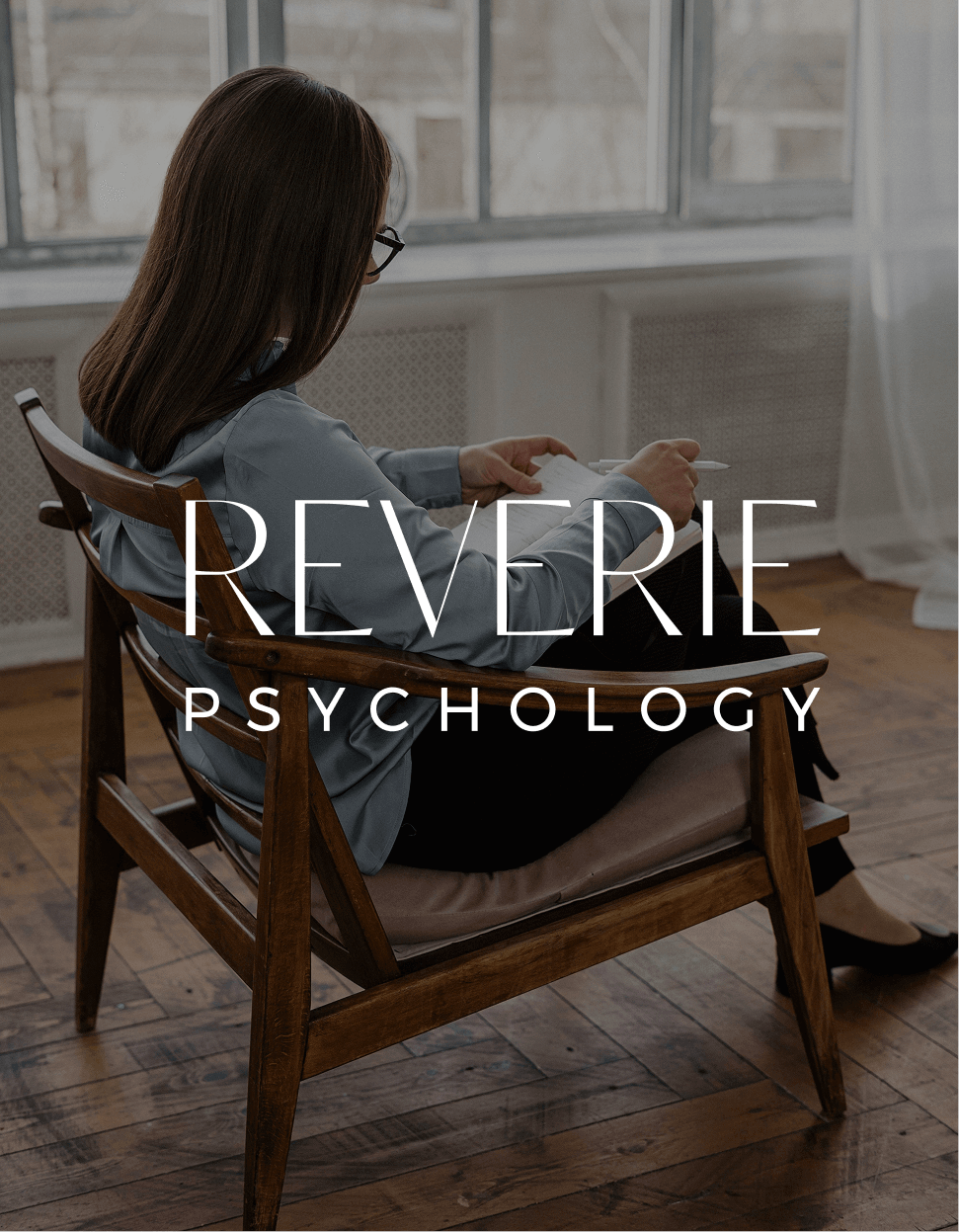
Visual Identity & Logo Design: The logo system centres around an elegant serif logotype, paired with a custom Vajra Bell icon.The Vajra Bell is a symbol of wisdom and divine feminine power—representing Zada’s spiritual foundations and energetic presence. The icon is also used as a watermark and monogram across applications, ensuring consistency and visual impact.
Colour Palette: The palette combines rich jewel tones—deep teals, emeralds, magentas and royal blues—with a luxe gold accent. These colours convey mystery, power, and spirituality, while also nodding to celebration and soulful fun.
Typography: A mix of Quagera, a high-contrast, elegant serif, and Poppins, a geometric sans serif, balances sophistication with clarity. The typography system allows for fluid use across digital, print, and social formats.
Moodboard & Aesthetic: The visual moodboard reflects Zada’s essence—mystical yet grounded, bold yet graceful. Layers of symbolic textures, gold foils, and vibrant tones give the brand a multidimensional feel that mirrors Zada’s magnetic presence.
The Result
The final identity is soulful, striking, and versatile—a visual system that honours Zada Lau’s story while paving the way for future brand growth. It reflects her energy, purpose, and power, and positions her to lead a movement of spiritual entrepreneurs, high-vibe collaborators, and conscious changemakers.