The client
CUT! The Podcast is a bold new podcast from Undertow Content, dedicated to pulling back the curtain on the entertainment industry. The name is a dual reference—CUT! as a film industry term, and UT as a subtle nod to Undertow. This podcast exists to demystify an industry often shrouded in complexity, offering access to insider knowledge and career insights for creatives and non-creatives alike.


The Brief:
the challenge
Launching a new podcast in a saturated market meant CUT! needed a visual identity that was:
Instantly recognisable, visually unique yet cohesive with Undertow’s overarching brand, aligned with the podcast’s trailblazing, quirky, and inviting tone
We also needed to reflect the podcast’s deeper mission: breaking down high barriers to entry in the entertainment industry and opening up conversations that spark real opportunity.
The goal
Our mission was to create a brand identity that felt bold, empowering, and fresh—an inviting platform where both emerging and established creatives could connect, learn, and grow. The branding needed to speak to the Australian entertainment community first, while also appealing to a broader global audience.


The Process and Outcome:
Working closely with CUT! The podcast’s team, we focused on a brand strategy that would resonate both visually and emotionally:
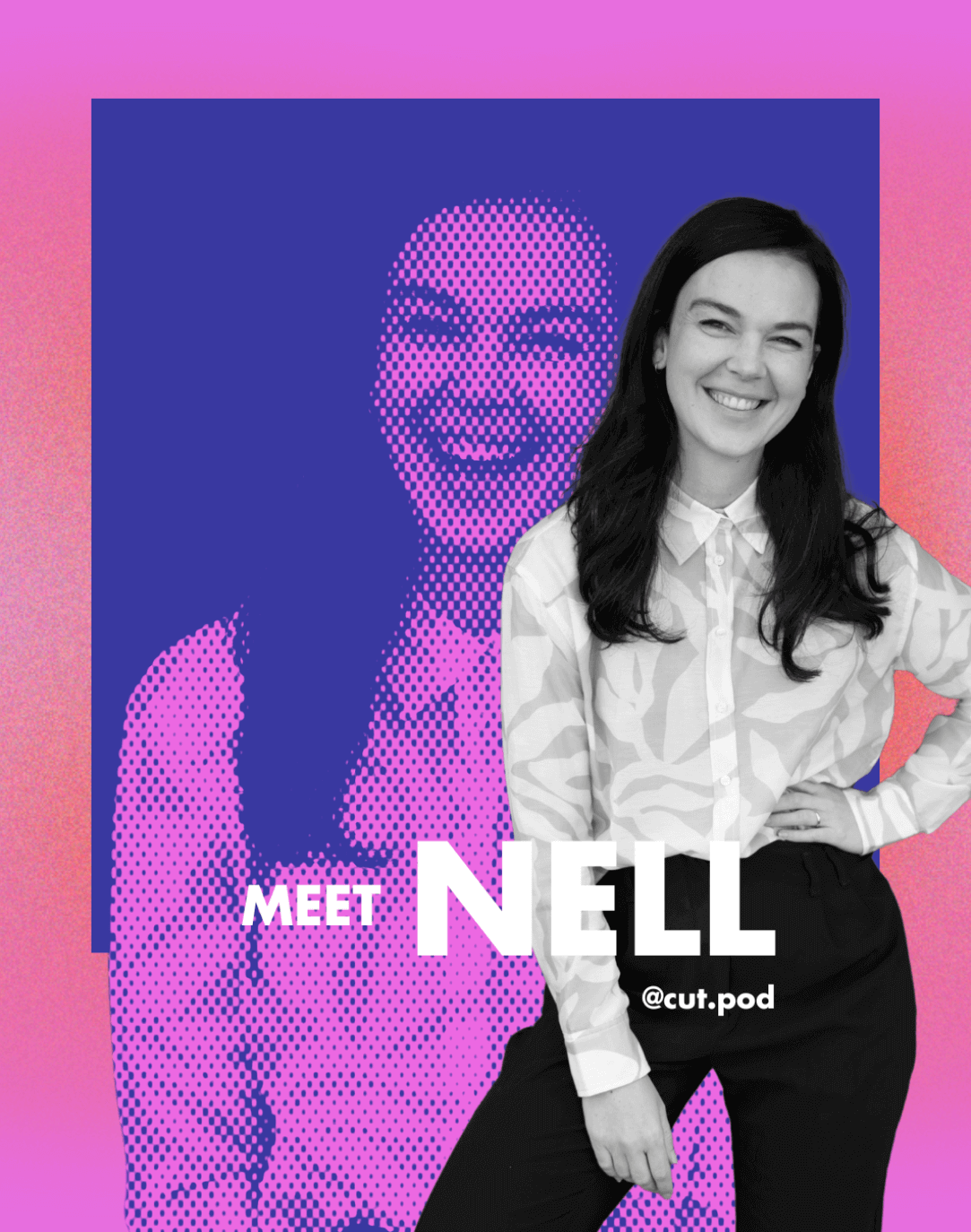
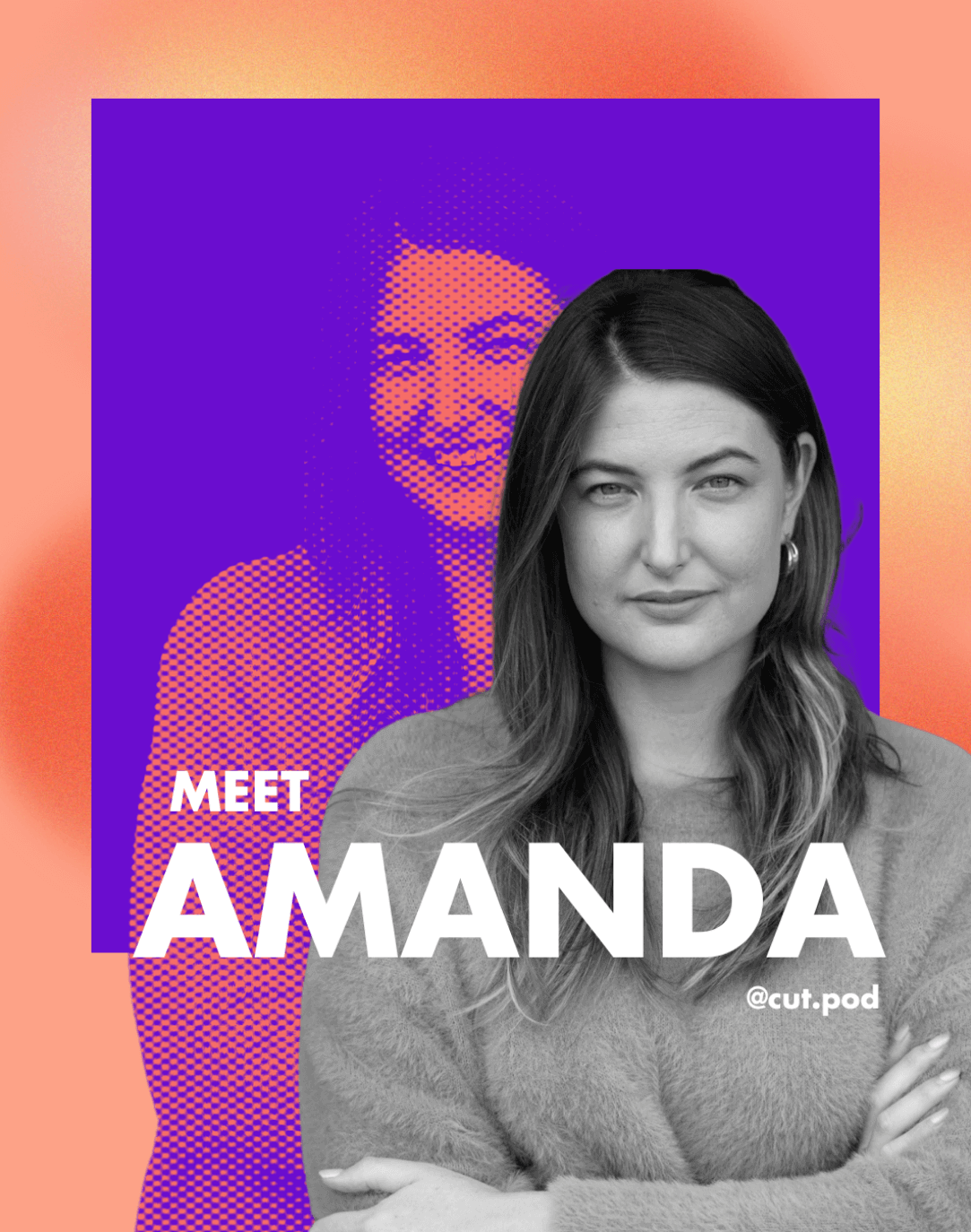
Visual Identity & Logo Design: The logo features a stylised clapperboard with a strong typographic treatment—symbolising storytelling, action, and behind-the-scenes energy. The bold use of CUT! conveys immediacy, while subtle references to Undertow provide continuity.
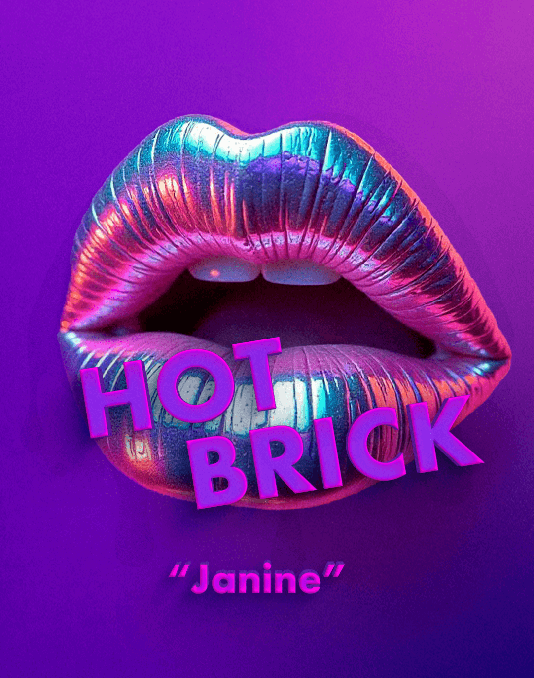
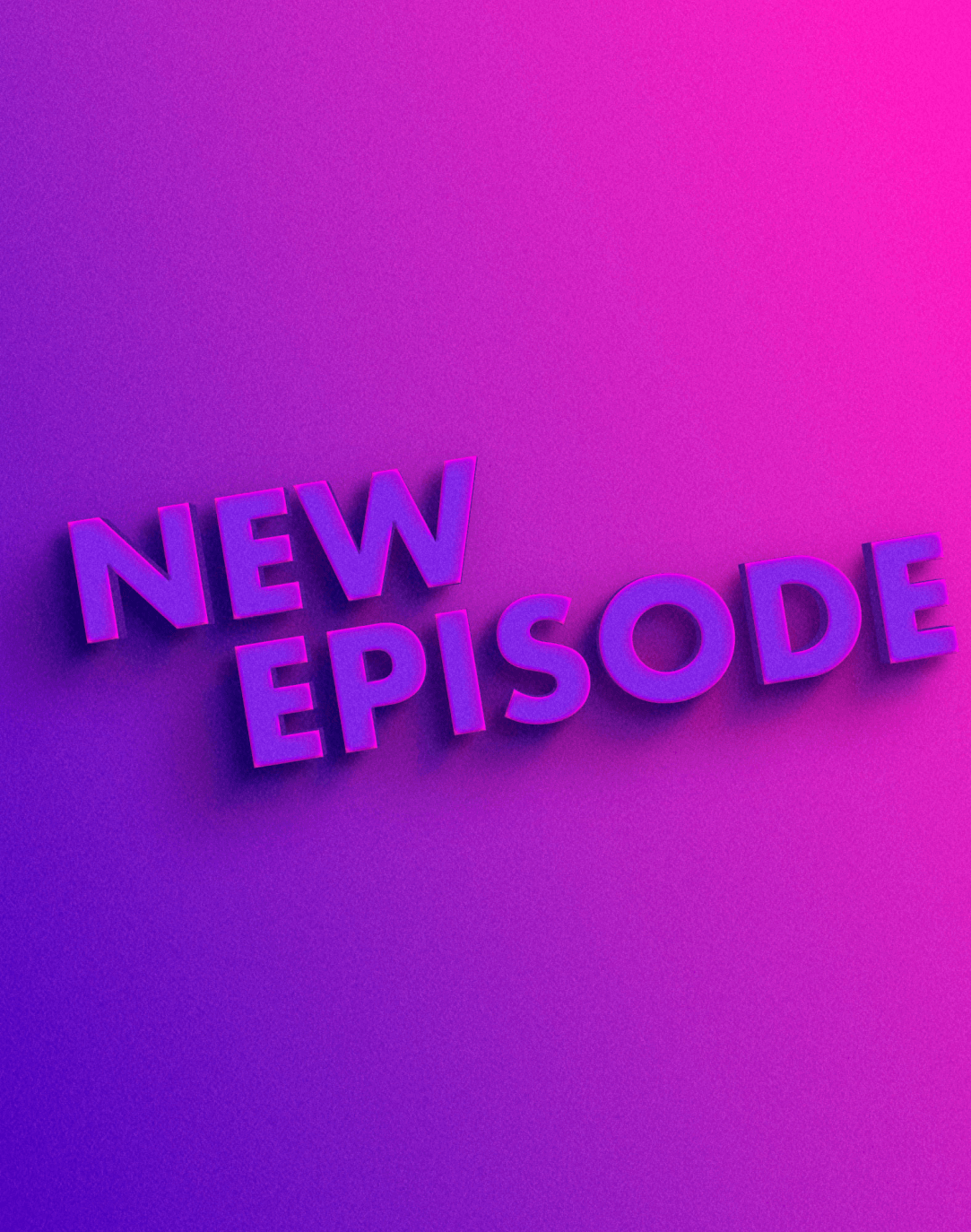
Vibrant Colour Palette: A rich mix of purples, pinks, and coral was chosen to reflect creativity, energy, and modernity—without veering into neon territory. The colours inject life into the brand and help it stand out across digital platforms.
Typography: A combination of Futura Bold and Poppins Regular balances personality with professionalism, making the brand feel modern and dynamic while remaining approachable.
Textures & Depth: Embracing texture and 3D elements added a tactile, layered feel to the visuals—symbolising the many layers of the industry the podcast seeks to uncover.
Moodboard & Assets: From cover art to episode promos and social templates, the visual suite was designed to be striking, playful, and unmistakably CUT!.
The Result
The final brand identity captures the essence of CUT!—vibrant, trailblazing, and empowering. With its bold visuals and clear messaging, the podcast now has a strong foundation to grow its audience, spark conversation, and create real impact in the entertainment industry.