The client
Herb Ware is a newly established brand aiming to redefine the smoking accessories market by offering modern, functional, and on-trend products. Unlike the industry norm of low-quality items and overused pop-culture references, Herb Ware seeks to elevate the space with premium products while also serving as a retail extension of their wholesale business, Canna Traders.


The Brief:
the struggles
The smoking accessories industry is often dominated by cheap, mass-produced products with excessive branding or outdated designs. Herb Ware wanted to break away from these conventions by creating a refined, high-quality brand that could later expand into their own line of products. The brand needed to be fresh, modern, and appealing to customers with more sophisticated tastes. Additionally, the visual identity had to align with their retail and wholesale objectives while standing out from competitors.
The goal
To develop a cohesive and visually compelling brand identity that reflects Herb Ware’s values: modernity, functionality, and quality. The branding needed to be distinctive, engaging, and versatile across different platforms while incorporating a green and orange colour palette for a balanced and energetic look.


The Process and Outcome:
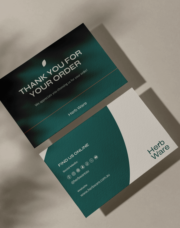
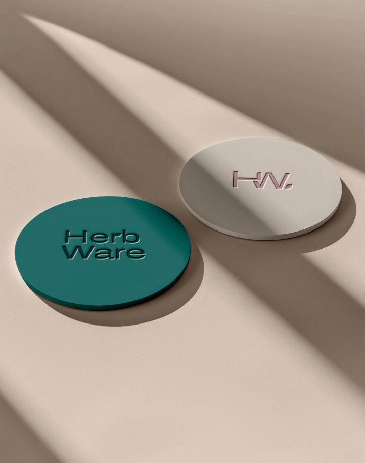
Our approach began with thorough market research and trend analysis to ensure the brand stood apart from competitors. We crafted a bold and modern logo using an expanded sans-serif typeface, ensuring strong brand presence. The defining feature of the logo was the leaf integrated into the ‘r’ of ‘Herb,’ symbolising the connection between nature and the brand’s core values.
A comprehensive style guide was developed to maintain brand consistency across all mediums. This included colour palettes, typography, and usage guidelines, ensuring a unified and polished brand identity. The primary colour, green, symbolises growth, harmony, and a connection to natural elements, while the complementary orange adds vibrancy, energy, and approachability. This combination allows Herb Ware to establish itself as both refined and dynamic.
To support the brand launch, we designed key collateral materials, including a postcard and other marketing assets. The logo was presented in multiple formats: horizontal, stacked, and monogram, providing versatility across platforms and ensuring seamless integration into both retail and wholesale settings.
With its new visual identity, Herb Ware is positioned to lead in a market hungry for stylish and functional smoking accessories. The refined design and strategic branding ensure the business stands out while staying true to its commitment to quality and innovation.