The client
Reverie Psychology is a private practice founded by early-career psychologist Caitlynn Ashton. The name ‘Reverie’ reflects a calm, creative state of daydreaming—an important part of personal growth, creativity, and the therapeutic process. With a personable, light-hearted approach that makes building rapport effortless, Caitlynn wanted her practice to feel warm, welcoming, and distinctly her own.


The Brief:
the struggles
Caitlynn approached us to create a brand from the ground up—one that captured the essence of ‘reverie’ while presenting a professional, modern image. She wanted her identity to stand out in the psychology space while maintaining a sense of softness, calm, and approachability.
The key objectives were:
- Develop a visual identity that reflects the meaning of Reverie and Caitlynn’s therapeutic approach
- Build a cohesive system for both digital and print applications
- Create marketing assets that would work across client communications and professional materials.
The goal
To create a brand identity that is warm, thoughtful, and restorative, while maintaining professionalism and trust. The new brand needed to feel consistent across every touchpoint—from business cards to social media—so clients instantly connect with the calm and personable experience Caitlynn provides.


The Process and Outcome:
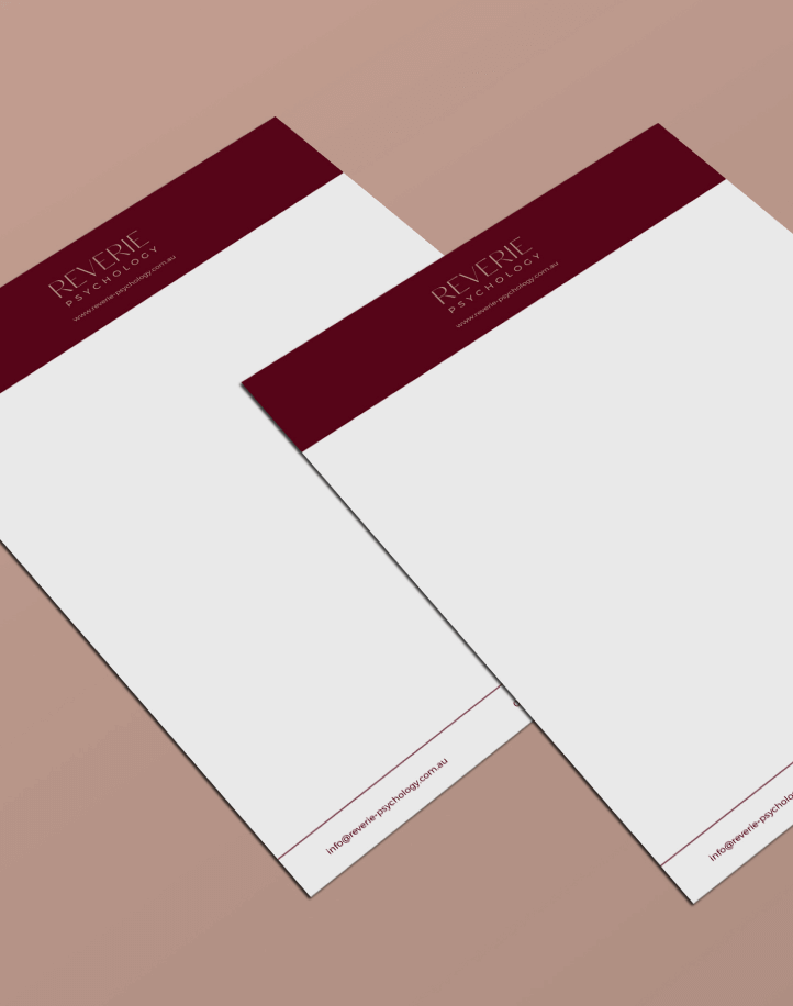
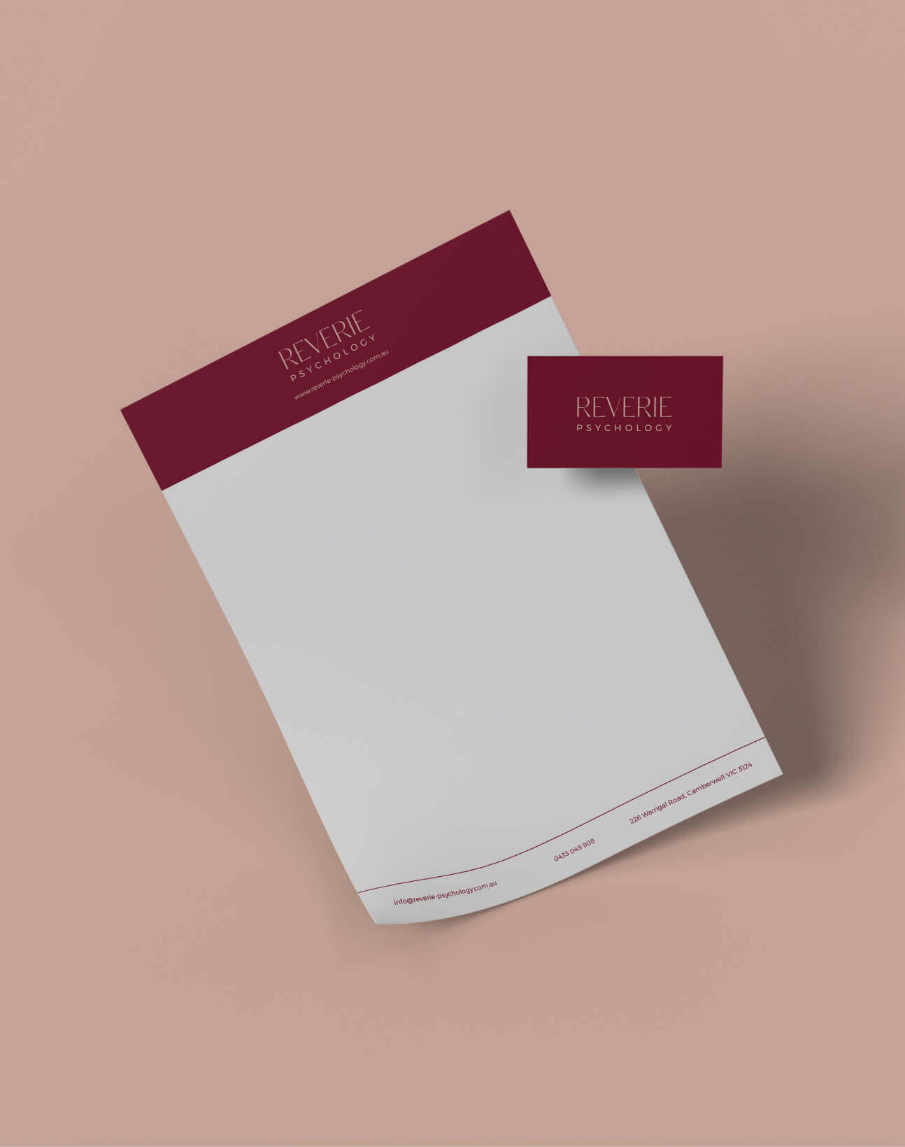
Visual Identity & Logo Design
We developed a logo suite that combines elegant serif typography with clean, modern sans serif accents. The primary logo communicates sophistication and calm, while alternative lockups offer flexibility for different platforms and materials. The visual style was inspired by the balance between professional credibility and a welcoming, human touch.
Colour Palette
Using Reverie Psychology’s soft, muted tones, we built a palette of warm neutrals, muted blues, and deep burgundy. These colours evoke calm and trust, while creating a distinctive look in the psychology sector. The palette works across both digital and print formats, maintaining clarity and warmth in every application.
Typography
The brand pairs the refined Classico serif for headings and logos with the approachable Montserrat for body copy. This combination offers a clear hierarchy and a balance between elegance and readability—perfect for both client-facing materials and professional documentation.
The Result
The Reverie Psychology brand is now a seamless reflection of Caitlynn’s vision—professional yet personable, calm yet modern. From her business cards to her online presence, every element is cohesive and intentional, building trust and recognition with clients. The identity positions Reverie Psychology as a space where people feel safe, supported, and understood.


CLIENT TESTIMONIAL
If you’re seeking top-tier branding expertise, I wholeheartedly recommend Fifth Studio Design Co.
I recently had the pleasure of collaborating with Nat and Cat from Fifth Studio Design Co. for my business’s branding, and the experience was nothing short of exceptional! Their professionalism and creativity were apparent from the very beginning. They invested time in truly understanding my vision and skillfully translated it into a standout brand identity.
If you’re seeking top-tier branding expertise, I wholeheartedly recommend Fifth Studio Design Co. Their work is outstanding, and they are the perfect choice for anyone looking to elevate their brand to the next level!
– Caitlynn Ashton, Reverie Psychology
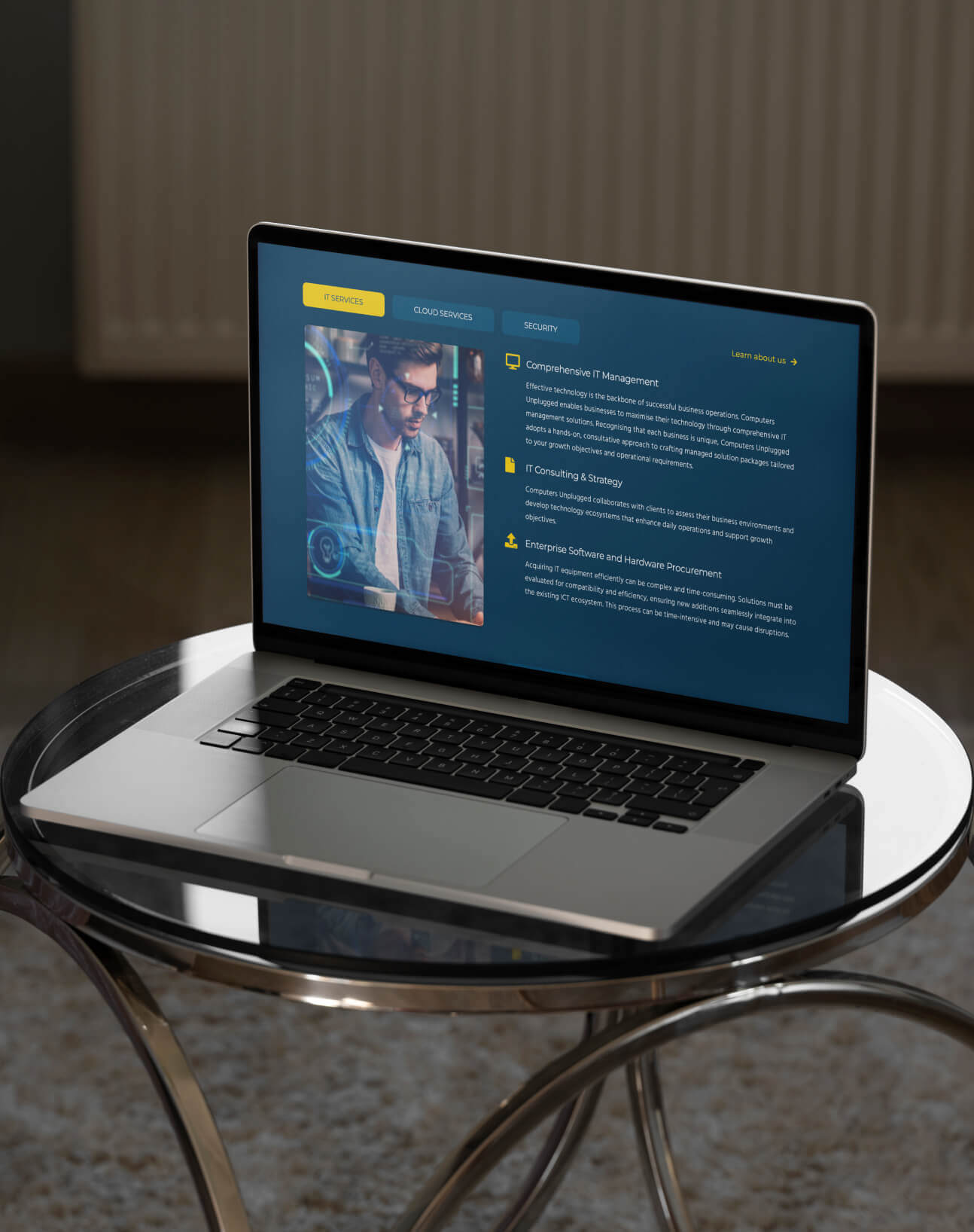
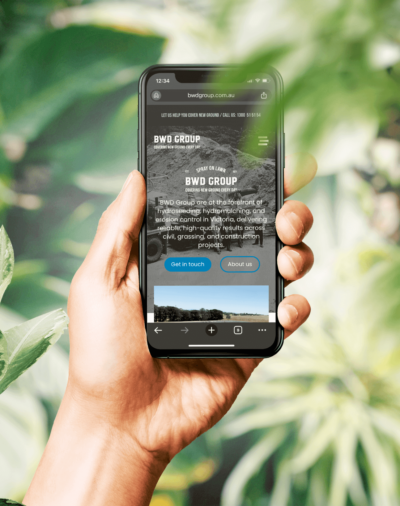
Client: COMPUTERS UNPLUGGED