The client
BWD Group are at the forefront of hydroseeding, hydromulching, and erosion control in Victoria, delivering reliable, high-quality results across civil, grassing, and construction projects. Known for their practical expertise and commitment to quality, BWD Group continue to expand their services while maintaining a strong reputation for consistency and care. As the business evolved, the team recognised the need to modernise their brand identity—creating a visual presence that reflects both their growth and their longstanding values.

The Brief:
the struggles
BWD Group approached us with a clear objective: to refresh their outdated logo and website, while retaining key elements of their visual history. They wanted a brand that felt professional, clean, and modern but still paid tribute to their origins—including an illustration that had been part of the company’s identity since day one.
The key challenges were:
- Update an outdated brand without losing legacy recognition
- Develop a colour palette that included green but differentiated from competitor brands
- Create a logo system versatile enough for use on uniforms, trucks, signage, and stationery
- Deliver a website that communicates the full scope of their services in a clear and modern format
The goal
The aim was to create a cohesive brand identity that blended tradition with modernity—something that reflected BWD Group’s evolution as a business while keeping their story intact. The updated branding needed to feel strong, trustworthy, and flexible, with assets that could be used confidently across digital platforms, printed materials, and industrial equipment.

The Process and Outcome:
Visual Identity & Logo Design
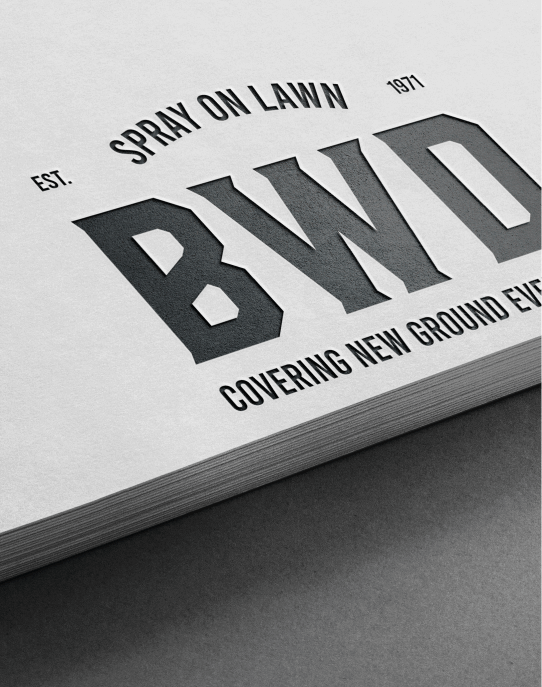
We worked closely with the BWD Group team to create a visual identity that balances heritage with a refreshed, professional aesthetic. The new primary logo is a bold, modern badge that works seamlessly across a variety of applications—from truck decals and workwear to social media and signage.
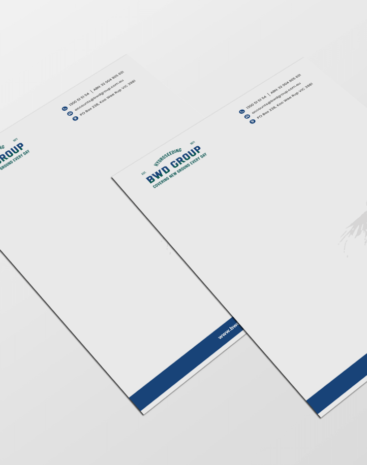
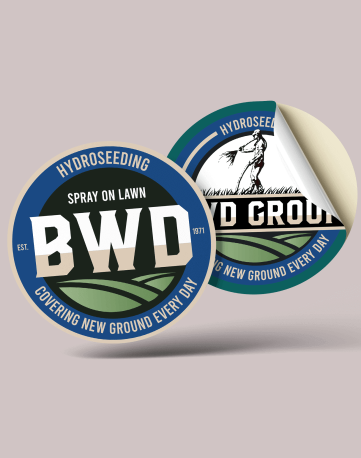
Alongside the badge, we developed alternative logo lockups and monograms to ensure flexibility across different formats. The original company illustration was retained as a nod to their history and thoughtfully integrated into select collateral, such as letterheads, where tradition is celebrated.
Colour Palette
BWD Group wanted to retain green in their palette but not rely on it exclusively, as it was widely used across the industry. We introduced a custom green paired with a distinctive deep blue, creating a combination that feels fresh, clean, and uniquely theirs. This new palette gives the brand a modern edge while still connecting to industry expectations around environmental service providers.
Typography
The type system was chosen for its clarity, strength, and versatility. A bold sans serif anchors the logo and key headlines, giving the brand a no-nonsense, professional tone that suits the industry. Supporting fonts allow for hierarchy and ease of reading across web and print formats.
Print Collateral
We designed a full suite of business materials, including business cards, letterhead templates (with and without the legacy illustration), and digital stationery. Each item was crafted to ensure consistency and professionalism while offering flexibility across internal and client-facing communications.
Social & Signage
The visual identity extended to social media, including a Facebook banner and profile assets that reflect the new look and feel. The logo and brand colours were also optimised for use on workwear and truck signage, ensuring the brand is visible and recognisable in the field.
Website Design
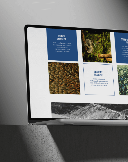
We designed and built a new website that clearly communicates BWD Group’s capabilities, values, and commitment to service. With an emphasis on easy navigation, bold visuals, and mobile responsiveness, the site reflects the modern professionalism of the business while being grounded in simplicity and function. Clear service pages, strong visual hierarchy, and updated copy ensure clients can quickly understand who BWD Group is and what they offer.
The Result
The new BWD Group brand is strong, modern, and built for growth. The identity reflects the company’s long-standing reputation while positioning them as a forward-facing industry leader. From truck signage to online presence, every element now feels aligned and intentional—built to support the business today and into the future.
Working in close collaboration with the BWD Group team, we delivered a brand system that respects tradition while embracing what’s next.