Skip to content
book a FREE STRATEGY call
BOOK A DISCOVERY CALL
Toggle Navigation
About
SERVICES
LOGO & BRANDING
WEBSITES
ON-GOING GRAPHIC DESIGN
SOCIAL MEDIA
VIEW ALL SERVICES
PORTFOLIO
Toggle Navigation
Home
About
Services and Packages
Logo and branding design
Websites
ON-GOING GRAPHIC DESIGN
Custom Social Media
View all Services
Portfolio
Freebies and Resources
Blog
Work with Us
Toggle Navigation
RESOURCES
BLOG
Work With Us
Studio Insights
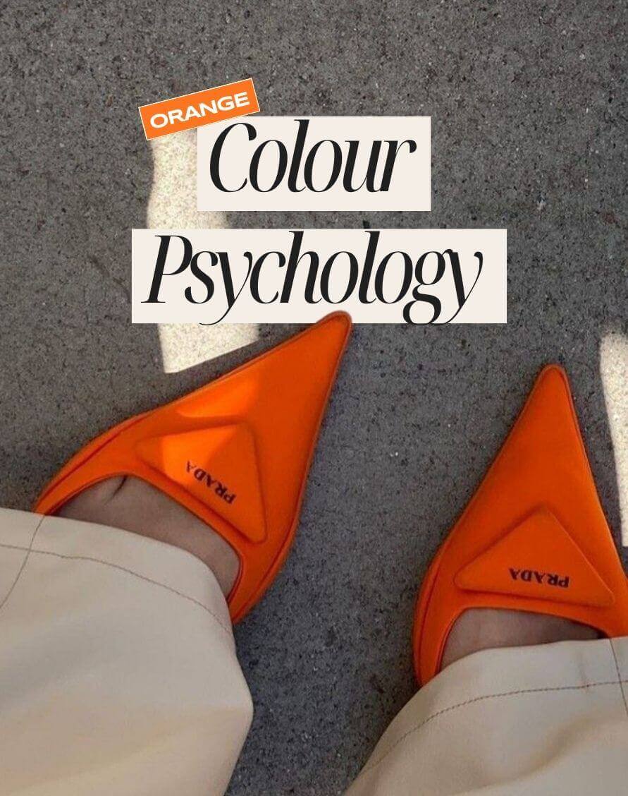
2025 Colour series: orange – the fearless colour in branding
Industry:
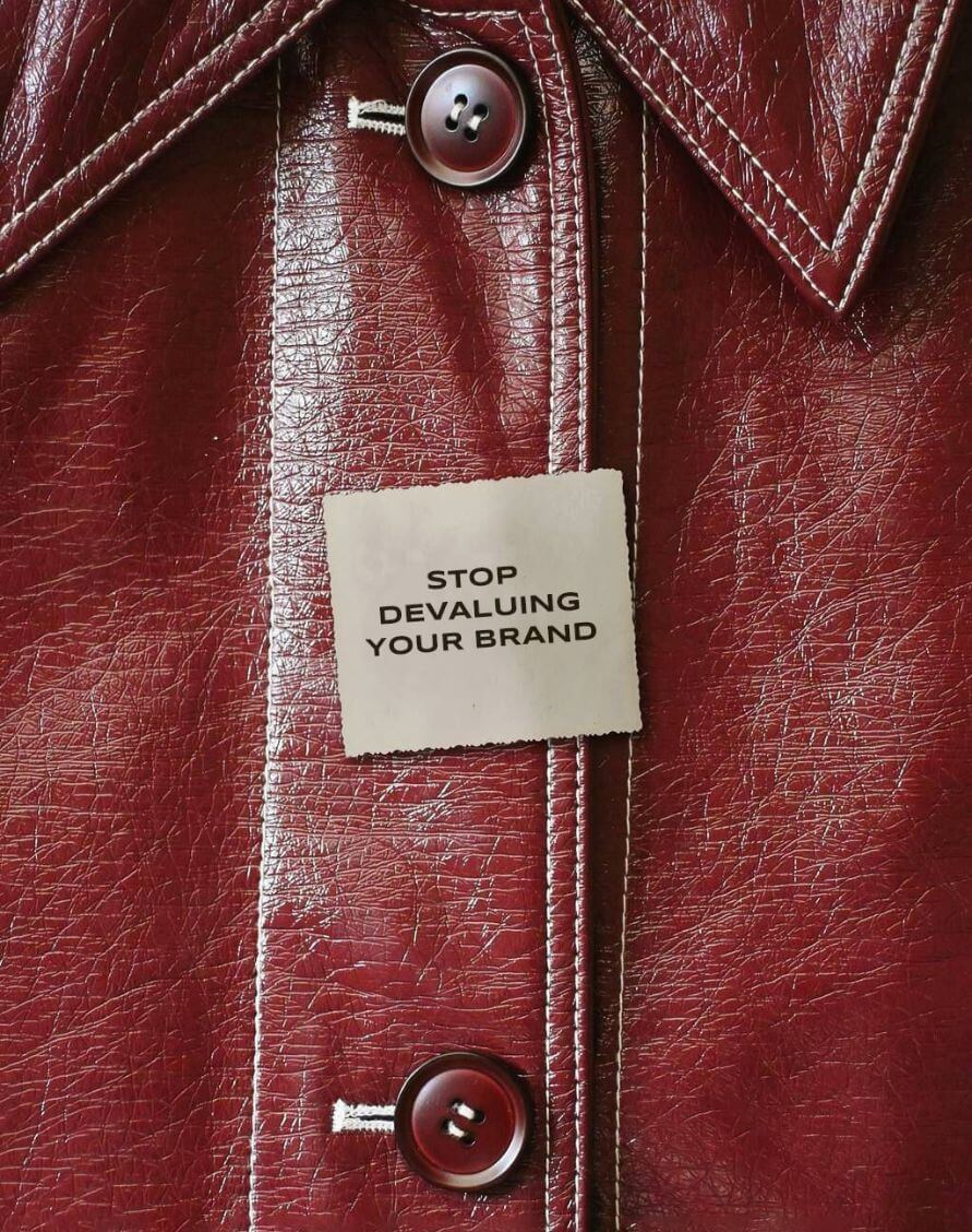
The hidden cost of cheap branding (and how to avoid it)
Industry:
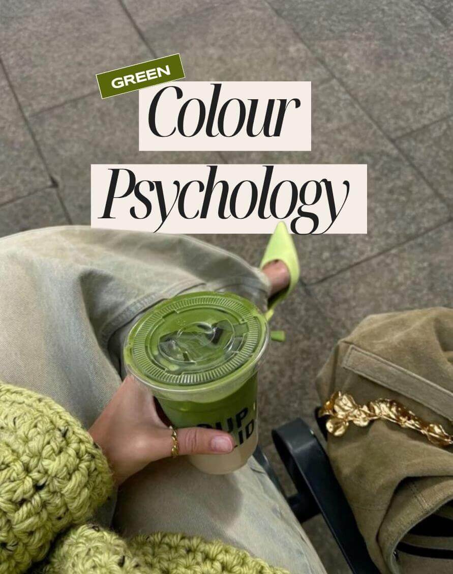
2025 Colour series: green – the calming colour in branding
Industry:
Style guides explained: the key to consistent and confident branding
Industry:
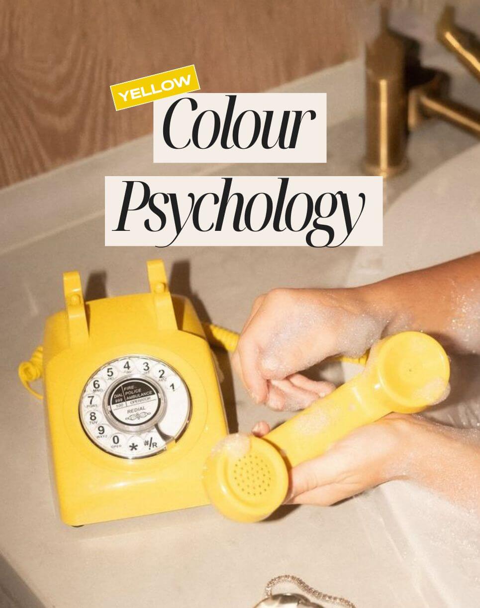
2025 Colour series: yellow – the happiest colour in branding
Industry:
Branding tips for service-based businesses – how to earn client trust in 2025
Industry:
Page load link
Go to Top