The client
Lift Less Solutions is a small business dedicated to empowering healthcare teams with effective manual handling training. They go beyond tick-box exercises, providing hands-on, industry-leading training to ensure safe and respectful handling of individuals in care. By equipping your team with the right skills, they help protect their wellbeing while enhancing the quality of care they deliver.
The Brief:
the challenge
Mark struggled to create a brand for Lift Less Solutions that resonated with BodyRight while standing apart. He needed a balance of shared values and fresh design, making the new brand unique yet recognisable.
The goal
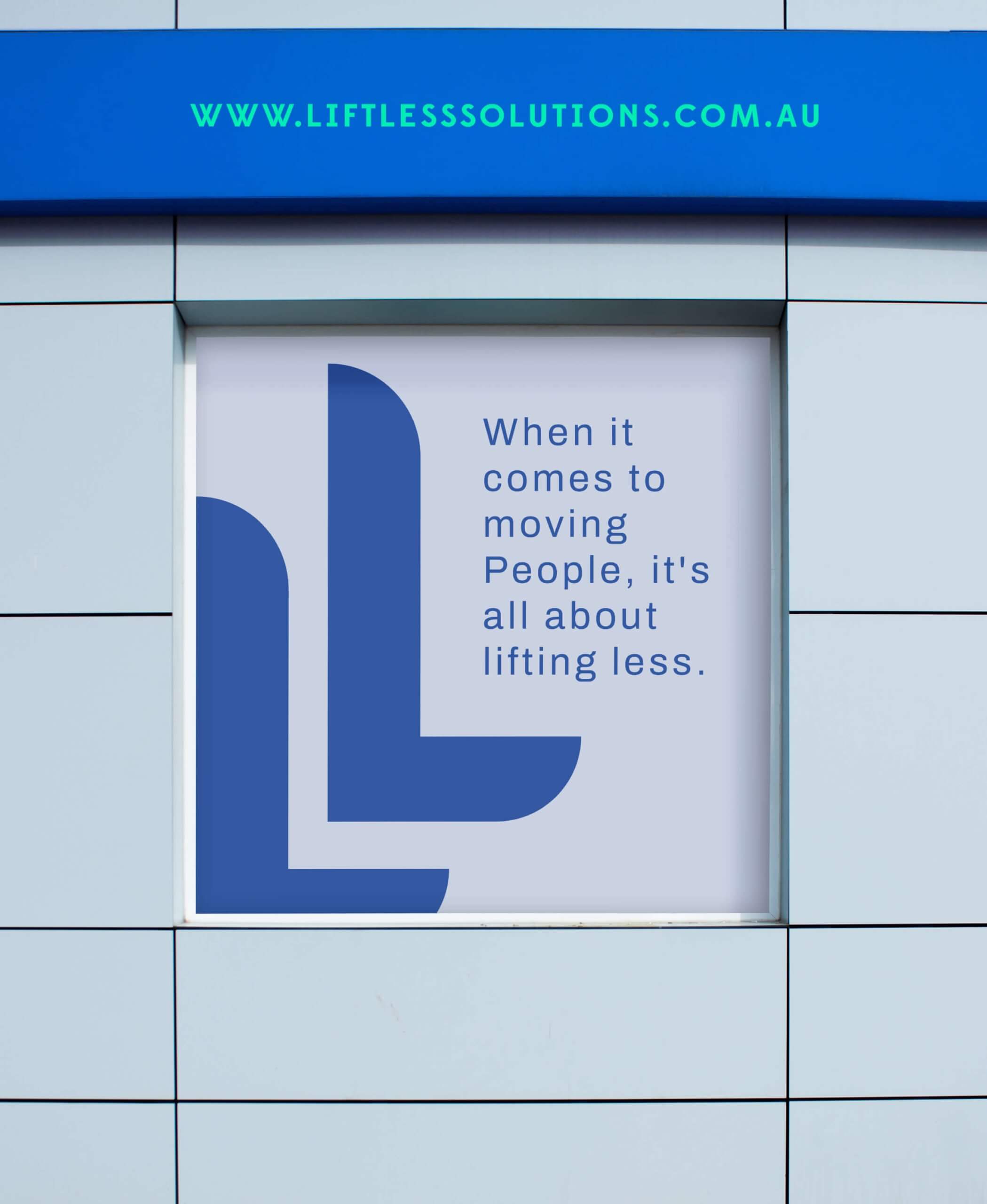
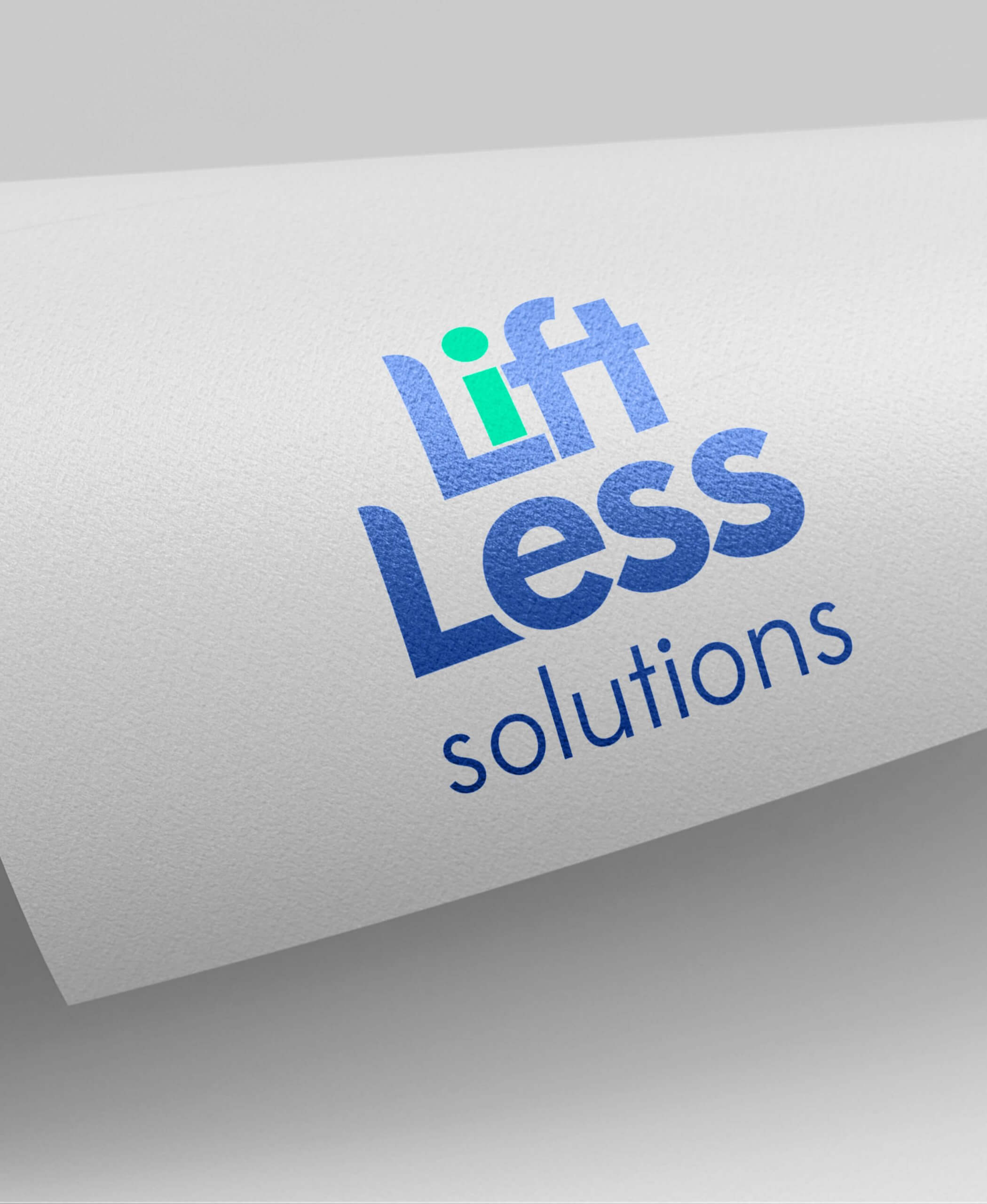
Mark had a clear goal: to create a fresh identity for his new brand while maintaining a connection to the established BodyRight brand. Our aim was to strike the perfect balance—introducing new colours and design elements that made the brand unique, yet familiar and aligned with its origins.
The Process and Outcome:
We began by collaborating with Mark to understand his vision and goals for Lift Less Solutions, focusing on three key areas:
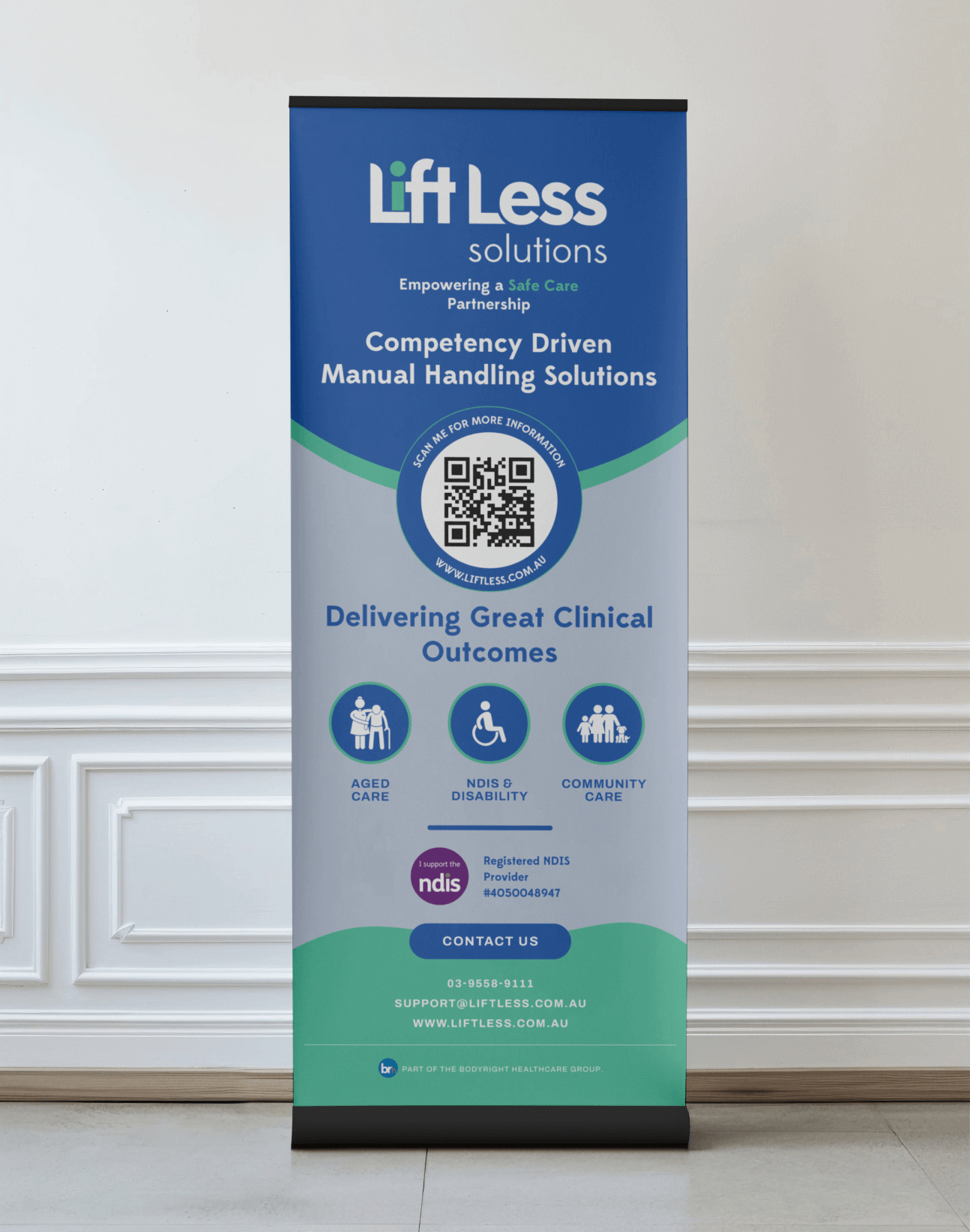
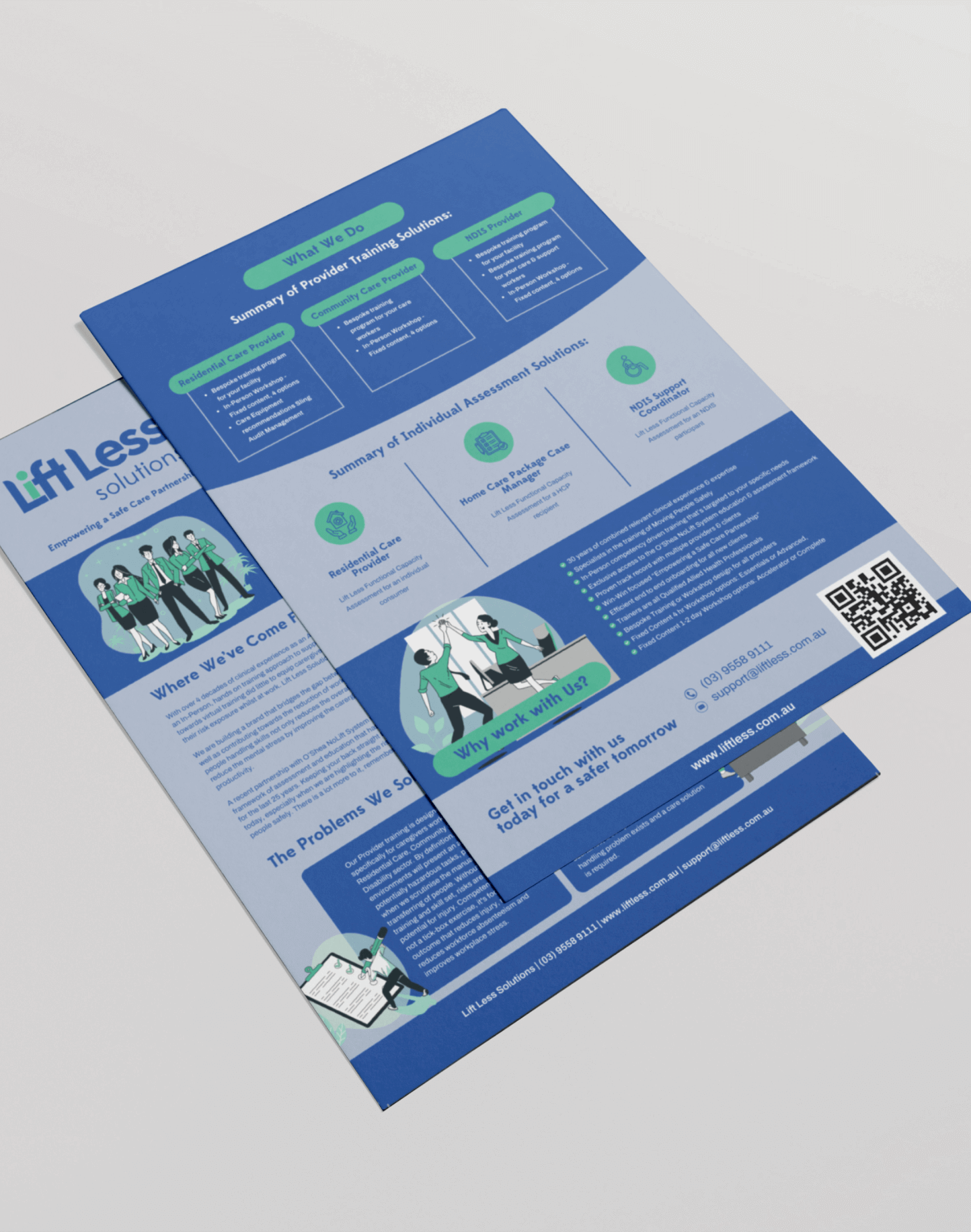
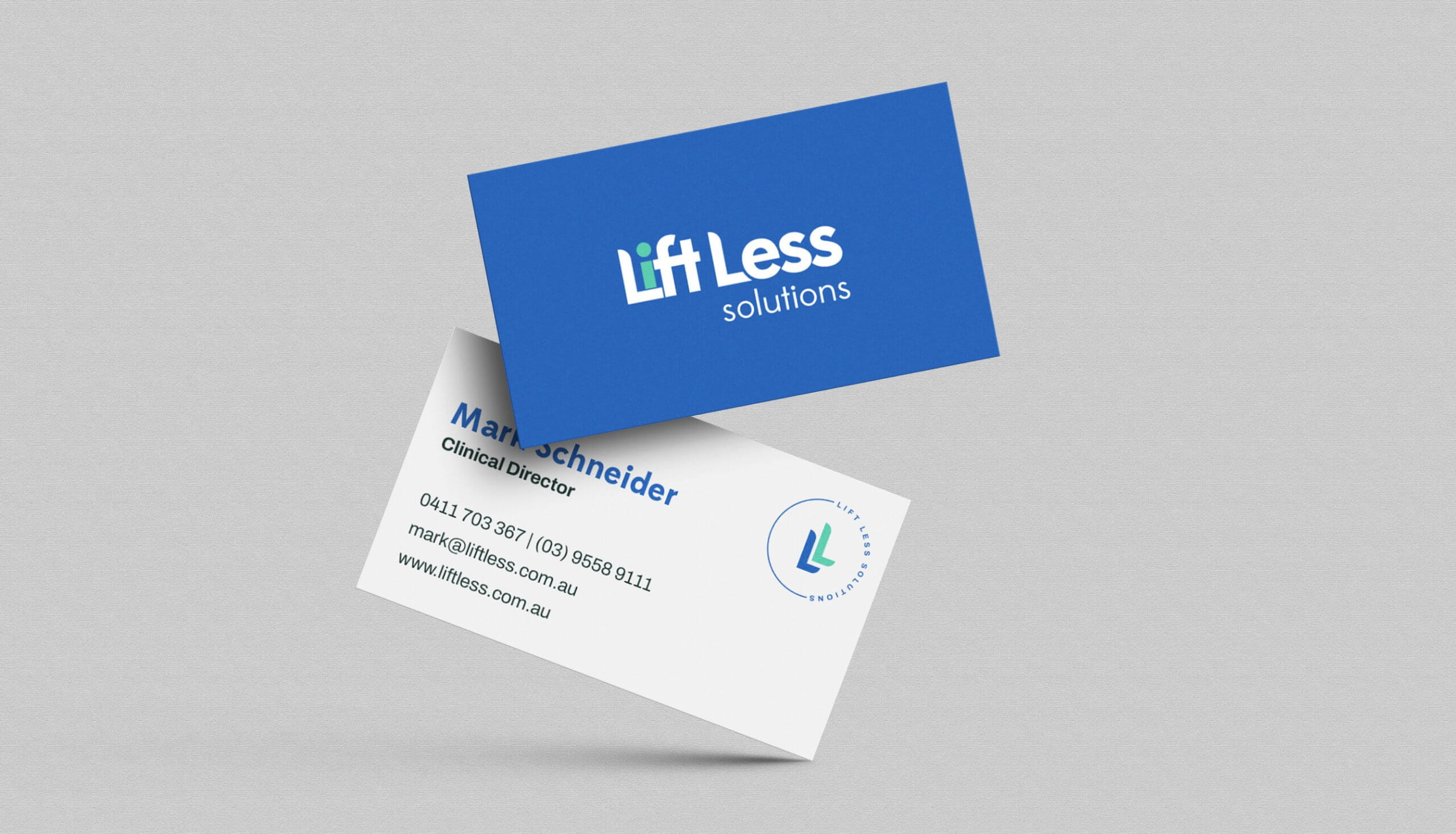
Colour Palette Development: We crafted a modern palette of blue, bright green, and white to convey professionalism, care, and innovation.
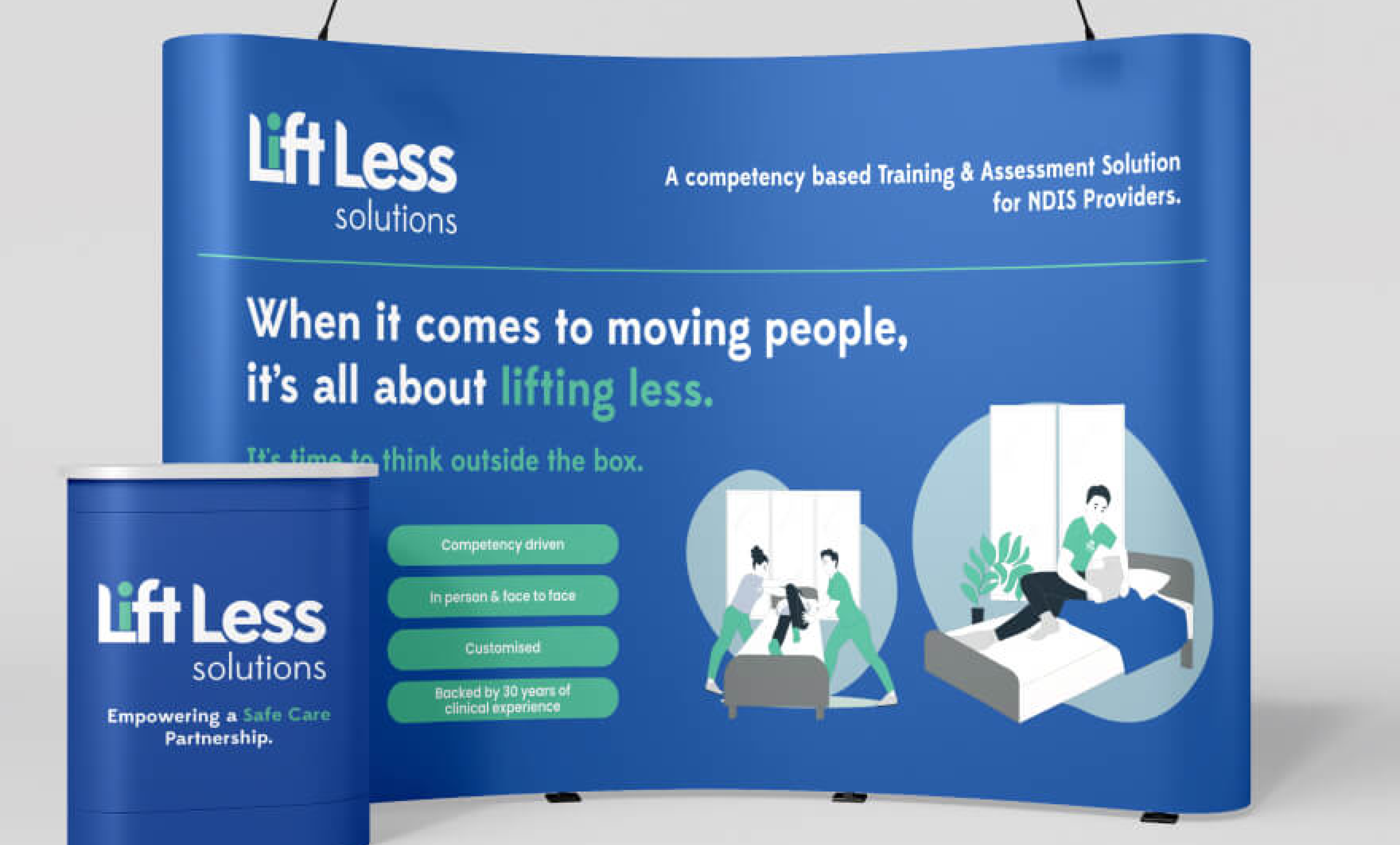
Custom Illustrations and Visuals: Custom illustrations were designed to represent key tasks, making the brand approachable and visually engaging.
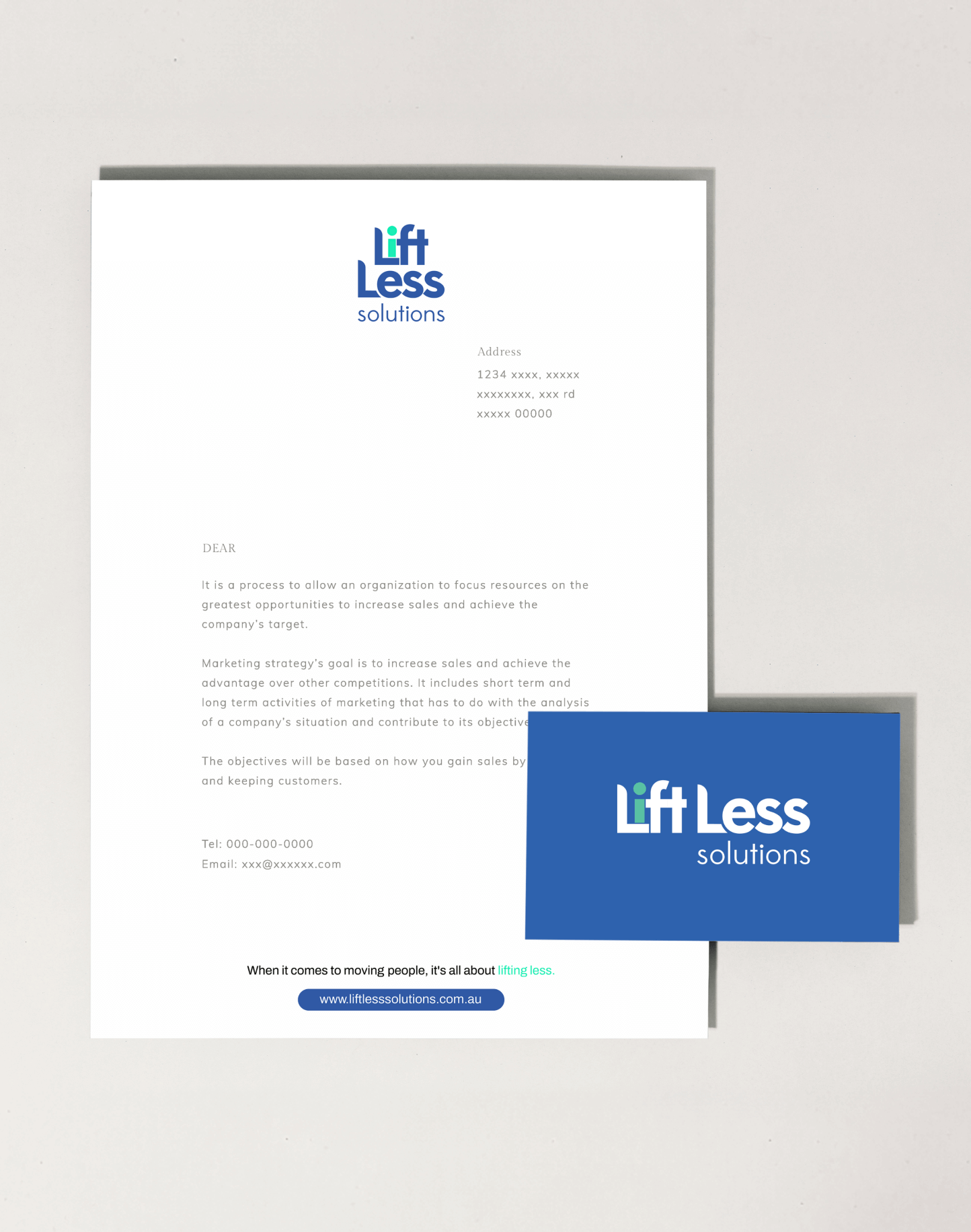
Clear Brand Guidelines: We created detailed guidelines to ensure consistency across all materials, enabling personnel to effectively apply the brand identity.
Throughout the process, we worked closely with Mark to align the design with his vision, ensuring every element resonated with the brand’s purpose.
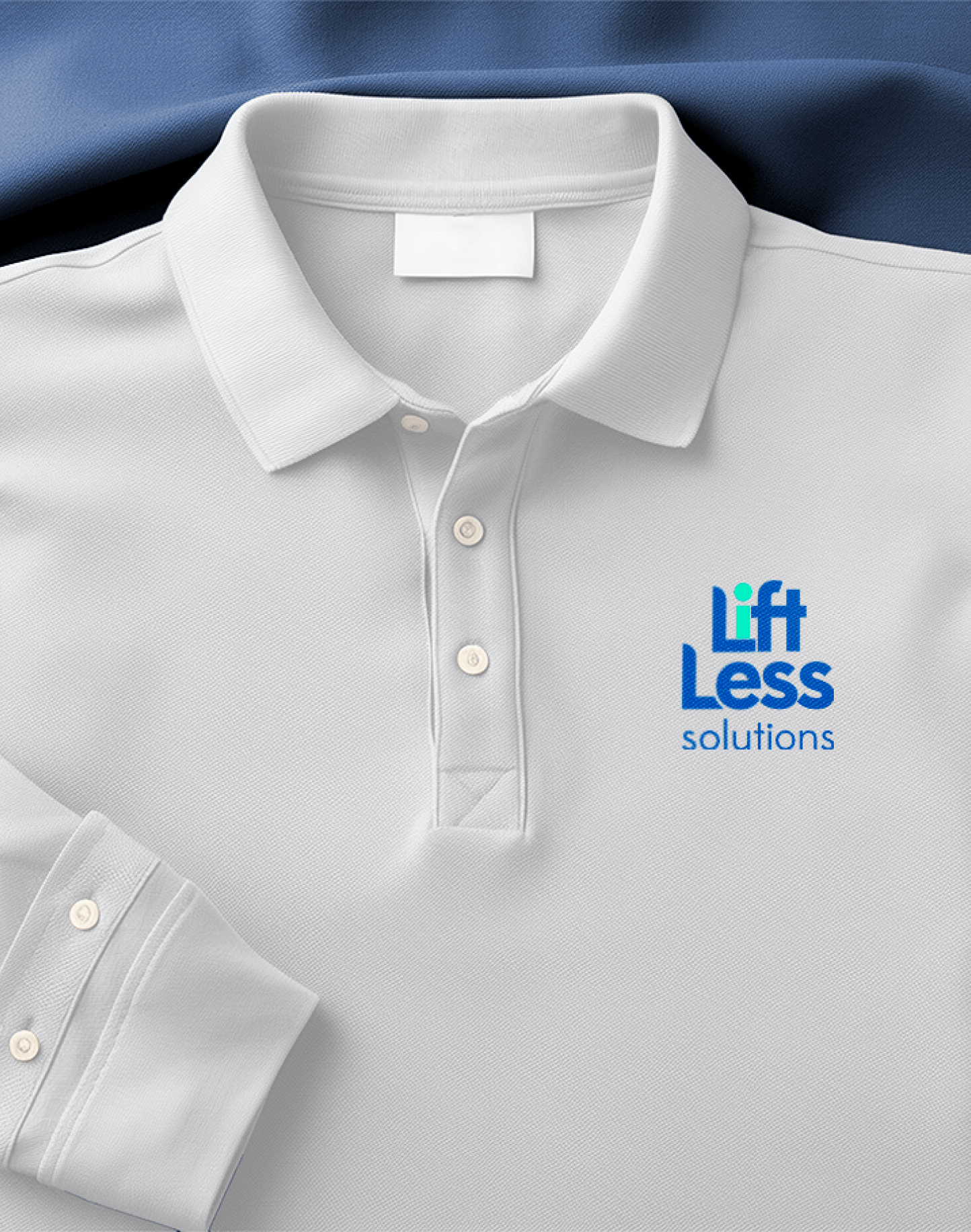
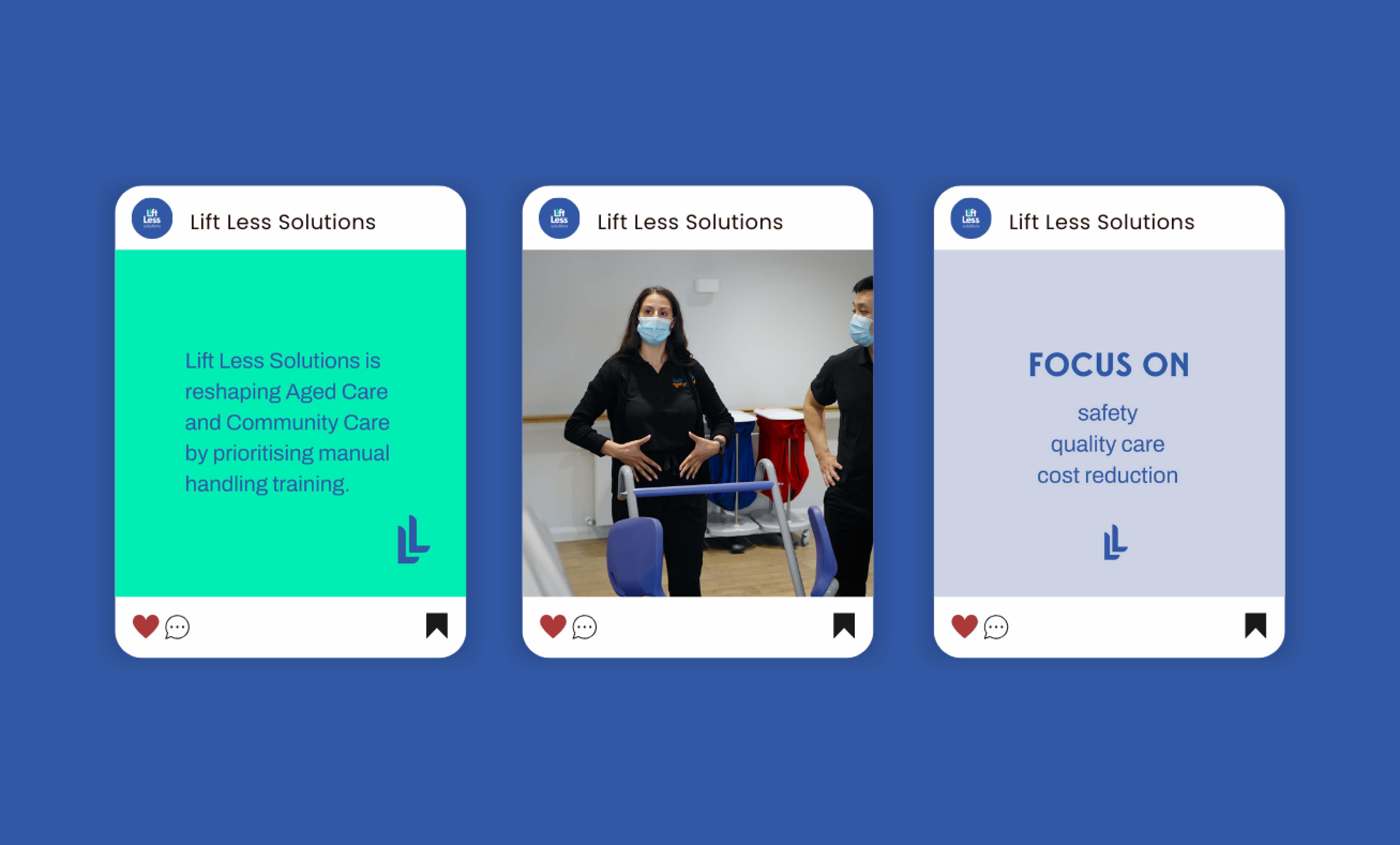
The result is a cohesive and distinctive brand identity for Lift Less Solutions. The vibrant colour palette, modern illustrations, and clear guidelines establish a professional yet approachable image, setting the foundation for the brand’s success in the healthcare training industry.
